You’ve bought a 1950s home in the Rugby area. It’s lovely and spacious, but it needs a little re-organizing. One example: It has a small, dark galley kitchen; you have four kids who want to bring their friends over and hang out, which means it’s time to re-do the first-floor layout and design a kitchen that works for your family.
“I spend 80 percent of my time at home in the kitchen,” says the homeowner. “I cook a ton, and the kids are always here—we’re the neighborhood gathering place. And I wanted a lot of pantry storage, and a big refrigerator and freezer. I mean, really big!”

She found her interior designer, Karen Turner of KTK Design, by word of mouth. Turner, who has been working in the Charlottesville area for four decades (“I went to UVA and stayed,” she says) had done a number of houses in the neighborhood, so she was familiar with both the charm and challenges of 1950s homes. Working with architect Bethany Puopolo, who did the overall renovation, Turner wanted to make sure that the new kitchen met the family’s needs and still fit the house’s original character.
The layout of the new kitchen had to work with the flow from the rest of the first-floor spaces. So on one wall, between two doors (one to the mud room and pool, another to the playroom/hangout space), Turner placed the large refrigerator and freezer side by side projecting out, with the floor-to-ceiling pantry cabinets behind them. That creates two “zones” within the kitchen. The two large appliances are placed opposite a counter with sink, where all the food prep takes place (and where the coffee setup is); opposite the pantry cabinets is a small desk/home office space.

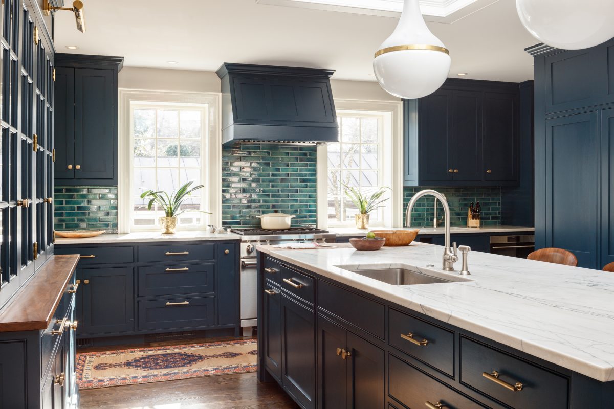
The prep counter extends to the oven and gas range, placed between two windows overlooking the pool. The central island, where all the gathering happens, sits underneath a huge clerestory skylight that brings in more natural light to the space. “We couldn’t make a cathedral ceiling there, because of the structure above,” says Turner, so the clerestory was Puopolo’s solution. And for added light on dark days or at night, Turner added two stunning Harford pendant fixtures from The Urban Electric Company.
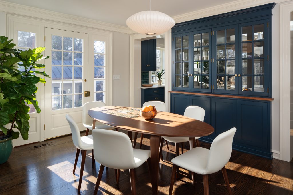
The central island is another of Turner’s zones. This area is for clean-up; there’s another sink, and next to it under the countertop is the dishwasher. And behind that is an elegant solution to another structural problem that precluded removing the wall: Turner decided to revive the mid-century breakfast room and opened the wall by designing a built-in, pass-through dish storage cabinet with glass-paneled doors on front and back. The doors let light through, visually connect the breakfast room with the kitchen, and let the homeowner put away clean dishes from one side and take them out to set the table on the other. (All the cabinetry work was done by Willis Woodworks in southwest Virginia.)

An added benefit: This kitchen is sized to its family. “I’m 5 foot 10, and my husband is 6 foot 6,” says the homeowner. “All our counters are higher than usual, and we have lots of high storage.”
With all the working elements satisfied, the homeowner had one more requirement. “I wanted color—I’m in the kitchen so much, and I wanted it to be bright colors that I love.”
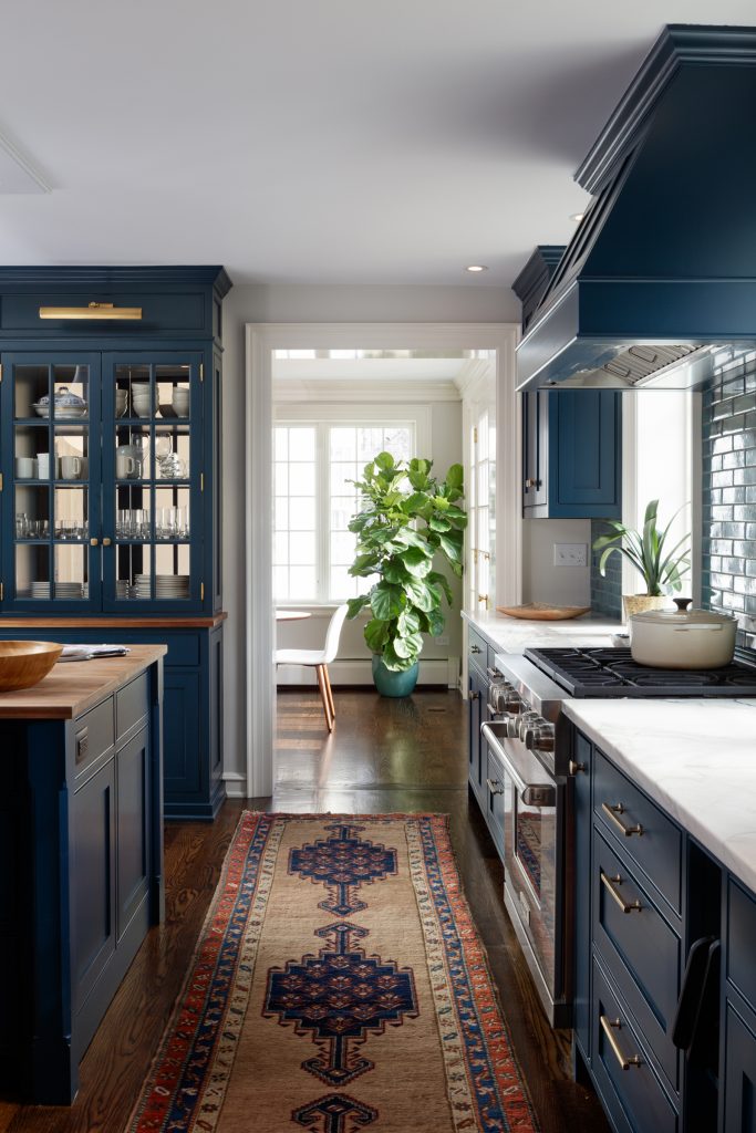
The color scheme started with a backsplash tile that the homeowner found at Sarisand Tile, a lovely variegated blue-green, which set the tone for the kitchen’s navy color on walls and cabinets. Turner set the tile as a backsplash for the range, since that is the central feature on the kitchen’s window wall, and keyed the range hood, the upper and lower cabinets, and the pantry to its blue tones. Happily, Turner notes, the counters’ White Macaubas honed quartzite from Cogswell Stone has that blue in its veining.
The navy cabinets with their brass fittings fit the house in its conservative character—making everything shipshape—but also satisfies the homeowner’s need for color and warmth. “I couldn’t live in an all-white kitchen,” she says. “I embrace color and chaos. This blue—it’s a happy color.”
