Categories
News

Building blocks

By Matt Dhillon

There is a moment when our things stop being our things and begin their new life as trash. It is the frighteningly casual act of throwing something away. Once it is trash, it is forgotten, discarded, and buried, but we know that our wastefulness is catching up with us.

It’s a problem that is being discussed in many disciplines, but UVA’s School of Architecture recently brought the issue to the sidewalks and lawns of Grounds with its Biomaterials Building Exposition. The completion of five installations under the direction of architect-scholars from Penn State University, Cornell University, University of Arkansas, Rice University, and Kansas State University addresses sustainability, decay, permanence, and alternative building strategies in the ways that we inhabit space.

Organized by Katie MacDonald and Kyle Schumann, assistant professors at the UVA School of Architecture, the exposition seeks to display innovations in biomaterials and their potential for construction. The organizers say the construction industry has been slow to recognize its responsibility in climate shifts and even slower to respond. 

“In the current building culture, the life­ span of buildings is rapidly decreasing,” says designer Jonathan Dessi-Olive, from Kansas State University. He pointed to the Georgia Dome in Atlanta, which was built in 1992 and demolished in 2017. 

“The building was thrown away much like you would throw away a paper cup. And this is something that’s happening all over the world,” he says. 

The EPA reported that in 2018 the United States produced over 600 million tons of debris from construction and demolition activities for buildings, roads, bridges, and other structures. The majority of this waste was relatively permanent material, such as concrete, asphalt, and steel.

The five installations in the BBE offer alternatives that use biological systems in ways that are both practical and conceptual. 

“To think about structural materials that aren’t concrete and steel is really the focus of the work,” MacDonald says.

Wood

From fire to log cabin to timber frame to wood frame (which makes up the majority of homes in the U.S. today), wood has been an essential and available form of shelter. But the same EPA report found that almost 41 million tons of wood debris was generated in 2018, with about 70 percent ending up in landfills.

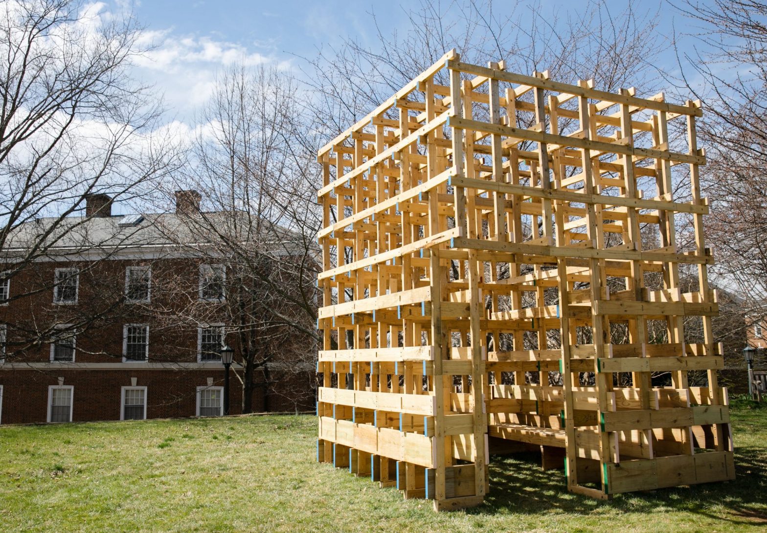
“Mix and Match,” from the University of Arkansas, proposes salvaging that waste. The project recycles the odds and ends of scrap wood by using lap joints to stitch together the lengths desired. Lap joints are always supported from behind by solid wood, and cross pieces reinforce the structure, resulting in a Lego-block-like composition of cubed frames. Also in Lego-block fashion, the project focuses more on assembly than the final structure. The boards can be disassembled and reassembled in new configurations, using the lap joints to fasten the pieces into a different shape.

The millions of tons of wood wasted each year is only a fraction of the wood wasted in logging, selecting the best trees, and milling them into the shapes used for building. “Unlog,” from Cornell University, makes use of the natural curve and forks of trees.

“As a building material, we encounter wood as a 2×4 or plywood or other standardized dimensions, but as we all know wood comes from trees that are non-standard,” says Sasa Zivkovic, one of the designers of “Unlog.”

The installation is made from six logs cut in accordion style zigzags so the logs can be unfolded into a wall. The logs are arranged into a serpentine A-frame that challenges the boxy geometries traditionally imposed on wood. 

Decay 

Our concern is typically for how to preserve a structure and not how it will decompose, even though decay is inevitable. Rice University’s “From Wood to Tree” explores incorporating decomposition into the design. Contrasting the gravity and grandeur of monuments, the installation plucks at the temporary nature of our time here.

Made with four frames of different kinds of wood, the structure is intentionally gouged to expose the interior to the environment and encourage fungal growth. The frames are penetrated by nearby trees undermining the wall in its classical embodiment of separation between ourselves and the environment, inside and outside, human and non-human spaces.

Mycelium

It is in decay that some architects have found a novel, organic building material. A growing wave of builders are using the roots of mushrooms to grow bricks on agricultural waste. The mycelium can be grown into any shape as long as one has the form to mold the substrate. The pieces are then glued together through myco-welding, which occurs as the mycelium of one piece grows into the mycelium of another.

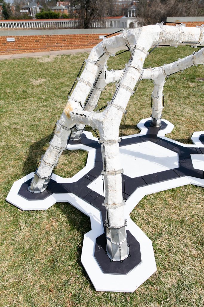
“MycoCreate,” from Penn State, works with the compressive strength of mycelium to build an arched, hut-shaped structure relying only on the compressive strength of its several columns. The structure’s weblike shape invites asymmetry, which opposes the ordered shapes of traditional buildings and gives an organic feel to the installation.

Kansas State’s “La Parete Fungina” investigates further the process of myco-welding. Currently, most mycelium structures are grown in parts and fired to stop the fungal growth. Designer Dessi-Olive sees this as a limitation because the parts can only be as big as is manageable in the oven, which compromises the strength of the myco-weld.

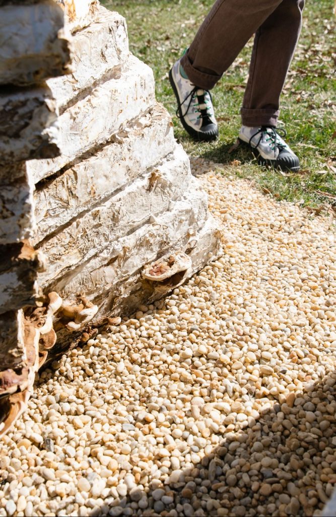
This installation, made of myco-welded bricks, reflects and distorts the form of the serpentine walls found on Grounds, positioning mycelium as a masonry alternative to concrete. And this wall is alive. The spongy, mottled-gray bricks have an aged stone appearance, but the living, reishi heart is apparent when you see the mushroom caps sprouting on the base.

However, living in a mushroom house is still a long way off. The material is lightweight and has strong insulative and acoustic properties, but its load-bearing capacity is pretty low. Though, as the architects remind us, a building is a system composed of many different materials working together.

MacDonald and Schumann are impressed with the potential they see. “It’s important to remember that these are proof of concept of primarily one material system in each of these installations. In reality buildings are much more complex than that,” Schumann says.
Categories
Abode Magazines

Natural high: A mountaintop home in Albemarle lets the outdoors in

The couple was living in Boston when they started looking for an architect to build their house on a mountaintop in Albemarle County. It would have to be a unique design, one that meshed with their reverence for nature and rigorous commitment to personal fitness (he’s a serious hiker and outdoorsman, she’s an avid runner). Because their work lives required extensive travel and stretches of time apart, the home must also serve as a sanctuary, a place that would make them feel sheltered and safe, a haven to reconnect and reaffirm their place in the world, together. The structure would also have to feel and look substantial—not necessarily large and certainly not a McMansion, but a building with enough physical bearing and architectural gravitas to crown a prospect that commanded a vast and humbling view of nature’s grandeur.

“Harmony, comfort, healing, health—we wanted our home to promote and express these things,” the husband says. “The connection to nature is deliberate.” Photo: Stephen Barling

As for the style of the house, both the husband and wife had strong childhood memories of design and architecture that they wanted it to express. He was born and grew into his teens in Finland (his father was a university professor there). It was a place where “we thought of good design as a higher thing but also part of everyday life,” he says. “I grew up with kids across the economic spectrum, and every one of them had an Alvar Aalto piece in their house.”

The husband’s mention of Aalto is significant. He was a giant of Scandinavian design who practiced from the 1920s through the 1970s. The guiding concept of his work, on which he partnered with his wife, Aino Aalto, was design as “Gesamtkunstwerk,” which translates to “a total work of art.” In practice this meant that the Aaltos designed not only buildings but many of the objects within them, from glassware to furniture, in shapes that were biomorphic, taking cues from nature.

The wife is Virginia born and bred, a farmgirl who spent much of her youth outside. She recalls summers that included raiding the family garden, picking and eating vegetables fresh off the plants. She also remembers the first time that a work of architecture captured her imagination. It was Frank Lloyd Wright’s masterpiece, Fallingwater. “When I saw a picture of that as a kid, I thought it was the coolest,” she says.

With a stream running beneath its foundation and leading to a waterfall, one of Falling-water’s core characteristics is its integration with the site. Large stones bulge up and out of the living room floor, and at one point along the foundation, naturally occurring stone rises a foot above the floorline before conjoining with a built wall, a literal expression of the connection between the natural and manmade. This is a central tenet of both Japanese and organic architecture: harmony between humans and nature. The wife may not have consciously registered this lofty concept as a child, but Fallingwater stuck with her into adulthood.

Building materials like Pennsylvania bluestone and Buckingham County slate enhance the connection to the natural environment. The steel I-beams at the top of the wall support the green roof above the garage, which creates a canopy above the walkway. Photo: Stephen Barling

The husband began the nitty-gritty of the search in the simplest way. “I Googled ‘modern architects, Virginia,’” he says.

A few clicks later he was poring over the extensive portfolio of Richmond’s Patrick Farley, who had earned both his bachelors and masters in architecture at UVA. The husband was impressed by the clean lines and simple geometry of Farley’s work. The buildings, mostly residential, were substantial yet unpretentious, and integrated well with their sites, some wild and some suburban.

After reviewing Farley’s work with her husband, the wife emailed the architect in November 2015. He was the one and only person they interviewed for the job. Their sensibilities and aesthetics aligned, and work on the mountaintop site soon began.

Above it all

How can a home exist so close to town and yet feel so middle-of-nowhere? That’s what I wondered as I drove there on a typically hot summer day, July 3, to be precise. The serpentine driveway climbed steadily for a couple of miles that seemed like five, at least. The ascent was so steep that I feared my car would overheat, which it did, with steam pouring out from under the hood. But when I finally reached the summit and saw the house, I knew the effort was worth it.

Standing on the fresh asphalt, I felt relieved—and not just because my car hadn’t died. I took a deep breath and exhaled slowly, enveloped in silence and surrounded by trees. In photographs on Farley’s website, the house looks imposing, but it’s inviting in person. The architect met me at the front door, where I kicked off my shoes (stocking feet only on the smooth wood floors) and stepped into a little foyer adjoining the dining room, immediately noticing the profusion of shiny leaves covering the vertical garden to my left, on the entry wall. I said a few words while greeting the couple and Farley. But when I looked up, I was drawn to the towering windows that form the east-facing wall, speechless. I was in a sort of trance as I backed away from the glass, turned to the right, and stepped down into the living room, scanning the mountainous horizon—again, through huge glass panes—from the north all the way to the southeast. On distant hilltops, I saw clearings around white or red dots that indicated other significant homesites, and I wondered whether if someone might be looking back at me.

“So, what is it we’re doing here?” the husband asked, perhaps a little annoyed by my wandering.

“Oh, I’m so sorry,” I blurted. “Let’s sit and talk.”

We took seats at the dining room table and dove in.

“We knew we wanted modern,” the husband said. “There’s Miami Vice-modern that’s cool in a Lamborghini kind of way. But we wanted something more in the direction of Scandinavian-meets-the-Pacific Northwest.”

“One of the things we were attempting to do is connect the materials inside and out,” Farley said. “That’s why you’re surrounded by mostly wood surfaces, and the glass, floor to ceiling, provides a connection to the outdoors and the big trees that you see.”

A view from above reveals the expansive green rooftops and photovoltaic panels—both of which help to make the house extremely energy-efficient. The tapered, V-shaped beams were milled from cedar, and the shape is a tip of the hat to Virginia. Photo: Stephen Barling

Those trees, stout hardwoods, were visible mostly to the north. I could see them through a rectangular window, maybe three feet high, that ran along the wall above the kitchen sink and counter. The husband confessed that he had wanted to clear those trees in order to expand the view even further. The wife smiled and shook her head slowly.

She said the trees remained, in part, to preserve the feeling that the house is embedded in the landscape, in nature. “It’s intentional—we tried to hide it,” she said.

“It’s not a triumph over nature, it’s a submission,” the husband said.

We had veered into Zen philosophy, which seemed apt.

No one spoke for a few beats. Farley took the cue.

“Acoustics are important,” he said. “The wood and other natural materials, the deep beams in the ceiling—they all absorb sound. In the Miami Vice version of modern there’s a lot of reverb. Sound bounces off the hard surfaces.”

Foundational to Farley’s architecture is “biophilia,” a rarely used term that draws from the hypothesis first promulgated by the eminent scientist Edward O. Wilson in his 1984 book of the same name. The idea rests on the notion that humans innately seek connections with nature. Farley attended a lecture by Wilson in 2003 and read the book, which the architect—like many in the profession who are dedicated to environmentally conscious design and building—adopted as a touchstone.

The design proportions, inside and out, draw upon the Fibonacci sequence, which is based on naturally occurring patterns like the arrangement of seeds in a sunflower. This is said to bring feelings of harmony and an intuitive connection with the natural world. Nice views also help. Photo: Stephen Barling

Back to the thing about sound. Wright’s Fallingwater is often cited as a prime example of biophilic architecture, even though it was built in 1939, decades before the idea surfaced. Sound is one element of the human connection to nature inherent in biophilic architecture—and one constantly hears the rush of water at the house that Wright built.

I asked the couple why they were sold on Farley from the get-go. The wife immediately mentioned the green roof that is part of the architect’s repertoire. At the couple’s house, above the garage, the expansive roof is thickly planted with sedum and other plants.

“We knew he could pull it off,” the husband said, turning to address Farley. “We just wanted you to channel your inner Wright.”

The architect and his clients smile. The husband’s comment was a good-natured jab, a lighthearted damning with faint praise, because he and his wife know that Farley’s work goes well beyond mere mimicry. The proportions of the rooms, and the built-in interior elements, such as the cherry-wood cabinetry that conceals the television and other home entertainment equipment in the family room, are based on the Fibonacci sequence, a formula invented by the Italian mathematician of the Middle Ages. The simple definition of the sequence is that each number is the sum of the two previous numerals: 1, 1, 2, 3, 5, 8, 13, 21, and so on. Its application in design and architecture is more complex, but basically, it is said to produce harmonious spaces and objects, in part because it is the codification of natural phenomena. The spiraling patterns of a nautilus shell’s chambers, the seeds in the face of a sunflower, a pine cone, the growth points of a trees branches and twigs—all are physical expressions of the Fibonacci sequence.

No wall divides the television-viewing space from the rest of the interior, preserving the sense of openness and the views. Photo: Stephen Barling

“Harmony, comfort, healing, health—we wanted our home to promote and express these things,” the husband says. “The connection to nature is deliberate. There will always be something about a close connection to nature that is healing.” (I had noticed that he was walking with a slight limp; turns out he was recovering from a leg fracture sustained in a cycling accident.)

“We’re out here on 200 acres—out here among all the critters,” the wife says.

But the natural setting is just part of it. The live roof—which is technological as well as natural, because it acts as insulation and sucks carbon dioxide out of the air—is one high-tech element that makes the home “green” and energy-efficient. Geothermal wells are used for temperature control. Photovoltaic panels provide electricity.

The conversation peters out, and the day stretches into the afternoon. The couple is anticipating receiving guests and attending an Independence Day party. So, after a quick tour of the house—three bedrooms, two bathrooms, and a large home-office upstairs, and downstairs a well-equipped gym, which includes an infinity lap pool—we bid one another adieu.

It has been an extraordinary visit—two remarkable people living in a beautiful home, designed with great care and purpose by an unusual (in the best sense) architect—and I am reluctant to leave. Down at the bottom of the mountain, people are rushing about, stocking up for July 4th barbecues. Up here things are quiet, and a one-of-a-kind house blends with nature. It’s not a bad place to be, even if your car overheats while getting there.