Categories
Abode Magazines

Southern Development’s founder talks personal and professional success

Southern Development Homes turns 25 this year, and on June 14, the company’s founder and president, Frank Ballif, won Distinguished Builder of the Year from the Home Builders Association of Virginia. Ballif, who prefers to avoid the spotlight, recently spoke to Abode about Southern Development’s longevity, giving back to the community, and the future of C’ville housing.

Abode: What’s been the key to your long-term success?

Frank Ballif: Every year is different, so I don’t want to make too many bold assumptions about the future. I think one of the most challenging time periods was the Great Recession. That was not easy to make it through, but the key was lots of longstanding relationships with our trade partners. This community is a wonderful place to live and has a high quality of life. The University of Virginia is a huge factor in that it makes a lot of people want to come back and stay here until retirement. But this community, in general, has grown slowly. It’s been 1 to 2 percent over a long period of time, even through the recession. Getting approved neighborhoods is probably the largest challenge for anyone in this market.

But that challenge has its benefits.

For sure, and Southern Development has never been focused on rapid growth. We’ve been focused on finding the right neighborhood projects that meet a demand and working with the community to make them a reality. We build around 100 homes per year. One of the things we do that not everyone does is we develop and build—not always, but a lot of the projects where we are most successful are infill neighborhoods. Those present a lot of unique challenges.

How long have you been tied to this community?

I came here in 1996 to go to UVA, graduated in 2000, and have never left. Southern Development Homes started in 1999; I actually built my first home before graduating. One of the things that helped me get my start was an internship with a local developer, Dr. Charles Hurt. Through that, I got to know the greater community and saw where I could be a part of it.

What drove you into residential building specifically?

I was always interested in construction and land development, so my civil engineering major was right on target. And I have always liked residential construction because you are entrusted to produce most people’s largest and most personal investment. Residential construction is relationship-based construction. We’ve used the same trade partners over the years, and you get to know a lot of people—a lot of very interesting people.

What are some of the ways you give back to the community?

I’m on the advisory board for the Salvation Army Charlottesville. One of the things I love about the organization is they are one of the only local organizations providing overnight housing for those in the community most in need. Anyone who has been in Charlottesville the last few years has seen that need grow. One thing that we are working on is a plan for a major expansion of the Salvation Army, which I am enthusiastically supporting. With my volunteer time, I want it to be as impactful as possible. Homes for Hope is another, very different organization that raises funds for entrepreneurs living in poverty all over the world. We built a house for Homes for Hope that closed in April of 2020 and raised more than $200,000, which they anticipate will help thousands of families.

Is it important to you to tie your philanthropy to your profession?

Yes and no. We’ve done some very special projects for other organizations that our company has worked with; we support the Building Goodness Foundation, for example. For me, personally, I’m a Christian and very active in my church. When I look at local charity organizations, the ones that are the hands and feet of the people they serve are the ones I am attracted to. We also support Meals on Wheels and Habitat for Humanity. The Salvation Army does a lot of service that is not focused on housing. In general, I’ve just tried to focus our company’s charity efforts on impacting those most in need. The takeaway is, we are part of the community and value it, and part of that is participating in projects that do the most good.

You said you don’t like to make bold predictions, but maybe one or two?

In our business, we do have to plan pretty far into the future. For a lot of projects, we could work for 10 years before they become a reality. So we have a lot of communities in the pipeline that are hopefully coming in a couple years. One of our big concerns is trying to help create a mix of housing. Affordability is a major concern for everyone. But this is a great area, and I think it should continue on its slow growing path.

Categories
Abode Magazines

Cover me in sunshine

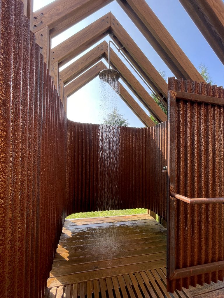
The homeowner of this Afton house envisioned an intimate and “materially rich” spot to rinse off after a day of working on the nearby farm. Mike Krop of Blu Haven Architecture took the idea and ran with it, creating an outdoor shower reminiscent of a garden arbor. 

From the timber home’s primary suite, a wood bridge leads into the heart of the structure, which is made of thermally modified slats and wrapped in a corrugated steel. Built by Against the Grain Woodworking, it sits on the home’s south side “to ensure its continued use into the swing seasons and to take advantage of visual privacy afforded by a large swale in the landscape,” Krop says.

Photo: Blu Haven Architecture
Categories
Abode Magazines

Creating your own space

Like plenty of other Wahoos, Landon Saks loved Charlottesville and stayed here for several years after graduation. Eventually, life took her to Aspen, Colorado, and her career keeps her traveling—but Saks still wanted a base in town and a gathering place for friends when she came back. So in 2021, she decided to make herself a haven here, a home away from home.

Fortunately for Saks, the stars came together. From her time in Charlottesville, she knew both builder Steve Nicholson and his wife, real estate agent Lorrie Nicholson. And when Lorrie listed a spec house that Steve had built on a small lot in Belmont, Saks says, “I bought the house sight unseen—I’d known Steve’s work for a long time, and appreciated his attention to detail.” 

Photo: Lincoln Barbour

The three-story contemporary home was the perfect fit for Saks. Its small narrow lot meant little to no exterior landscaping or maintenance for her to worry about. The basement apartment could be rented to provide income, while the house’s convenient location meant it could also be rented or made available to friends and relations coming to Charlottesville for UVA events, weddings, graduation, etc. And it meant Saks got a lovely, light-filled space in which to play. 

“It’s a contemporary design, so I wanted to bring in some warmth while keeping a clean look,” she says. “I wanted each room to feel unique.”

Photo: Lincoln Barbour

Fortunately, she also had a designer in mind. “I knew Jeannette Andamasaris—she has a great eye, and she likes to use texture,” Saks says. “I live in a very small space in Aspen—it was fun to have more space to work with.”

Andamasaris, a graduate of the Parsons School of Design, had run her own design firm, JAID Style, in Charlottesville for nine years, and in 2016, she founded architecture and interior design firm Studio Figure. When Saks got in touch, Andamasaris says she “knew [Saks] wanted a fun place to gather with her friends, I knew she loves the arts, and she wanted a bespoke feel to the interiors.” 

Photo: Lincoln Barbour

Saks and Andamasaris got to work on the areas that Saks chose to adapt—the stairs were reimagined to be more of a design element, and custom cabinetry was built out in the closet. (And, in a story that will be familiar to any homebuyer, it turned out a roof leak meant a bit of reconstruction on the third floor.)

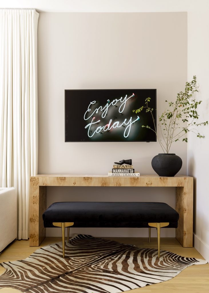
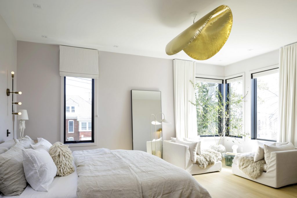
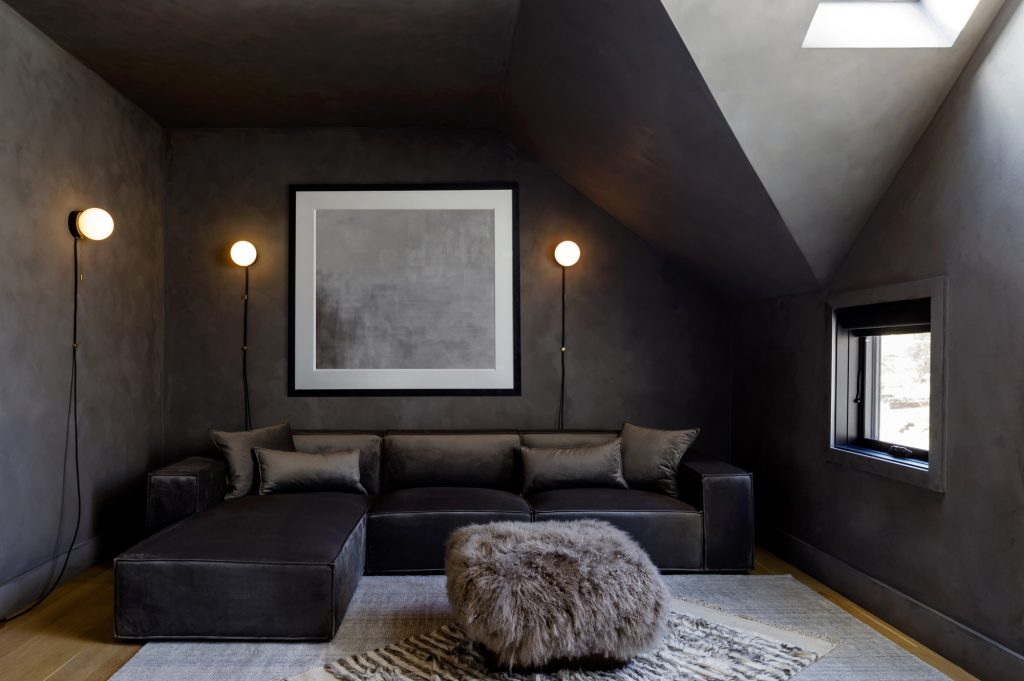
Then the interior design work began. Because Saks wanted the focal points of color in each room to come from the artwork she planned to select, the walls and furnishings lean heavily to neutrals and white—but “not too white,” says Andamasaris. There’s actually a light pink limewash up the main stairway, she points out, that becomes more saturated in Saks’ second-floor bedroom. The media room on the third floor is a deep, warm gray—walls, furnishings, carpet—which gives it a cozy den feel.

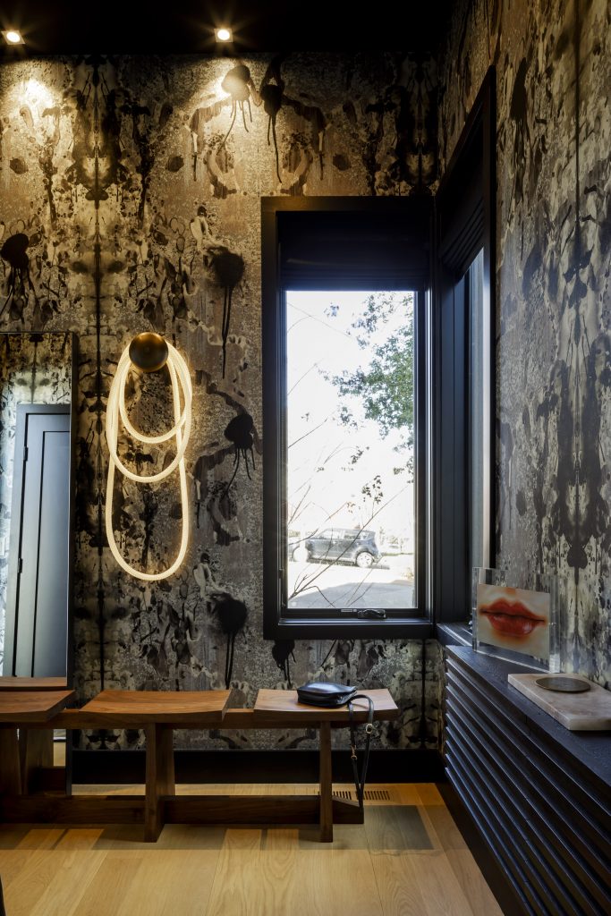
But there are also touches of whimsy. The small entry is wallpapered in blots and swirls of black, gray, and gold (a design called “Rorschach Diamond” by luxury wallpaper brand Timorous Beasties), and features a three-section walnut bench custom-made by local artisan Tate Pray, and a Luke Lamp Lighting fixture that resembles a lasso hanging on a hook. The first-floor powder room has Gucci wallpaper with life-size white herons on a pink background, and a pendant light that echoes the shape of the birds.

Photo: Lincoln Barbour

Andamasaris says all the lighting in the house was redone—“it’s a way to make the spaces more sculptural.” The track lighting up the stairwell was replaced with Bocci inset wall lights (more of a feature, and much easier to replace the bulbs). The seating area in the kitchen has a matte black metal wall fixture by Wo & We, with two arms that can provide soft, indirect lighting along the wall, or focus it down for reading recipes.

The most striking feature on the open-plan main floor, however, is another configuration of Luke Lamp Lighting ropes over the dining table. “These are amazing lights,” Andamasaris says. “They are completely customizable [in shape], they have dimmers so you can adjust the level, you can even put them under water.” In this area, the three rope lights provide a focal point that helps shape the space, and reinforce both the warmth and the creativity that Saks was seeking. (The furniture is from Maiden Home; the burl wood tables, Scout Design Studio.)

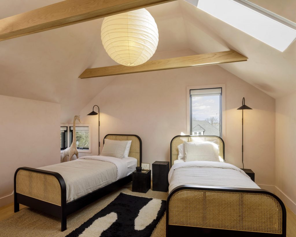
While Saks is still working on choosing and placing artwork (especially from local artists), in several rooms the light fixture serves as art. Saks’ bedroom features a floating curvilinear brass pendant by Gervasoni; the Arceneaux fixture (by RH) in a guest room is formed of cast resin to create a warm glow. Another bedroom has a three-armed Mouille pendant from France & Son—and a Flag Halyard chair from PP Mobler that looks like the Lunar Excursion Module, and is sink-into-it comfortable, says Andamasaris. The twin-bed attic bedroom (“for kids at heart,” says Andamasaris) has an original Noguchi paper lantern. 

Photo: Lincoln Barbour

“We all had the cheap version in college,” she laughs. “But when you see the real thing, created using handmade papers and ribbed with bamboo instead of wire, it’s wildly different.” 

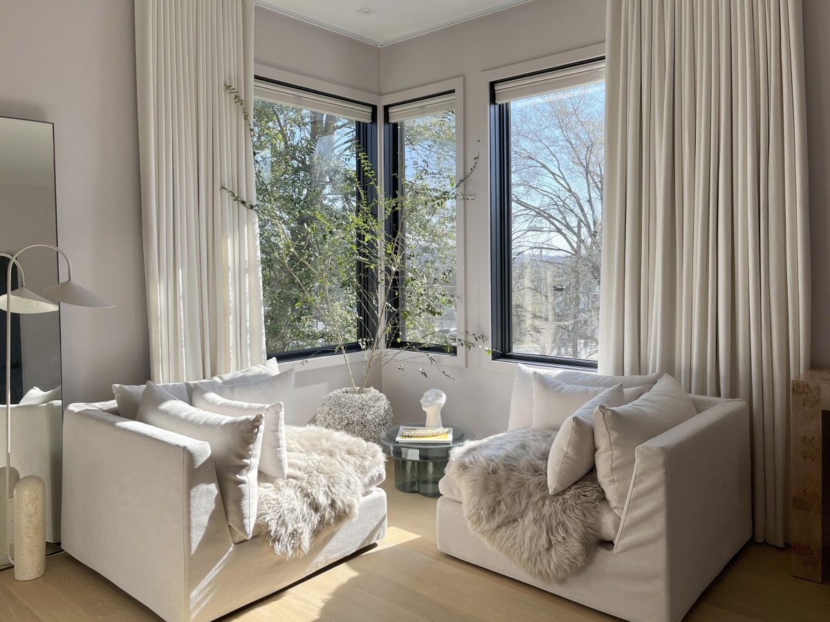
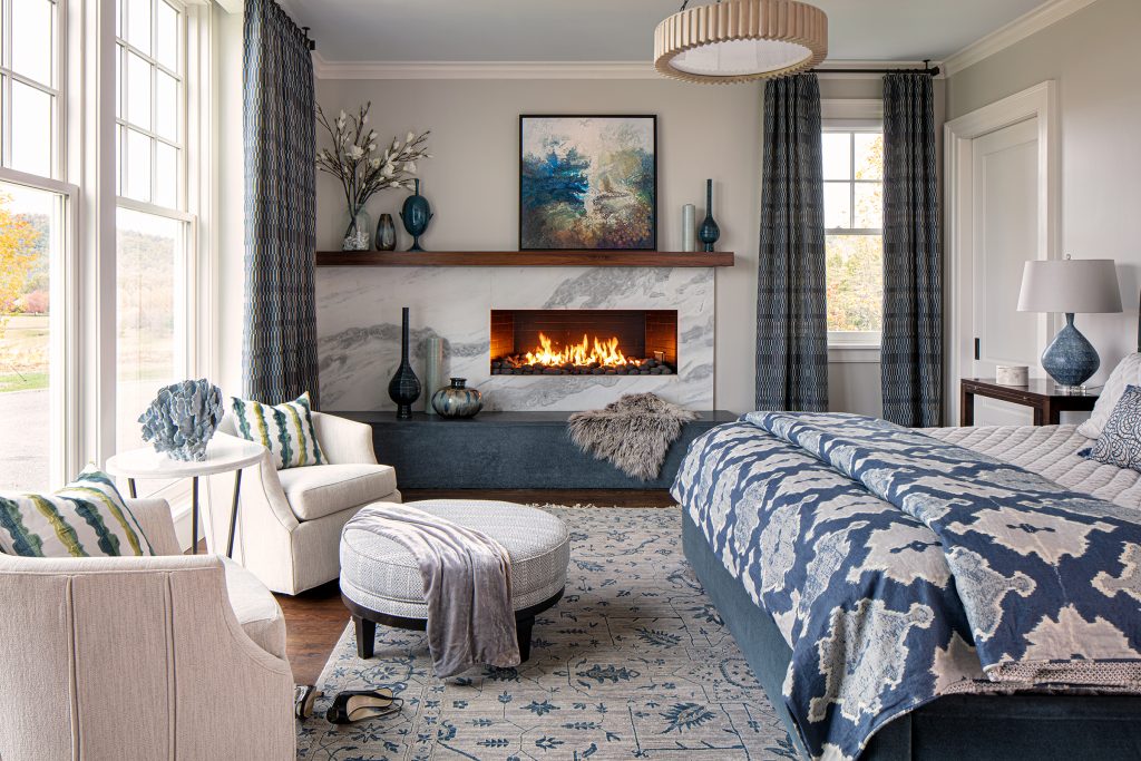
A favorite space for both Saks and her designer is the corner window in the master bedroom. Andamasaris placed two large corner chairs to create a spot for gazing out the window or relaxing before bedtime. The windows provide two walls of light and sun, and the oversize pillows, white fur throws, and flowing floor-length drapes from U-Fab soften the space. “I try to use this corner as much as I can,” says Saks. “It’s a perfect spot for a cat.”

Categories
Abode Magazines

Creating a hilltop haven

When she’s called a serious decathlete, May Kelly demurs. “I just love to be in the outdoors,” she says. “But I have to be moving—I enjoy it more.” 

“Moving” for Kelly means lap swimming, bicycling, running, and hiking. When she and husband Jim bought a Whitehall-area house on a knoll overlooking Shenandoah National Park in 2017, Jim says they knew right away the “postage stamp-sized pool” in the back yard wasn’t going to work.

Figuring out how to revamp the property to fit their needs took about a year, says Jim. A lap pool was a large part of the ask, but May also wanted to turn the existing backyard pool area into a formal garden. They decided to add a master bedroom suite on the home’s north end. And their family enjoys bocce, so there also had to be a bocce court in the mix.

Photo: Virginia Hamrick

In 2018, the Kellys hired landscape architect Anna Boeschenstein of Grounded LLC to take on their project. The first challenge: The couple wanted the lap pool to take advantage of the spectacular mountain views. “That meant a long element on a steep topography, and finding flat spaces that fit around the existing [house] layout,” Boeschenstein says. 

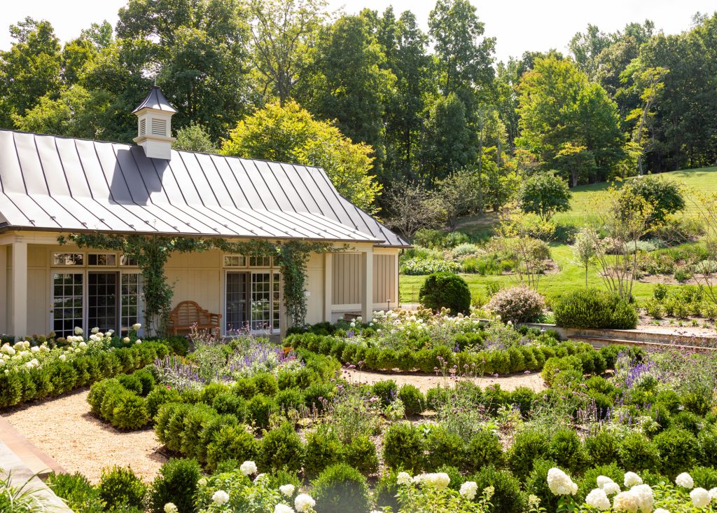
Boeschenstein and project manager John Gendreau of Abrahamse & Company solved that by building retaining walls along the western and northern hillsides, allowing them to place the lap pool along the home’s long axis and then wrap around the extended master bedroom end with a hot tub and a small patio with a fire pit. On the eastern façade, Boeschenstein converted the former sunken pool area into a parterre garden bounded by the drive, the existing guest house, and a new pergola with the bocce court behind it.

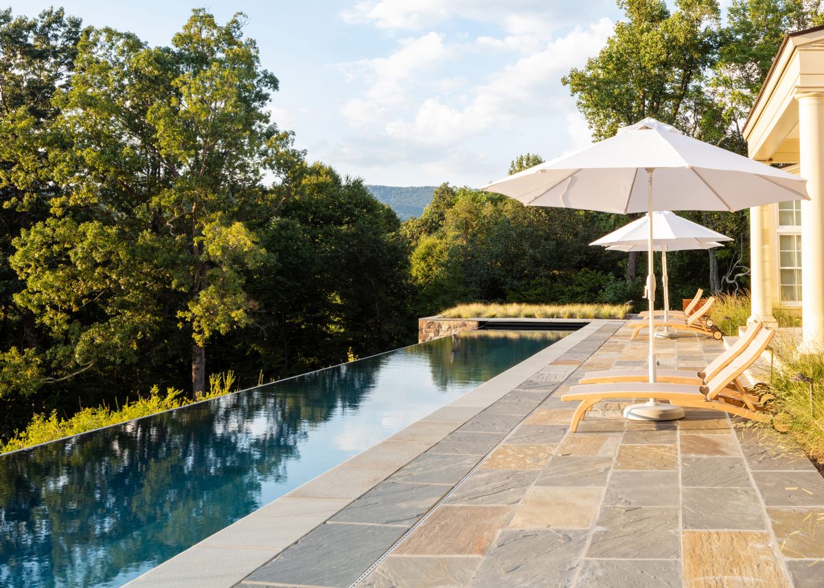
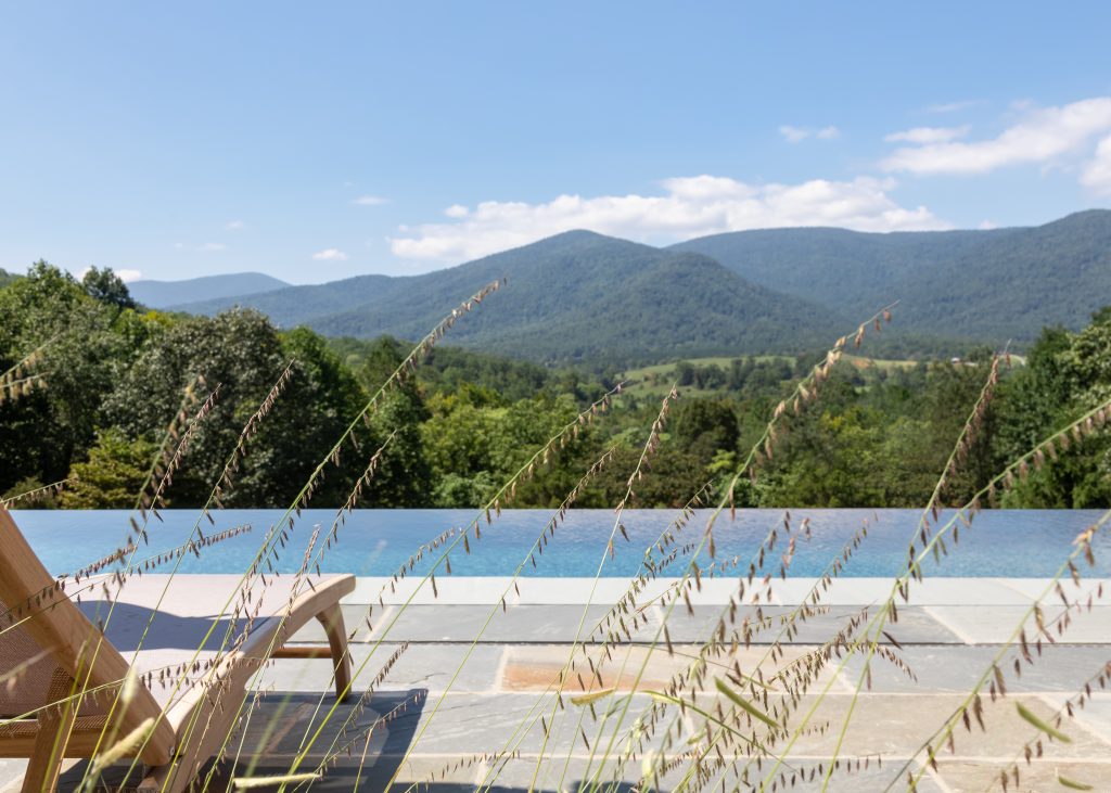
There’s no question the salt-water endless-edge lap pool is a stunning addition to the Kellys’ hilltop home. Because its narrow patio runs the length of the living, dining, and family rooms, the feature draws the eye out into the surrounding mountain vistas as the land drops away. The patio’s bluestone paving encloses three sides of the pool—at each end is a bed of native grama grass and ornamental Mexican feather grass, which is decorative, but not intrusive to the views. The pool installation was handled by Charlottesville Aquatics (the Kelly’s master bedroom addition provided a basement space to install the pool equipment out of sight).

Adding the spa area posed some challenges as well. The square hot tub and its seating area were set down a few steps, tucked into the hillside to keep clear sight lines around the pool. Boeschenstein planted green mound boxwood, a low-growing hybrid perfect for borders, around the spot. To help hold the slope below, she added more forsythia to the existing mix—“it’s fast-growing, and holds a slope well”—as well as Mount Airy dwarf fothergilla, with its showy and aromatic flower and multicolored fall foliage. 

Photo: Virginia Hamrick

The small patio on the house’s north end provides the master suite with a private outside space. Paved with the same bluestone as the pool and spa areas, the patio has a stone cube firepit that allows year-round use. 

The bluestone paving continues around to the east-facing terrace overlooking the new sunken garden. “I had seen formal gardens at the Morton Arboretum outside Chicago and loved them,” says May, who with her husband lived for years in the Chicago area. “Anna is the one that told me what I wanted was a parterre.”

Two existing large boxwoods and two coral bark Japanese maples that Boeschenstein added frame the steps leading from the terrace into the square parterre garden. Each corner has a triangular planting of little lime hydrangea enclosed by green mound boxwood. Crushed gravel paths outline four angled triangular beds bordered in Morris dwarf boxwood. The beds contain a mix of narrowleaf blue star, Japanese anemone, coneflowers, Siberian iris, dense blazing star, purple Joe Pye weed, peonies, bee balm, and mountain mint for changing color and foliage through the seasons. The central focus is a crystal sphere water fountain that the Kellys found; it adds a soothing sound, and catches light at all times of day.

Shaping the entire landscape took about a year. Fortunately for May, the pool was finished in 2019—just in time for the pandemic. Pre-COVID, while swimming at the ACAC pool, May got to know a couple of women who are national-level senior swimmers. When gyms in town were shut down, she invited them to practice in her new lap pool. 

The garden, as gardens do, is still maturing. May gives credit to head gardener Alfredo Martinez and his crew—“they work really hard”—and to Boeschenstein’s plan: “The garden looks better every year.”

Categories
Abode Magazines

Something new (with a little old)

When did Heidi Gilman Bennett know she wanted to renovate the kitchen in the 1980s Ednam house she and her husband had just bought for their move here from California? “Before we even moved in,” Bennett says with a laugh. 

The family loved the house in the woods on its hillside site, “but the kitchen was original,” Bennett says. “It had never been renovated. It was dark, outdated.” And the cooking space was enclosed by a cul-de-sac circular counter that trapped whoever was working in the kitchen. 

Bennett wanted a designer who could help her create a more modern kitchen space, “but not something out of character for this house.” She found Kendra Guiffre of blueply design: “I liked her design sense, and since she has kids, I knew she would ‘get’ us as a family.”

Guiffre, a Wahoo who has a master’s degree in architecture from the University of Texas in Austin, recalls the first thing that struck her about the Bennett kitchen: “Green was everywhere”—the walls and cabinets, as well as the walls and vaulted ceiling in the adjoining family room. The shade was an attempt to tie the indoor spaces with the forested setting, but it made the space darker. 

The biggest challenge was creating circulation that made sense. Surrounded by the living room, dining room, breakfast area, laundry/mud room, with access to the patio/garden and the basement, the kitchen had a half-dozen doors. The cul-de-sac working area took up most of the space. And the visual flow was hampered by a two-shelf cabinet hanging in the middle of the ceiling above the cooktop. 

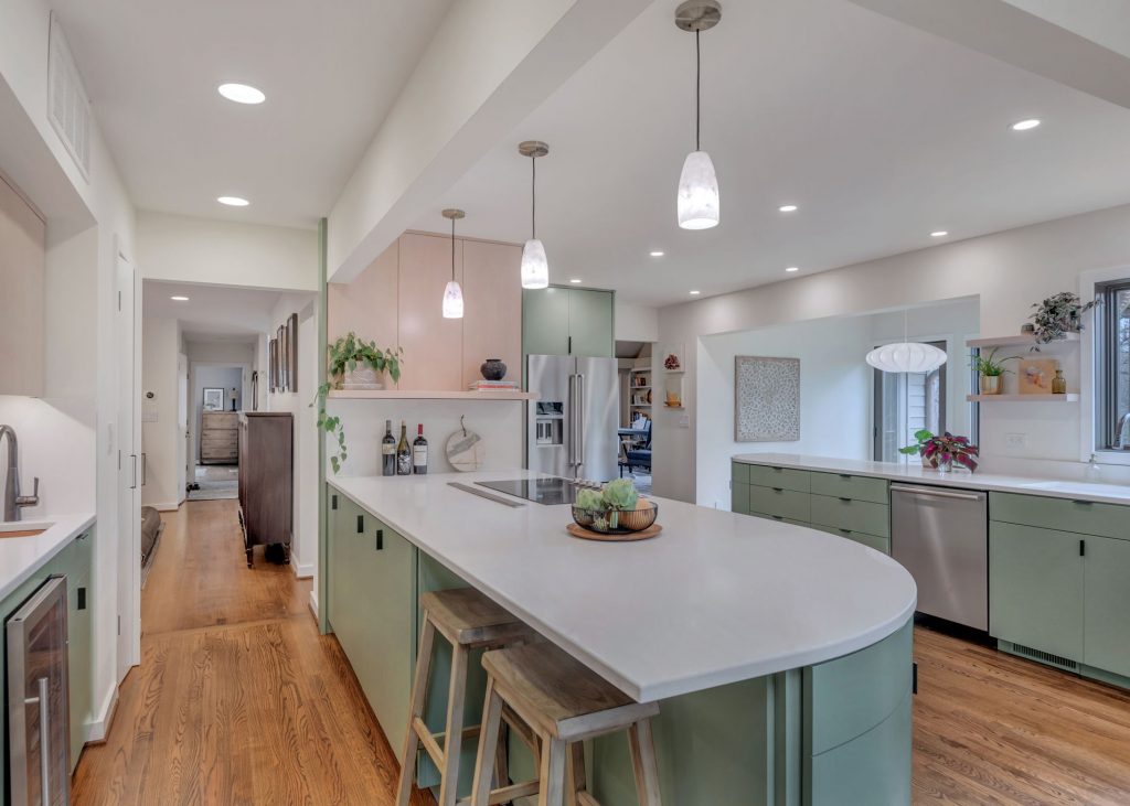
Because Bennett wanted more light and more interaction with (and access to) the garden and the patio outside, Guiffre replaced the breakfast nook’s mullioned windows with much larger single-pane Marvin windows, and moved the refrigerator so she could take down the wall between the nook and the kitchen. She added a casement to the corner window above the sink, adding an outdoor shelf for pass-through to the patio, and replaced the three-door patio entrance with a double sliding door. A large central island replaced the cul-de-sac—its under-counter storage, as well as floating shelves and two revamped pantry areas, helped minimize the need for upper cabinets on window walls. And the odd hanging shelf unit is gone. (“My husband took that to the basement to use as storage,” Bennett says).

Photo: Chris Inman

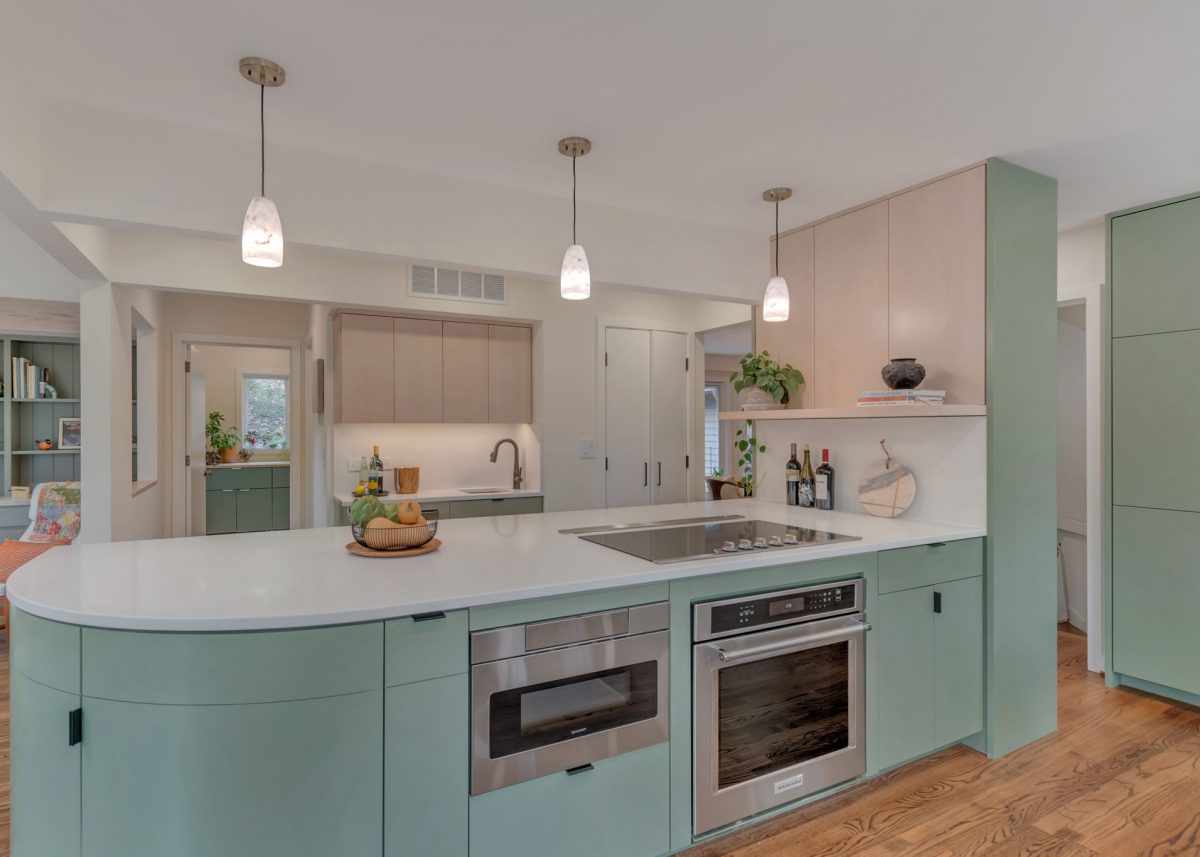
Guiffre did take some cues from the old layout. Because the living-kitchen-family room axis skews to the right, she replaced the circular cul-de-sac with curved counters that move people through the spaces without navigating around tight turns or pointed corners. (“It took a lot of geometry and working it through,” she recalls. “We had the outlines taped out on the floor” to make sure the clearances would work.) The custom cabinetry, built by Jeffrey Cherry of Creative Construction, is a marvel of clean design and organization; the curved doors open into fully usable storage space, and Bennett shows off the hands-width vertical pull-out shelving unit next to the cooktop that holds her olives oils, vinegars, and spices.

Bennett and Guiffre also decided to keep two elements of the old décor that worked with the home’s wooded setting. “We liked using green—it fit this house and this setting,” Bennett says, but they chose a warmer tone (Sherwin Williams’ Featherstone) and scaled back the area into portions of the woodwork and cabinetry. They also decided to echo the family room’s pickled pine wood curtain fascia by using pickled fir wood veneer with a clear finish on the upper cabinets, the upper panel above the island, and the floating shelves, quarter-sawn for a tighter vertical grain.

Bennett loves her new kitchen’s clean and light-filled look. The project took longer than expected, largely due to post-COVID supply delays, but she and Guiffre also wanted to take the time to get it right. They went back and forth on putting backsplash tiles on the bar counter and the island/wall junction, but decided in the end to stay simpler. They debated about veined marble for the counters as well, but ended up choosing the clean look of MSI Frost White quartz from Albemarle Stoneworks. 

Bennett appreciates how her new kitchen fits into her older home. Guiffre says she worked to reflect both the existing palette and the connection with nature in the original design, while noting that the kitchen redesign has improved the flow throughout the rest of the house as well. 

“But I’ve still got work to do on the living room,” says Bennett.

Categories
Abode Magazines

So fetch

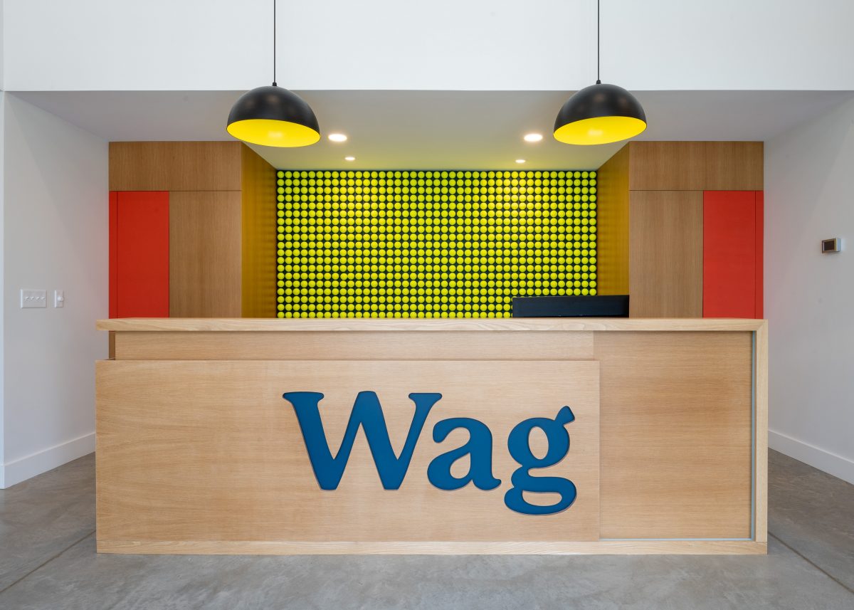
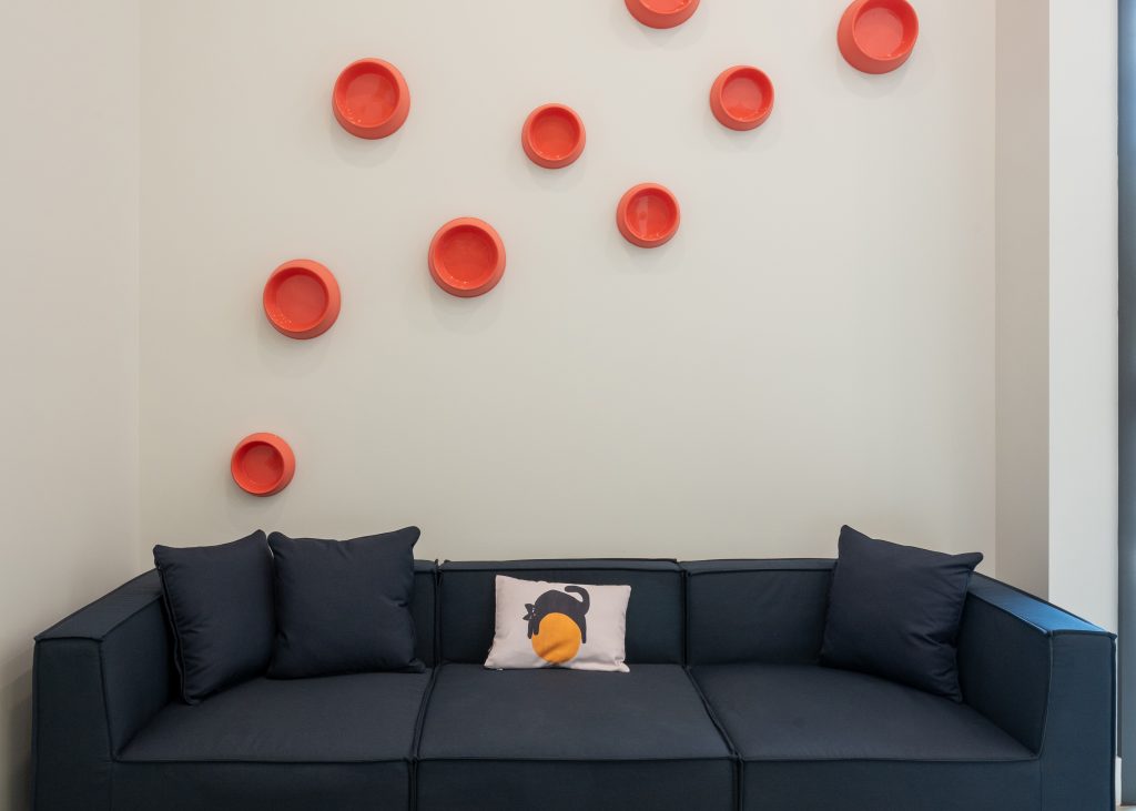
Walking into Wag, the new veterinary clinic that Jesse Bejar opened last November in the heart of Ivy, you immediately get the sense that this is not your typical vet clinic. Maybe it’s the wall of tennis balls behind the reception desk, or the clean, modern design aesthetic. The vibe is playful, fun, and anything but ordinary. 

“The idea we had was for a community-based practice, one that’s more homey, fun, and enjoyable than a normal vet experience,” says Anna Boeschenstein, a local landscape architect who’s married to Bejar. For years, Bejar dreamed of opening his own practice—he and his wife regularly talked about their vision for what would someday come to pass.

After more than 20 years working in other vet clinics, Bejar says the pandemic finally nudged him toward going out on his own. “During COVID, trying to balance the demands of work with caring for 6-year-old twins—that’s when I realized that I needed a lot more flexibility,” he said. 

When an ideal property was developed in Ivy, Bejar and Boeschenstein started to get serious about the concept for the new space. “Anna took the lead on researching the design,” Bejar says, and she eventually made an important design contribution: the impossible-to-miss tennis ball wall, which greets everyone who walks in the front door. 

Photo: Stephen Barling

With a tight budget and specific limitations on how much he could augment the interior of the shell Wag would eventually inhabit, Bejar turned to Alisha and Mike Savage, with STOA Design+Construction and Savage Clark Architect, for the design/build work. “STOA didn’t have prior experience with this kind of project—they mostly do residential design/build—but Alisha was good at diving into the project and learning about the flow of the vet clinic,” Bejar says, noting that they really homed in on how create a “good flow” for the animals as they enter the building, get into the exam rooms, and then back to the treatment rooms. 

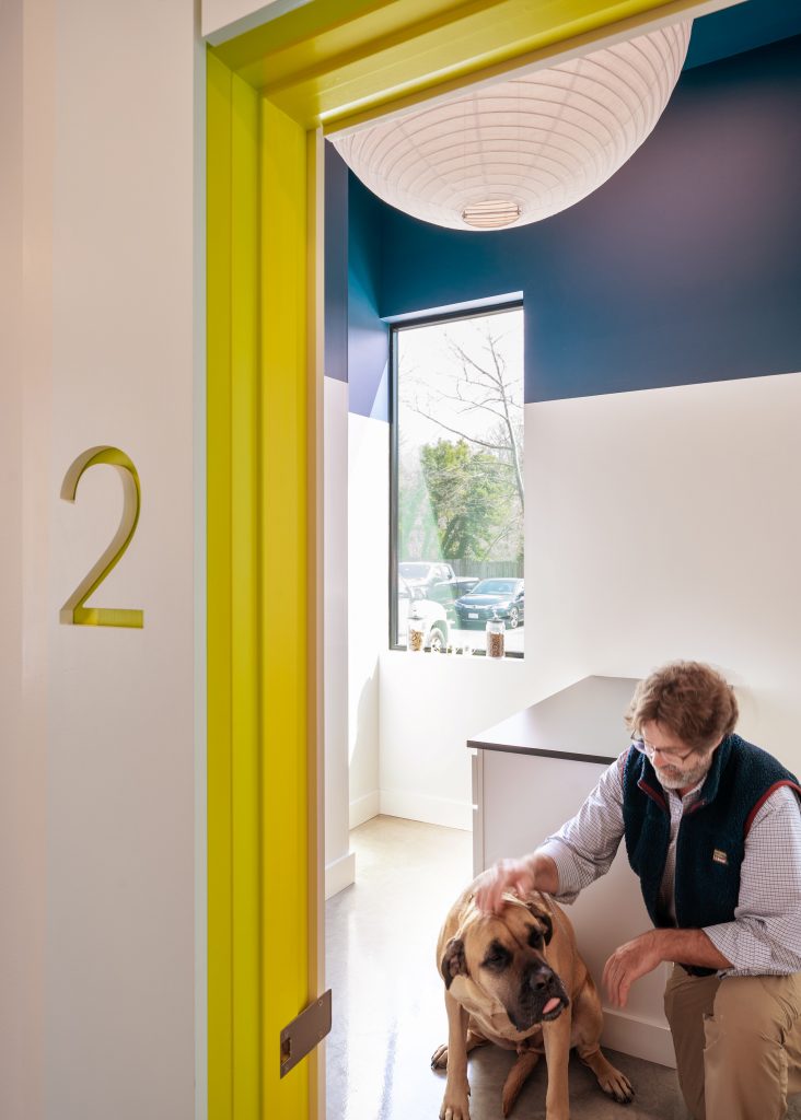
Bejar describes the clinic as something of a reverse mullet—party in the front and business in the back. The “front of house” (comprising the entryway, reception area, and exam rooms) is fun and open, with playful design elements, colorful exam entryways, and big windows to let light in. The back of house, where surgical procedures and treatments take place, is more cut-and-dried, Bejar says. 

Animal care clinics come with a laundry list of design and building considerations—managing all the fur and dander, keeping sick pets quarantined without contaminating the rest of the building, keeping sound transmission to a minimum—just to name a few. Alisha says they enjoyed the “dual challenge” of keeping the design fun and uplifting while addressing and thoughtfully designing to meet those specific technical requirements. 

Alisha says she and Mike tried to be nimble with the design and technical expectations, while staying sensitive to the overall budget. “We’d use off-the-shelf cabinetry and then engage our in-house woodworking expert to create special elements,” she says. “This was more cost-effective than subcontracting the special elements out to a custom cabinetry shop.” She notes that strategic use of color can be a suitable supplement for an investment in costly materials—e.g. the tennis-ball-colored exam entryway details.

Ultimately, says Bejar, “We wanted the clinic to be clean and unique, not like every other medical clinic you visit. We wanted it to have a sense of being playful and enjoyable.”

Photo: Stephen Barling

Balls on the walls

Fido’s in for some fun when he arrives in the lobby at Wag, which features a massive installation of hundreds of perfectly aligned tennis balls. Veterinarian Jesse Bejar’s wife, Anna Boeschenstein, a local landscape architect, was inspired by British artist David Shrigley’s “Mayfair Tennis Ball Exchange,” an interative art installation in which hundreds of tennis balls line shelves of the exhibiting gallery. The exhibit evolves as visitors are invited to swap the new balls in the exhibit with old, dirty, used ones. “I got really excited about the potential to use inexpensive materials in cool ways,” Boeschenstein says of her inspiration for the wall. 

Wag’s tennis ball installation isn’t interactive, but it is playful and on-brand with rest of the clinic. Design elements throughout Wag tie in with the wall’s electric yellow hue—the exam room entryways are trimmed with the same color. STOA architect/general contractor Mike Savage used a computerized millwork machine to space, align, and drill holes for each ball. With access to that same tool, he says, a similar installation could be created for a child’s room with basketballs or soccer balls.

Categories
Abode Magazines

To each their art

Katharine Brooks developed her craft at some of the biggest art houses in New York City. Then, after the fine-art expert and her husband moved to Charlottesville 11 years ago, she took time off to raise a family. Now, she’s back with a new solo venture: KNB Art Advisory.

C-VILLE Abode: What made you start your own firm?

Katharine Brooks: I’m originally from Guatemala, and I was a Latin American art specialist at Christie’s. That’s where I was truly introduced to the art world. You’re exposed to so much incredible art and so many collectibles. I was meeting collectors and going into their homes, appraising art and helping them build their collections. I had always thought of art as something you see in a gallery. Seeing the way people live with art and how it added to their life lit a fire inside of me.

What do you tell your clients about buying art?

Regardless of your budget, there should be meaning around you. Life is short; instead of buying a poster, you should surround yourself with artwork that means something to you personally. Some people think that art is just for millionaires. But there are many local artists that are doing fascinating things that are affordable. As a collector myself, sometimes I am investing in artists, but sometimes I just buy pieces because I love them. I think there is this mysterious fear in the art world. But if I can help people find artists they love, I know it can add a great amount of joy to their life. It’s a passion project. I get excited when I find something that has meaning for someone else.

Is art a good investment?

I think it is challenging. There are always options by well-established artists that have a record of auction prices. What can be tricky but incredibly lucrative is finding new artists. The problem is new artists come out and sell at auction and then plummet in value. If you are coming to art purely from a financial point of view, you need to see the full auction record, but you also have to be aware that auction houses will estimate works at a lower value than a gallery will sell them. And, flipping art is not really favorably looked upon.

The transition from New York to Charlottesville must have been difficult.

It was really hard to give up my career and life, but we wanted to raise a family—the classic conundrum. I was at the epicenter of my career. I was doing appraisals in Jack Nicholson’s home and selling art to Oprah. I’m not trying to say I’m anything special, but I had this passion. By the time we launched around May of last year, I had already started helping friends and acquaintances with their personal art collections.

What makes KNB Art Advisory unique?

I am trying to be more personalized. I don’t want to be married to one artist. As much as I learned from the gallery setting, I didn’t love having inventory that I felt like I had to sell. I want to find the right thing for the right person. There are more artists now who are not marrying themselves to one gallery or rep, as well.

What do you say to clients who are unsure of their own taste?

I think that is the most challenging thing. It is so personal. I have one client who only likes to collect works that were painted in the year they were born. I have another client that has a thing about red hats. She wore one as a little girl, and it became this iconic thing. If I ever see anything with a red hat, I shoot it over to her. For my own taste, I love abstract works. And I think sometimes landscapes are easier to live with in your home. But I also think the beauty of art is that there is no wrong. Anything can be art. What is the first thing everyone asks you when you are a child? “What’s your favorite color?” And that’s a good place to start. Everyone has that innate feel for what they like. No one needs to answer to why they like something.

What’s the best way to start your art collection?

I would say staying local. That is the most comfortable way. You can meet the artist, and most artists are willing to do studio visits. You can see their process, the materials they use, and examples of their work. It gives you a personal connection.

Categories
Abode Magazines

Laying the foundation

Morgan Bailey was tired of replacing the rugs she’d bought at big box stores every nine months (“thanks to my toddler and golden retriever!” she says), so when she moved into a new home in 2020, she took the opportunity to search for something durable, high quality, and family-friendly. 

“I was searching for bright and colorful rugs but couldn’t find the right fit,” Bailey says. “After trying out various suppliers and facing some trial and error, I eventually found a few beautiful pieces.” So beautiful, in fact, that when her family and friends saw her new rug, they wanted one, too. And that’s when it came to Bailey: There might be a market for these in Charlottesville. 

KES Collections (short for Keswick, where her business is located) launched in April of 2020. Bailey sources the rugs—which range in size from 2’x3′ to 18’x22’—from artisans in India or Turkey, always on the lookout for new ideas and designs. 

“You can count on us to introduce two to four fresh styles every month or put a new spin on your favorite existing design in a new colorway,” she says. 

Bailey prides herself on the custom touches she offers, like being able to order rugs down to the inch for a client’s own specifications. She hand-selects threads from more than 1,400 hues, many of them matching directly to a Benjamin Moore paint color. Customers can choose from a selection of in-stock rugs at one of four local retailers—Brigid and Bess and Flooring Fashions, as well as Gramercy Collective and Gild and Ash in Richmond—but Bailey likes it best when she gets to put her own personal stamp on a project. To that end, KES Collections offers 2’x2′ samples of most designs, as well as in-house design consultations. 

“I love being able to meet and get to know my clients while creating a beautiful heirloom piece that will last a lifetime,” she says. “Let’s not just decorate your space—let’s craft a story.”

Categories
Abode Magazines

Green living

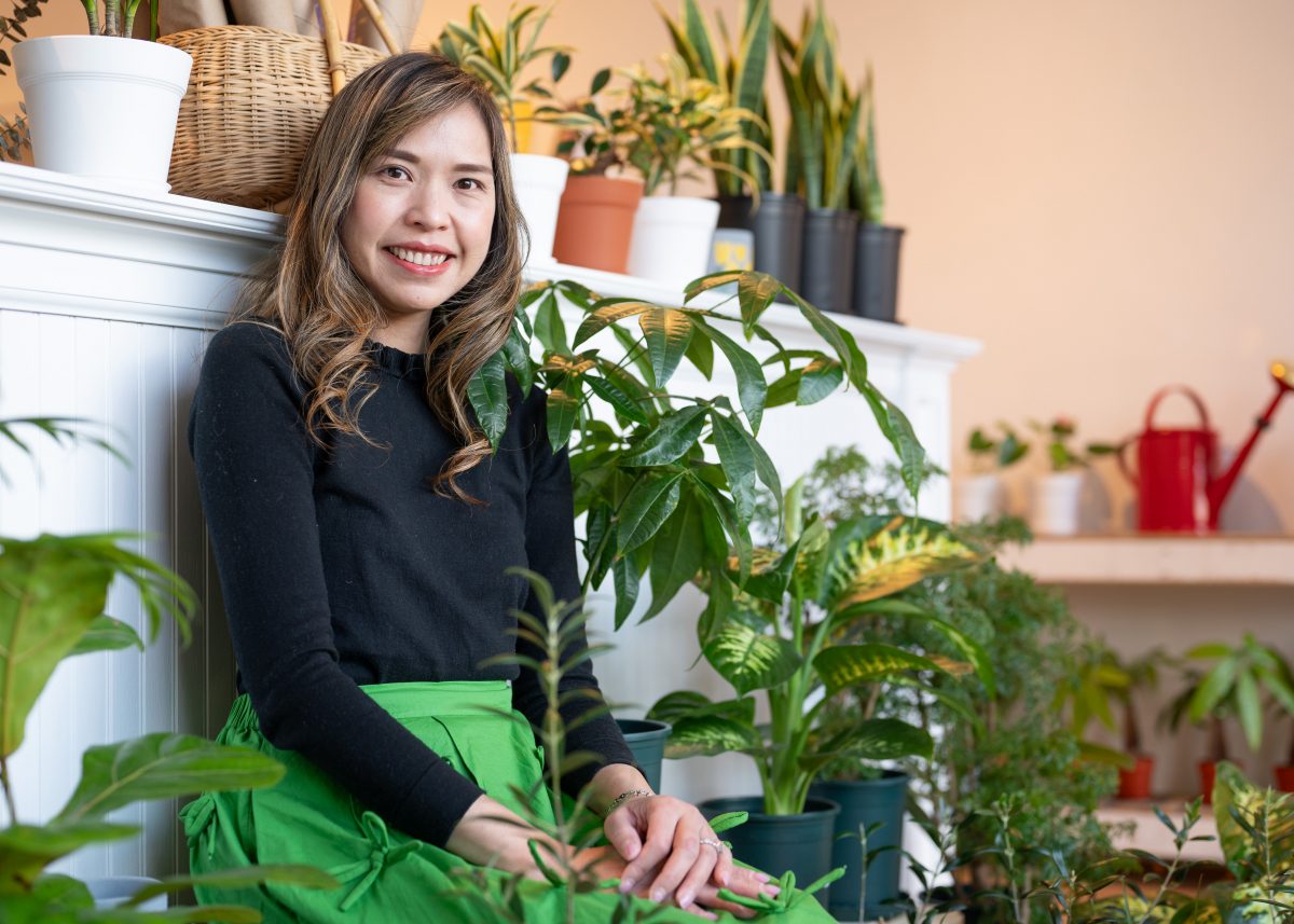
Pitsuda LaRussa believes that every journey begins with one small step—at least when it comes to living a more sustainable lifestyle. The Botanique & Co. owner started her own journey shortly after giving birth to her daughter. She began with a little switch, from conventional to organic food, then worked her way from plastic shopping bags to fabric, disposable diapers to cloth, and paper towels to reusable.

“I always inspire people to start one thing for each month or each week,” she says. “A little bit of daily routine change or switching things will become part of your life for the long term.” 

Eventually, she began to wonder if there was a bigger contribution she could make. The Botanique & Co. opened in November of 2023, stocking indoor plants and offering a refillery service. From there, she brought in eco-conscious products for the kitchen and bathroom, as well as vegan cosmetics and organic skincare. 

Her daughter’s favorite section in the store is the eco-friendly toys, and she says customers have responded best to the plants and the reusable cotton makeup removers. LaRussa, though, is partial to the self-care and beauty products.

No matter where in the store customers find inspiration, LaRussa hopes it makes a lasting impact.

“My goal is to help inspire you to do some little switch,” she says. “Every item could be a great gift for yourself to start a journey of sustainable living or even a zero-waste gift for friends and family to start their sustainable practice journey.”

Categories
Abode Magazines

Rooms with a view

Architect Rosney Co. Architects  Builder Greer and Associates Interior design Jennifer Stoner Interiors  Landscape architect Waterstreet Studio

As soon as I came up here and saw the view, I called my wife and said, ‘I’ve found the place,’” recalls Hugh Shytle. “I felt like I was on top of the world.” 

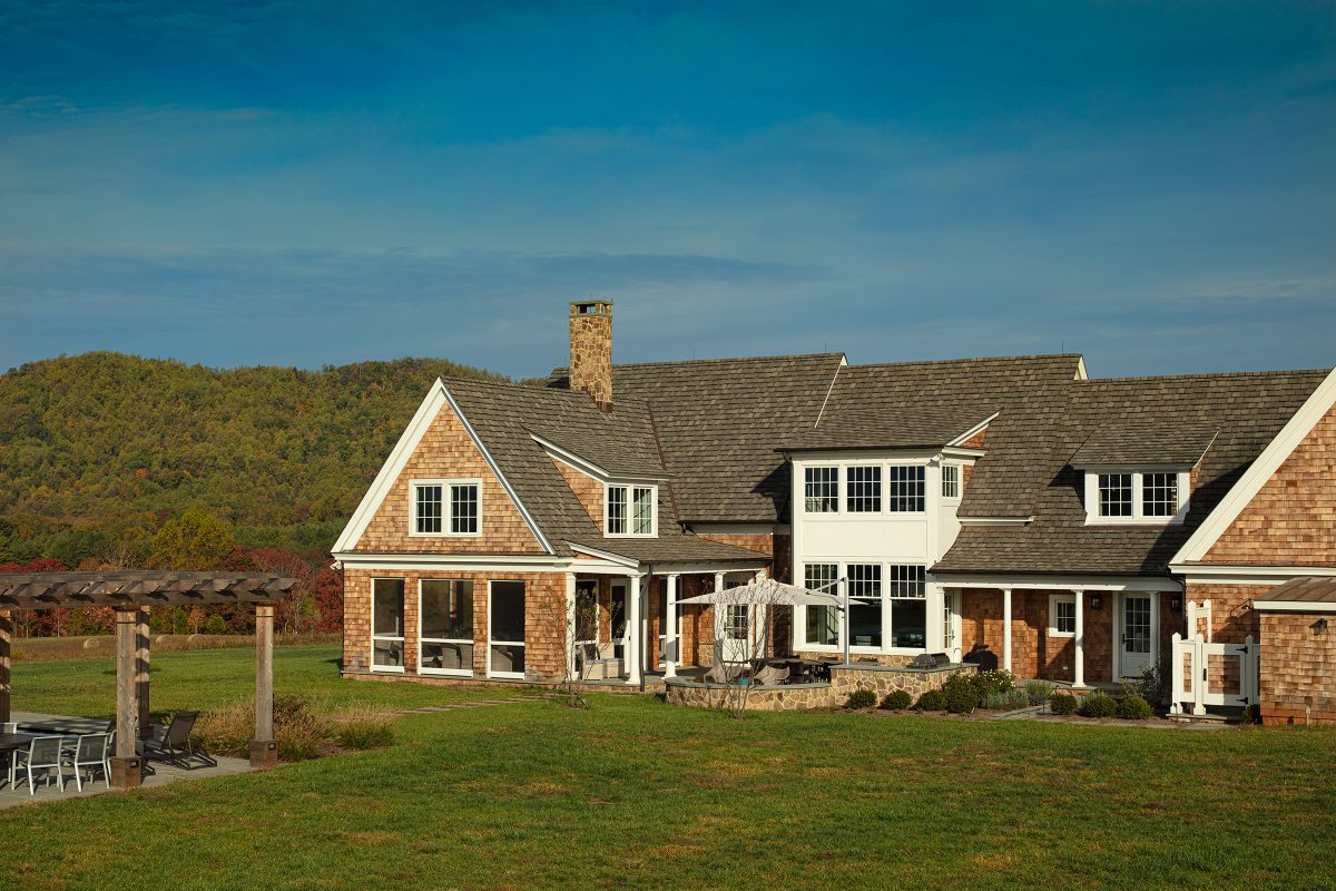
Shytle and his wife Doreen had lived in New England and raised their children there, but when it came time to build their forever home, Hugh was drawn to central Virginia. As a remote-working partner in a Richmond-based real estate development firm, Hugh was familiar with the area, and the couple homed in on southern Albemarle County close to Charlottesville. When a colleague of Hugh’s called about a lot in Blandemar, he came to check out the site, took in the 360-degree view from the hilltop over rolling hills and the Ragged Mountains, and was hooked. 

Photo: Gordon Gregory Photography

Hugh had already been networking with colleagues in the Charlottesville area for a design team. By the time the Shytles had closed on the site, they had an architect (Rosney Co.); a builder (Greer and Associates); a landscape architect (Waterstreet Studio); and an interior designer (Jennifer Stoner Interiors) lined up. “We had never built a home before,” Doreen says, “so it helped that we had a great team.” 

Having the full team involved from the start “is really our preferred approach,” says Rosney Co. architect Keith Scott. And the site was a plus—not only for its “outstanding” views, but because working on the flat hilltop made construction easier (“steep sites are a budget killer,” he says). Scott says Hugh’s experience in the real estate business helped prepared the Shytles for the hundreds of decisions they had to make—and the many blips that can cause delays or changes in plans. 

Photo: Gordon Gregory Photography

The couple had also given lots of thought to their forever home. Hugh, in fact, had a 10-page document listing everything the pair wanted. Top of the list: “maximizing the view with lots of windows.” Other have-to-haves: two home offices at opposite ends of the house (“Doreen doesn’t want to hear me on conference calls,” Hugh laughs); an owner’s bedroom suite on the first floor; lots of fireplaces; and a large screened porch. Doreen wanted a shingle-style house and a large open kitchen with a pantry; Hugh wanted geothermal heating, an outdoor kitchen by the pool area, and a barn. And, of course, room for their two children and family to visit. 

Photo: Gordon Gregory Photography

As the design progressed and “forever” choices had to be made, the original plan for 5,000 square feet ended up at almost 7,000. The Shytles hadn’t originally asked for a full basement, for example, but “we were glad to have that [workout room] when COVID hit,” Doreen recalls. (The couple came to Charlottesville in June 2017 to oversee construction, and moved into their new house in January 2019.)

Photo: Gordon Gregory Photography

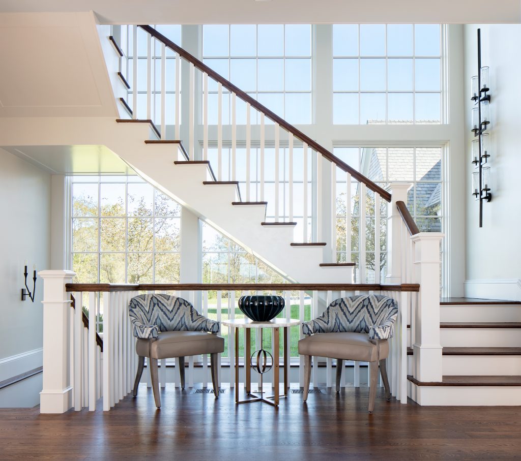
The finished home feels comfortable and human-scale, both spacious and well-organized, and the stunning views are everywhere. The main entry’s back wall is the staircase silhouetted against a two-story window. The wing to the left is the owners’ suite: a calm and private bedroom with fireplace and large windows west and south; a couple’s bathroom with separate vanities and a makeup table, heated floors, a walk-in shower, and a free-standing tub; his-and-hers dressing rooms with loads of cabinets and clothing spaces (including shelves for Hugh’s hats); a laundry room with built-in storage drawers, drying racks, and even a step on which to place the laundry basket.

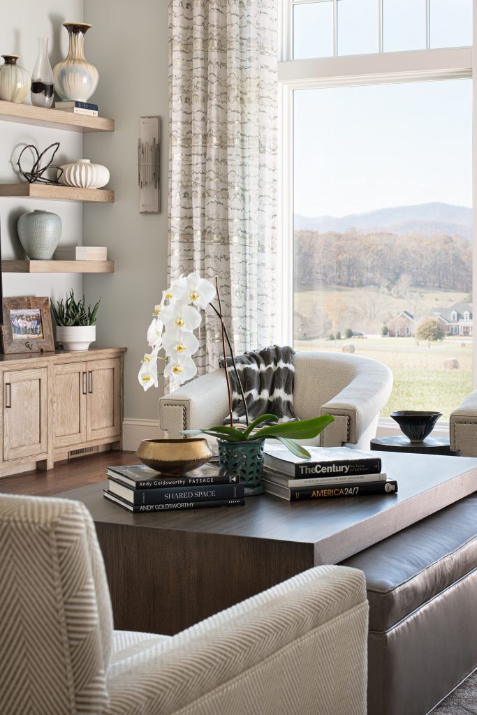
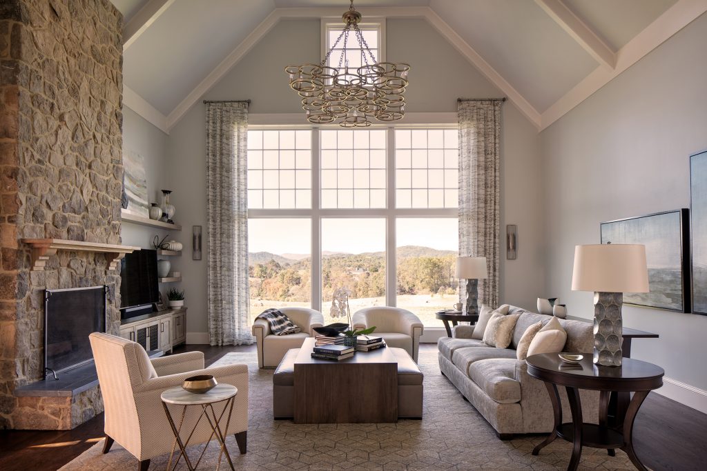
To the right of the entry, past the formal dining room, is the high-ceilinged great room featuring a fieldstone fireplace and a two-story southwest-facing window. The comfortable furnishings are warm neutrals, with accents of wood, and nature-themed contemporary artwork. “Our house in New England was a colonial, with dark wood furniture,” Doreen says. “We decided to get rid of almost all of it.” (They did keep several lovely bedsteads and dressers for the upstairs guest rooms.)

Photo: Gordon Gregory Photography

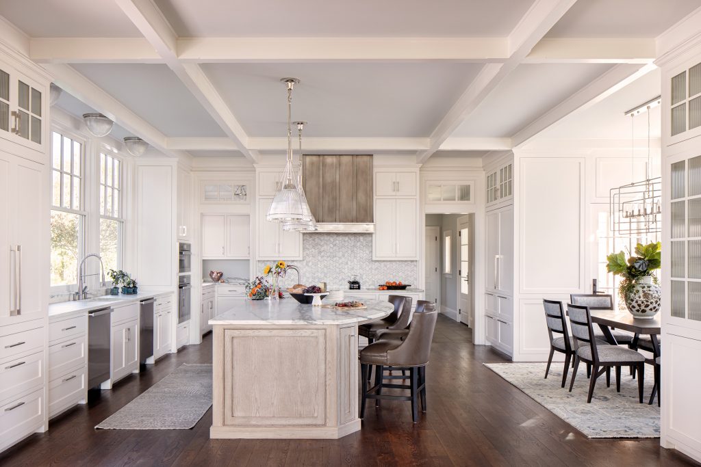
Off the great room is the large open-plan kitchen with its own dining area and spacious windows running along both sides. This is Doreen’s domain: “I wanted a large but well-organized space, white but not sterile.” So the expanse of white cabinets is lightened up by opaque patterned-glass inserts, the counters are gray-streaked honed Montclair Darby marble, and the cabinet under the island is a neutral lined oak. One side of the island’s large counter is a half oval that gives people gathering on the bar stools more room. The handmade range hood of burnished nickel from Thompson Traders is set off by the chevron-patterned tiles in shades of gray on the backsplash. Tucked away off the kitchen are additional working spaces—a pantry/appliance room, and a butler’s pantry/staging area across from the dining room. And, as with any country home, there’s a good-sized mud room full of coat hooks and cubbies.

The Shytles got their other must-haves as well. Hugh’s and Doreen’s offices are on opposite ends of the second floor—with a guest bedroom suite, two bedrooms and a full bath, and a game room in between. The large screened porch, with its shingled columns, fieldstone fireplace, and large-screen television, functions as an all-season outdoor gathering space. Beyond the pool area (designed by Waterstreet and built by Pool Designs by Schultz in Lexington) is a two-acre wildflower garden with beehives from which the family harvests its own honey. And yes, Hugh got his barn.

“We had our list of what we wanted, and the team brought it to life,” says Hugh. “People ask what we would have done differently, and it’s really very little.”


Photo: Gordon Gregory Photography

Incorporating contemporary into classic

To prepare for decorating her new home, Doreen Shytle “spent hours on Pinterest,” she recalls. “I wanted a feeling of calm, light, airy.” Her research online led her to interior designer Jennifer Stoner.

“Doreen knew she wanted a Hamptons shingle-style house, but [for the interior] we started from scratch,” says Stoner. “I took them down to [the showrooms in] High Point, North Carolina, and she started gravitating toward more contemporary styles.”

Stoner keyed the design to the home’s stunning views: “I tried to bring in the greens and blues from nature, and focused on a warmer palette.” Choices like veined marble, textured glass, and patterned tiles in the kitchen, butler’s pantry, laundry room, and baths added warmth and texture (Cogswell Stone supplied all the stone in the home, and the patterned tiles came from Sarisand Tiles). In smaller spaces, like the butler’s pantry, the mudroom, and the powder room, Stoner and Doreen used tans and warm dark blues for the walls and cabinets.

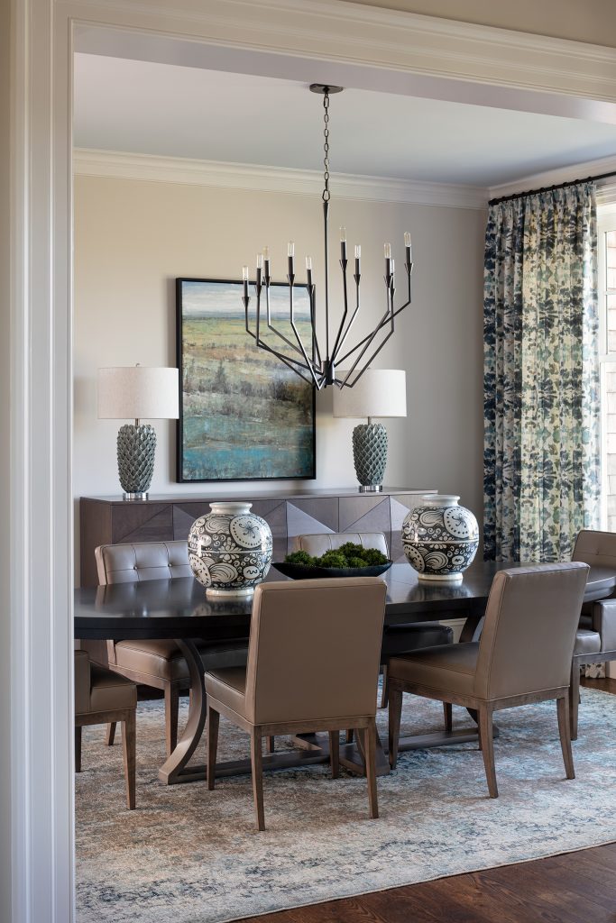
Choosing light fixtures “was one of my favorite parts of the process,” says Stoner. Centered in the great room’s vaulted ceiling is a hanging fixture of interlocking gold-toned circles from Currey & Co. The dining room chandelier is a modern metal take on a classic candelabra, with matching wall scones in the adjoining entry. The stairway features large vertical wall scones and an unusual straight-line hanging fixture from Visual Comfort. Doreen admits she was hesitant at first, but has grown to love how they fit the space.—CD