“One of the best things about collaborating with another artist is I learn a great deal about the other person’s sensibility to materials, aesthetics, and mark making,” says artist Diego Sanchez. His work is currently on view at the Quirk Gallery, together with fellow Richmonder Mary Scurlock.
In “Conversations,” each artist has eight paintings on display, which give the viewer enough information to understand and appreciate the artists’ individual approach and style, while providing a key, of sorts, to the intricate dance of give and take apparent in the 10 joint pieces. The artists worked in layers, on top of one another’s contribution, exchanging paintings back and forth three to four times, keeping a tally in pencil on the back of each work.
Looking at the individual pieces, you might not put the two artists together. Sanchez favors bold color and geometric shapes, while Scurlock prefers a more streamlined palette and blurred edges. But spending time with their paintings, you begin to see that both artists employ a similarly diverse selection of media, and devote the same attention to developing their surfaces with layers of paint, wax, and paper.
Sanchez’s paintings are hung in the front part of the gallery, where the Quirk’s soaring space can easily accommodate their exuberance. Scurlock’s are in the back, where the ceilings are lower in a quiet, more meditative area that suits these contemplative pieces.
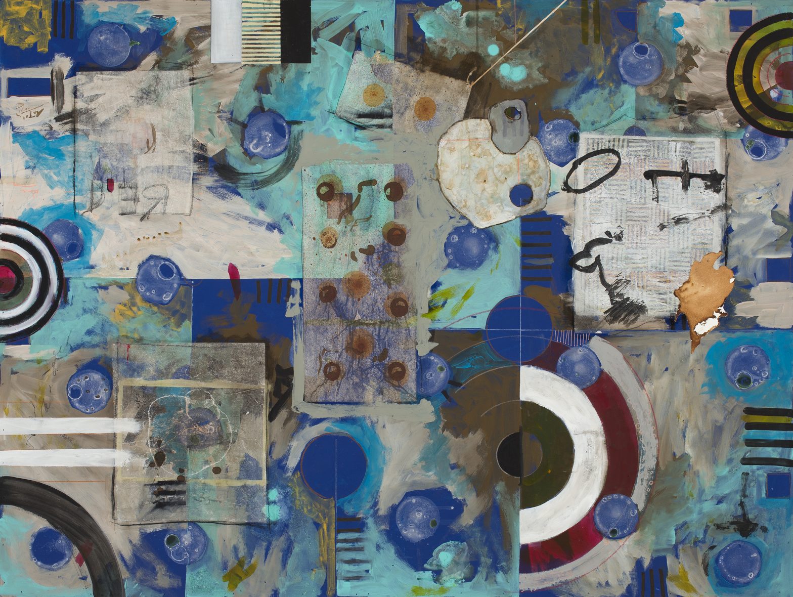
One marvels at all that’s going on in terms of color, composition, and medium in a work like Sanchez’s “Composition #151.” The easy allure of turquoise and cobalt is tempered and elevated into something much more sophisticated by passages of dun and gray. The rectilinearity of the overlapping planes is subsumed in places by broad brushstrokes. Perfect orbs of blue dance across the surface, encountering more amorphous circular shapes. Partially obscured targets are “visual representations of ‘centering,’ of being mindful and present in our busy lives,” says Sanchez. They also summon Jasper Johns, an artist Sanchez admires, as does the mini crosshatch rectangle. Sanchez makes this his own by seasoning it with calligraphic scrawls of black and an odd tawny blob. Near the center, a lavender pastel rectangle dotted with burnt-orange dots more than holds its own against the more saturated passages.
“Composition #141” has a completely different effect. Here, it appears Sanchez has scraped off the background paint, leaving behind an expanse of fractured lines reminiscent of ceramic crazing. Whether it’s the light hue, or the network of lines that turn this flat expanse into a topographical map, the background appears quite distant with the strange shapes rendered in aqua, gold, and burnt sienna, floating above.
You might think it would be hard to compete with all the bright color and bold marks at the front of the room, but Scurlock’s paintings have a slow-burn heft and a presence that really gets under your skin. She relies heavily on the use of rubbings in her work. Instead of headstones, she goes after things like manhole covers, signs, and inscriptions, or even natural items. It all depends on her surroundings and what she wants to capture and convey about it, because, as she explains, “The intention of these paintings is to create a feeling—a space that mimics a place.”
Back in the studio, she begins by adhering old paper—letters or clippings she’s saved—onto her panels. She then applies color, followed by the rubbings. These are done on delicate rice paper and are transparent, so when they are embedded in the surface they’re still legible. “The way I work, you put one thing down and something else changes, then you have to change that area so it works with the other area,” says Scurlock. “So, it’s hard to save things. But even though you can’t see them, they’re there. The idea is still there.”
In “Ydra,” your eye is drawn to the graphically bold Greek lettering, especially the delta and zeta at center right that stand out against the vaporous clouds of pigment. There is the suggestion of houses on a hillside, evoking a Greek village. But it’s fragmentary, obscured here and there by blotches and daubs of shimmering paint. Similarly, incised lines and scratches form words or shapes, but they’re disjointed and incomplete. Just as memory does not present a perfect image, Scurlock intentionally renders this Saronic island in indistinct form.
With “Hatteras Village,” Scurlock introduces faded pink and dull green into the mix. Here, the composition is flatter, reflecting the topography of the subject. Again, we see bits and pieces, the eaves of a house possibly in the upper left, writing at the right center, and various circular shapes and squiggles scrawled across the surface.
Within the collaborative pieces, you recognize the distinctive traits of each artist. There’s the color and geometric forms favored by Sanchez, but they’ve been softened, their tones and edges blurred by Scurlock’s hand. In doing so, she disturbs the integrity of those shapes and hues, shifting the timbre of the work to something more tenuous and uncertain.
Many artists would balk at the idea of letting go of a piece they’ve labored over and offering it unconditionally to another to augment as they wish. But the exercise can be remarkably rewarding, introducing new techniques and approaches, and producing exciting collaborative work.