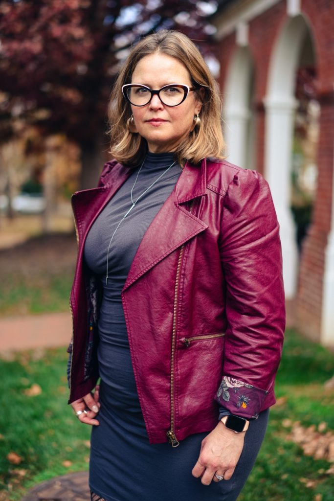
Uzo Njoku’s show “Virginia is for Artists” is at the Connaughton Gallery through June 14.
More information at commerce.virginia.edu/art. Supplied photo.
The John P. and Stephanie F. Connaughton Gallery at the McIntire School of Commerce might not be on every Charlottesville art lover’s radar, but it should be. The gallery typically presents three shows each year with two artists per show who are invited to apply by McIntire Art Committee members. In most cases, McIntire purchases work from the exhibiting artist to add to the school’s permanent collection, now numbering over 80 pieces and hung in public spaces throughout the Rouss & Robertson Halls complex.
Currently at Connaughton is the work of Uzo Njoku. A 2019 UVA graduate, Njoku was born in Lagos, Nigeria, and moved to the United States when she was 7. At UVA, Njoku started out as a statistics major but switched to studio art after her first year.
She is now a one-woman art-producing and marketing powerhouse based in New York City. “Uzo’s journey from statistics major to a self-styled ‘artpreneur’ holds such appeal and also valuable lessons for students in both the arts and in commerce,” says Dorothy C. Kelly, McIntire’s Robert B. Hardaway, Jr. Lecturer of Personal Finance, who sits on the art committee and is an admirer of Njoku’s oeuvre as well as her entrepreneurial skills.
You only have to look at Njoku’s sleek website to see the breadth of her activities; beyond painting, there are events and a prodigious array of Njoku merch—coloring books, calendars, mugs, T-shirts, and outerwear—plus her own wallpaper designs and a mural commission for Tommy Hilfiger. Not bad for a recent college graduate.
Njoku’s vibrant, large format works feature broad, flat planes of paint. For the most part, she takes a stylized approach and uses a bold palette of bright colors together with black to create a compelling graphic quality.
In many of her pieces, Njoku incorporates patterns, as their detail contrasts nicely with the more simplified passages. Pattern is very important to Njoku, who uses it to incorporate Nigerian culture into her work. She uses it in a similar fashion to Kehinde Wiley, as backdrops to portraits, but she favors traditional wax cloth patterns, such as in “A New Perspective,” or distilled versions inspired by them in “A Very Nice Girl,” as opposed to Wiley’s lush floral expanses.
For Njoku, these designs extend beyond visual flourish or cultural reference to imbue the pieces with movement. “The Weight of Ink” is a self-portrait of the artist, identified by the “U” tab on the end of her turtleneck zipper. She’s positioned against an intense teal background and wears a hot pink sweater under an orange shirt and red jacket. Features like ribbing, stitching, and buttons are rendered in careful detail. Two yellow circles denote earrings. What makes the painting captivating is the face, which is largely nonexistent. Is it that she is laughing so hard that her eyes are squinted shut? All we can see against the black of her skin and hair are her teeth, yet the title suggests a more somber interpretation. Is it a comment about Black invisibility, or the weighty responsibility of presenting the Black experience? One thing is certain: The title suggests that there’s more here than meets the eye.
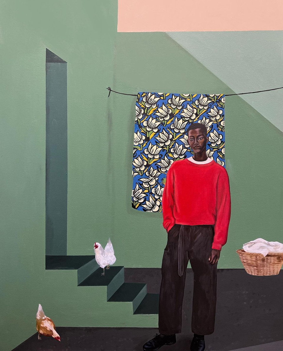
With the “The Young Man,” Njoku produces a psychologically charged image—a result of the melancholia that seems writ on the subject’s face. Sporting a bright red sweater and jeans, he stands before a structure composed of various geometric shapes that form walls, steps, and a doorway. It feels confined, and one wonders if it’s intended to reflect his situation and, perhaps, the stasis that governs his life. Languor is conveyed by a couple of chickens pecking at the ground. Njoku executes these in a more painterly fashion, using blurred brushstrokes to produce feathers. A full laundry basket is positioned against the back wall, and behind the youth hangs a showy floral cloth. Njoku makes it pop by painting it like a self-contained rectangular pattern, as opposed to laundry drying on a clothesline.
The largest work in the show, “Indefinite Space,” is an eye-popping tour de force of motifs and portraiture. Two female figures recline against a vivid pattern of blue, yellow, red, and white that explodes across the canvas. Njoku ratchets up the effect by introducing another similarly hued pattern that butts up against the dominant one. Behind these, she paints a background that looks like a stylized version of deep space. The women, whose faces are rendered with deft sensitivity, confront the viewer with powerful gazes. Each wears African-style head wraps and large gold earrings; one has on fashionably ripped jeans and sneakers, while the other sports a nose ring. The clothing positions them in contemporary times, yet the figures’ poses recall classical renderings of Greek gods and, together with the celestial background, suggest divinity.
The exhibition, which includes multiple works featuring strong women, opened during March’s Women’s History Month. The fact that the strong women in this show are also Black is especially important, given its location at a school that produces future movers and shakers within the realms of commerce and power.
Dathan Kane’s “The World of Shapes” exhibition at Visible Records is one of two shows by Kane that are on display in Charlottesville and Newport News through the month of March. Publicity photo.
Dathan Kane has just completed a month-long residency at Visible Records, an artist-run gallery and studio space that focuses on contemporary arts and empowering the community, and is located in the Belmont/Carlton neighborhood. Kane’s residency is part of a joint project with the Contemporary Arts Network of Newport News that will see two Visible Records artists headed there to produce a mural.
During his time at VR, Kane painted the walls of the 1,000 square-foot space with one of his distinctive black and white murals, which he collectively refers to as “The World of Shapes.” The result is stunning.
Born and raised in Hampton, Virginia, Kane received his B.A. in art and design from Virginia State University in 2014, with a focus on illustration, charcoal drawing, and graphic design. He didn’t start painting until his senior year, but took to it immediately. After graduation, he embarked on a career painting still lifes and portraits. But this changed dramatically following a 2015 trip to Art Basel Miami. “Seeing the work that was there and the artists I’d been studying—having access to that was inspirational,” says Kane. “It’s not like I’m coming from L.A. or New York, where you’ll see a lot more of that type of art.”
Inspired, Kane took his art in an entirely different direction, going big, going bold, and going monochrome. “I was thinking of ways to create something, to develop a visual language that felt authentic to me,” he says.
Reducing his palette to black and white wasn’t such a stretch for him, given his focus in college. But this palette choice was more profound than mere facility with a genre, “Black and white has always represented the foundation of art,” Kane says. “The absence of color draws attention. When you think of art for the most part, you think of color. When color isn’t present, you tend to be a little curious.” And color may have had a chastening effect on the scale of his forms since the combination may have been too much visually.
Looking at images of Kane’s various installations around the Hampton Roads area, Richmond, and Baltimore, you’re struck by how individual the projects look, while obviously done by the same hand. You also see black and white’s timelessness and how its undeniable chic works so well within the urban landscape.
In 2018, Kane became involved in the public art scene. He loves working outside and he likes the way public art engages with people who might not set foot in a gallery or museum space, or might not feel comfortable in those spaces. “If you’re able to engage someone passing by on their daily commute and take them out of reality for a minute, that impact is really special to me.”
In 2021, Kane was given the opportunity by Contemporary Arts Network to present his work on a grand scale and create an immersive experience. “I was a big fan of theme parks growing up,” he says. “And I had this idea to create a visual theme park.” If this sounds similar to Yayoi Kusama, it is. But Kane, motivated by entirely different forces, is achieving a similar effect using paint only. For that project, he painted six different spaces in the CAN headquarters in Newport News, including walls, floors, ceilings, and objects in the spaces. It took about four weeks to complete, working 12 hours a day.
Kane’s installation at VR includes podiums and a framed painting mounted directly on the mural. Like visual exclamation points, these features draw the eye and set up interesting spatial relationships between the large shapes on the wall and those on the other smaller objects. The arrangement of shapes themselves, what goes next to what, provides opportunities for Kane to toy with space and depth, creating the illusion of three dimensionality, overlapping planes, and forms that seem to flicker back and forth between dimensions.
Kane painted steadily for about 16 days at Visible Records, often working into the early morning hours. He finds inspiration for his rounded shapes in organic forms, and he works without a projector or grid marks. Everything is drawn freehand directly on the wall, giving his shapes a pleasing irregularity. The one exception is the perfect circles, which are made using cut-out stencils.
After priming his surface and mapping out the design in his head, Kane sketches it on the wall, moving from left to right, using a paint pen marker. When he finishes this, he adds the paint. Some projects require a preliminary drawing, but nothing stays exactly the same since the texture of the wall determines what you can do. Kane is really big on clean lines, and uses a flat-tip brush to paint everything. This brush, with which he fills up massive expanses, is just two inches long.
It’s hard not to be charmed by Kane’s chunky jumble of forms that push up against each other and seem ready to burst forth from the constraints of their two-dimensional surfaces. They’re amusing and joyful, and also incredibly stylish. They tick all the public-art boxes because what’s better than inserting a little joy, humor, and beauty into the life of someone passing by?
Karen Elizabeth Milbourne. Photo by Tristan Williams.
January 29 marks the start of Karen Elizabeth Milbourne’s tenure as the J. Sanford Miller Family Director of The Fralin Museum of Art at the University of Virginia. Milbourne comes to UVA from the Smithsonian’s National Museum of African Art in Washington, D.C., where she was senior curator and acting head of knowledge production. A leading scholar in the field, Milbourne received her BA in African studies from Bryn Mawr College, and Ph.D. in art history from the University of Iowa.
Milbourne has won numerous awards and fellowships, including a Fulbright Fellowship, and several awards from the Smithsonian and others for curatorial excellence. Her writing has been published in edited volumes and journals including African Arts, Nka: Journal of Contemporary African Art, Art Papers, ARS, and Collections. Milbourne is the former chair of the Smithsonian Artist Research Fellowship program and currently serves on the scientific committee for Archives of Women Artists, Research and Exhibitions, and the advisory board for the Lusaka Contemporary Art Center.
She is arriving at an exciting time for the arts at UVA, with the second Charlottesville Indigenous Art Takeover on view now. The event is sponsored by the Kluge-Ruhe Aboriginal Art Collection and The Fralin, in concert with the exhibitions “Maḏayin: Eight Decades of Aboriginal Australian Bark Painting from Yirrkala” and “Voices of Connection: Garamut Slit Drums of New Guinea” at The Fralin. The former, the most significant exhibition of bark paintings to tour the United States, was largely curated by the artists themselves, who formed the concept, selected the works, and wrote all text associated with the exhibition, including catalog essays. A collaboration between Papua New Guinean scholars and UVA faculty, students, and museum staff, “Voices of Connection” showcases the instruments and people of Papua New Guinea and its offshore islands. Correlating exhibitions and events will be happening at the Kluge-Ruhe, Les Yeux du Monde, Second Street Gallery, and the Upper West Oval Room of the Rotunda.
Just as exciting are the plans to expand and elevate the arts at UVA by constructing a new multidisciplinary arts center. C-VILLE sat down with Milbourne to discuss her role.
C-VILLE Weekly: Can you tell me about your personal history with art? What set you on your path?
Karen Milbourne: I did not officially start studying art history until graduate school. I was always interested in the arts and took studio classes throughout college. I actually started out as a psychology major, but wasn’t loving running rats through mazes. I took an African art history class and suddenly everything made sense. It was just the right place for me. And so I created an independent major in African studies with a minor in studio art. For my junior year I applied to a program through Colgate University at the University of Nigeria in Nsukka. I was extremely fortunate because artists who now are incredibly world-famous, like El Anatsui, taught there. He used to just let me hang out in his studio while he was working. His monumental work “Behind the Red Moon” is currently installed at Tate Modern’s Turbine Hall.
I came back knowing this was something I was passionate about. That summer, I had an internship at the Museum for African Art in New York City, which led to my first job. Around the same time, Bryn Mawr was given an African art collection and I was made curator of it as an undergrad. So, I wasn’t technically studying art history because Bryn Mawr didn’t offer a focus on Africa in its program, but I was quite focused on the subject. I wrote my senior thesis on Nigerian modern art and then worked at the museum in New York for a couple of years before going to graduate school.
Lisa Waup’s screen painting “moving tides” is part of “close to the wind” at Kluge-Ruhe Aboriginal Art Collections of the University of Virginia. Photo courtesy of the Kluge-Ruhe Aboriginal Art Collections of UVA.
Looking at the exhibitions you’ve curated at NMAfA, the African art you focus on is contemporary mostly, isn’t it?
Mostly. I work largely in the global contemporary. I’ve worked with Africa’s arts across time and a lot of my effort has been to undermine or unsettle assumptions about what is or isn’t African art. For instance, people don’t understand that there’ve been African photographers since the 19th century and that masquerade is a contemporary art form.
Of all those exhibitions, which are you most proud of?
I’ll give you three examples because each represents something different. The first, “Earth Matters, Land as Material and Metaphor in the Arts of Africa” was a really wonderful collaboration across the Smithsonian campus. It included partnerships with the Environmental Film Festival, Dumbarton Oaks, the National Air and Space Museum, the American History Museum, and the Smithsonian Garden. So bringing all of those different groups together and looking at what the Earth means to all of us was really exciting and rewarding. And intellectually, it was thrilling to have that ability to pull that project together. But it also made me realize how challenging big projects can be in terms of sustainability. So many of the things that I wanted as relationships or because of changing institutional structures weren’t possible.
“I Am: Contemporary Women Artists of Africa” came about after I’d gone through the collection of the National Museum of African Art and realized that only 11 percent of the named artists in the collection self-identified as female. So that led to a women’s initiative where we’ve been able to bring the representation of women artists in the collection up to 25 percent. With that exhibition I was really looking at the history of one institution and what institutions need to do to change, and then modeling a different way of showing women artists. It wasn’t that ambitious a project. I wasn’t traveling all over the world and bringing my own new research to it. It was about implementing a different kind of structural change.
“From the Deep” [on view now at NMAfA] wasn’t about me, the expert, going to an artist and saying, “I like this one, that one and that one,” and taking those artworks back to the museum. It was working collaboratively with the artist, Ayana V. Jackson, to help push her practice forward. So it was a six-year process where I worked with her from seed to harvest, providing her the space to create the artwork and bringing it to an exhibition format. We did two pop-ups, one in Johannesburg, one in Cape Town, because she’s based in South Africa. We brought audiences in, the soundtrack wasn’t yet scored, so it was going on live around us and we asked audience members, if you sit this close, if you sit this far, how do you experience it? And Ayana got the feedback of how people were experiencing the exhibition, which then informed the finalization of the artwork. That sort of collaborative process is really very exciting to me.
As director of The Fralin, you’ll be stepping away from your curatorial activities. Are you going to miss that?
Very much so. But the opportunity to envision what a museum should be is such a tremendous opportunity. I’m excited about partnering with the Kluge-Ruhe and creating a museum system that includes the performing arts and is centered on indigenous perspectives. It just didn’t seem like an opportunity I’d ever get again.
Karen Elizabeth Milbourne. Photo by Tristan Williams.
What is the status of UVA’s Center for the Arts? Is it going forward?
Oh, it’s definitely going forward. The Fralin, the Kluge-Ruhe and the new performing arts center will all share a single space, which is really exciting to think in a multidisciplinary fashion. I’ve worked with a lot of live artists, so it’s wonderful to think about partnering with the performing arts.
You’ve been recognized for your collaborative approach. How do you plan on collaborating with other creative and performing arts entities across UVA and Charlottesville?
It’s exciting thinking about the brilliance that one can find around the UVA campus. I would love to partner with the new [School of] Data Science. One of the main issues facing museums is databases, particularly, how to create databases that are flexible to allow for differing knowledge systems. For example, we might label something Yoruba artist, 19th century. Well, Yoruba might identify that same thing by clan. So where do you put the clan name instead of cultural name? How do you account for gender fluidity? How do you both have a backend where you can input data to allow for greater inclusion, and create it so that it’s outward facing in a way that’s not contradictory to how anybody wishes to identify themselves.
There is also potential for collaboration with the law school looking at ethical stewardship of collections, looking at cultural patrimony laws and understanding those in relationship to our collections and thinking about how we take care of them and interact with and share them. So these are things I’m really excited about, as well as really thinking in a more multidisciplinary fashion.
Another reason I’m so excited is the new building. We have the opportunity to think flexibly from the get-go, and can include things like a sprung floor for dancers and comprehensive electrical cabling that can support something complicated like an immersive video.
I would consider you on the front lines of the culture wars, and we’re a divided country and UVA is kind of a microcosm of that. The Fralin’s diversity efforts in recent years are really admirable, but there are many who are resistant to this. How do you remain positive and effective in the face of these challenges?
I’ve never worked anywhere where there weren’t challenges. I think that’s sort of the nature of being alive in this world. But I think all of these individuals are looking at the world around them and trying to imagine new futures. And that’s what I’m trying to do, I’m imagining a future with the museum. So it’s really trying to work with somebody on that front rather than hashing out what you said or they said, or was it this way or that way. I’m interested in, What is the future that we can build together? I think that’s the space where we can find common ground.
Do you have any hobbies? What do you like to do in your free time?
I’m an avid walker. I walk upwards of five miles a day with my dog. And, as soon as I can find a pool, I will go back to swimming. So those are two passions of mine. I love to hang out with my kids (ages 13, 16, and 19), and I love to read.
What are you most looking forward to about moving to the Charlottesville area?
Well, outside of the brilliant colleagues at UVA, it probably is the mountains. The physical environment was definitely part of the appeal, and I would also say, the vineyards.
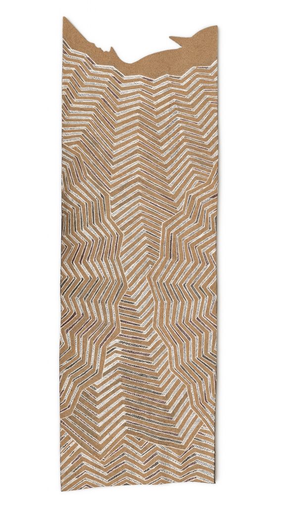
Included in “Maḏayin: Eight Decades of Aboriginal Australian Bark Painting From Yirrkala” at The Fralin, Gunybi Ganambarr’s “Garrapara,” uses natural pigments on eucalyptus bark. Photo courtesy of The Fralin Museum at UVA.
Charlottesville Indigenous Art Takeover 2024
The Fralin Museum of Art at the University of Virginia
“Maḏayin: Eight Decades of Aboriginal Australian Bark Painting from Yirrkala,” February 3-July 14.
Painter Frances Brand’s “Firsts” collection put names and faces to innovative doers whose contributions shaped Charlottesville. All images courtesy of the Albemarle Charlottesville Historical Society Collection.
It wasn’t until the 1970s that painter Frances Brand found her creative calling. Inspired by the story of Anna Luisa Puerta, an immigrant from Colombia who took a job as VDOT’s first flag woman in order to support her family, Brand started thinking about other people in our area who were the first to do something noteworthy in their careers, studies, or other endeavors, whether because of race, gender, or nationality. Running with this idea, Brand completed over 157 portraits with the bulk produced between 1974 and 1978.
Painting History: Frances Brand and the “Firsts,” a panel discussion on Brand and an exhibition of her legacy of socially engaged artwork, will be presented at 6pm on Wednesday, January 10, at the Martin Luther King Jr. Performing Arts Center. The panel boasts its share of firsts—Nancy O’Brien (Charlottesville’s first female mayor), Cornelia Johnson (Charlottesville’s first Black female officer), Teresa Walker Price (the first Black female secretary of Charlottesville’s electoral board)—all painted by Brand, as well as Frank Walker (artist and painter of a portrait of Frances Brand). Former Charlottesville mayor Virginia Daugherty will serve as the event’s moderator.
For information about the January 10 panel and exhibition, visit albemarlehistory.org.
The panel, and exhibition of a selection of Brand’s portraits on view in the performing arts center lobby, is part of a larger effort undertaken by Daugherty, O’Brien, and others, to ensure the “Firsts” portraits remain a vital part of the Charlottesville community. Brand’s granddaughter, Cynthia Brand, donated the collection to the Albemarle Charlottesville Historical Society in 2006. Many are in need of costly restoration work. Brand didn’t use the best materials, sometimes painting over affordable artwork from five and dime stores.
Brand, who died in 1990, was wonderfully unconventional. An Army brat, whose father, maternal grandfather, and maternal great-grandfather all graduated from the U.S. Military Academy, Brand was born at West Point. She moved from one Army post to another throughout her childhood, attending boarding schools, including a convent school in Belgium, before entering Goucher College in Baltimore.
Brand lived in Charlottesville twice. The first time while her husband was attending law school in the late 1920s, and then she returned for good in 1959, settling in the JPA neighborhood. In the interim, she had two sons, joined the Women’s Army Corps, divorced, and lived abroad working with the German Youth Association aiding children who’d suffered under the Nazis. Upon her retirement from the Army in 1954, she lived in Mexico City, where she earned a bachelor’s degree in art.
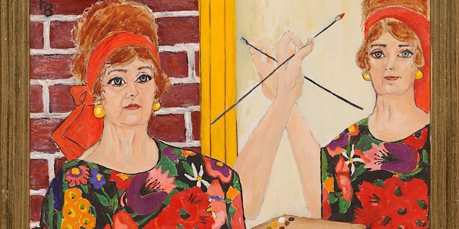
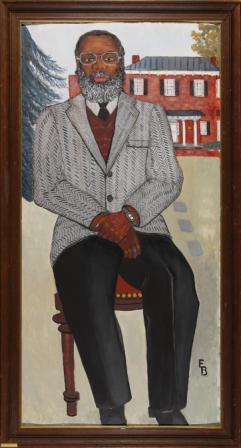
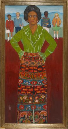
Brand’s deep commitment to portraiture and social justice is similar to her contemporary, the great Alice Neel. So too is the confrontational quality of her portraits, their scale, and the interest in pattern. Brand uses it with panache, as can be seen from the bold herringbone in the jacket of William Harris, UVA’s first dean of African American affairs; the black and gray houndstooth of The New York Times’ first female reporter Nancy Hale Bowers’ cape, which echoes the newsprint in her hand; and the elaborately embellished skirt worn by Grace Tinsley, the first Black woman to serve on Charlottesville’s school board. In Brand’s self-portrait, she employs the conceit of the mirror to give you two Brands: herself and her reflection, thus doubling not just her, but also the expanse of eye-popping floral material that comprises her gown, turning the bottom of the painting into a field of flowers.
Evident in the work of both Neel and Brand is the respect and admiration for their sitters. But that’s where the comparison stops. Neel was a consummate artist in complete control of her medium. She took her time developing a work to completion. For Brand, the narrative elements, and her goal of recording as many firsts as she could, eclipsed technique. She was in a hurry, eager to complete her project and trumpet the achievements of her sitters.
Brand didn’t just paint “the walk,” she walked it, not only by shining a spotlight on ordinary people doing extraordinary things, but in her inclusive attitude. It’s noteworthy that Brand, along with her friend, prominent local civil right activist Sarah Patton Boyle (who Brand depicts with a burning cross that had been ignited by white supremacists on her lawn), are the first white members of Charlottesville’s NAACP.
We don’t often have the opportunity to pause and consider steps made along the way that help enrich a community and move it forward. Brand’s joyful paintings of this extensive cast of lively, interesting, stylish, and socially engaged people offer just this, breathing life into a slice of Charlottesville’s history.
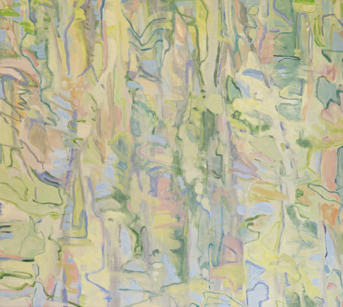
“Come to the Woods” calls for repeat viewing of Susan McAlister’s show “Canopy,” at Les Yeux du Monde through October 29. Supplied photo.
Susan McAlister uses a number of approaches to landscape, from direct physical representations to more nebulous suggestions of place, to riffs on the basic forms and patterns that are the building blocks of the natural world. “My process is essentially the same whether I’m working representationally or abstractly,” says McAlister, whose work is the subject of “Canopy,” now on view at Les Yeux du Monde. “I’m finding form, I’m pushing color, I’m layering materials, I’m thinking about the relation of all of these elements together.”
The plein air tradition of sketching and painting out of doors is central to McAlister’s practice. “When I take my walks in nature,” she says, “I think about the shapes that are happening and the way the light moves through those shapes and how a vine travels up a tree and continues over your head. I’m considering all of this and what it’s like being engulfed by nature and how that makes my heart feel.”
While outside, McAlister also forages for natural found objects, which she uses as inspiration, sometimes incorporating them into her assemblages, thus rooting them in a specific time and place. “Faunus I,” for example, features a feather, petal, and bee. Originally inspired by a visit to the Matisse room at the National Gallery in Washington, D.C., McAlister took the concept of cut-outs and ran with it, adding three-dimensionality into the mix to produce her gorgeous explosions of layered cut paper.
Luminous vistas of the Blue Ridge cloaked in fuzzy haze are conjured up from a combination of McAlister’s observation and memory. “These wooded landscapes are about my childhood. I grew up where my playground was the uncut forest outside my door. That kind of tangled landscape, that’s orderly but also disorderly, is endlessly appealing to me.”
In “Near and Far,” the haze has been replaced with rain-washed crispness. McAlister uses extraordinary brushwork here, with bold expressive slashes, smears, and clumps of paint that describe the varied mountain terrain of woods, meadows, and streams.
“Meeting in the Woods” depicts the sort of tangled woodland that appeals to McAlister. In this rollicking work, the scene has shifted from the gently sloping hills of memory seen in “Wooded Way,” “The Engagement,” and “Evening,” to more rugged Montana. McAlister has amped up her brush work accordingly, with slashing strokes that describe the wind tossing the trees, and add points of visual interest to the work.
“Spring Shadows & the Forest Floor” seems to exist on the knife edge between abstraction and representation. McAlister has visually nailed the sense of wind, using large brushes to produce blurry contrails of paint along with quick daubs of green that suggest fluttering leaves.
The artist’s muted palette perfectly embodies the temporal and atmospheric conditions she wishes to convey. Light greens pinpoint the season as early spring. Dove gray represents the recesses of the forest interior. Elegant inky blotches describe roots, branches, and tree trunks, tiny flecks of cerulean blue and stark white brighten the sky with intense, pure pigment. In the upper left quadrant, the absence of green implies that we are at the edge of a clearing or body of water where the land opens up and the view of the sky is more expansive.
McAlister’s palette of sunny pastels is derived from Bonnard. It’s a challenging color scheme to make serious, particularly for an artist who states, “I don’t want to be cute, I don’t want to be sweet. I’m most pleased when my paintings read as bold and expressive.” So, she tempers her palette’s prettiness with the introduction of duller shades, gesture, and layering. You can see this in the rectilinear zones of “Edge of the Forest.”
“Come to the Woods” has a curious power that seems to build with each repeated viewing. The initial impression is of a work that is delicate and fragile, thanks to its pale colors and softly undulating shapes. But, the complex arrangement of pink, blue, green, and yellow and the interplay between painted surface and line, create interesting visual relationships. With its tessellated forms and passages that cascade down the picture plane, the work is really a deconstructed landscape.
Four paintings—“Vert,” “From the Open Window,” “Lost in the Forest,” and “Lush”—are hung together on the wall. McAlister did this to create a bigger expanse of painted surface. But the quartet’s juxtaposition, with two representational works and two abstract ones, hits at the crux of McAlister’s oeuvre, which is really about painting in and of itself, not one specific style. You see in these works, the ease with which the artist switches gears and her incredible facility, no matter how she’s painting. The “what” she’s painting remains a constant, however.
“Landscape is where my heart is,” she says. “It’s what I want to talk about.” As the works in the show reveal, McAlister uses various inventive means to “talk” about it, but one thing is clear, she is using a decidedly contemporary language to do so.
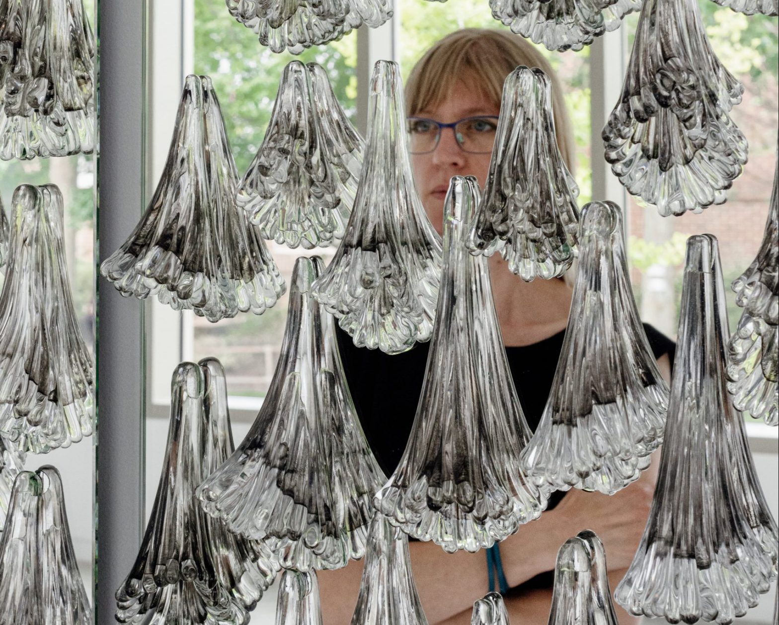
Glass artist Kiara Pelissier reproduces the tragic effects of climate change on the planet’s coral reefs in her show “House on Fire” at Quirk Gallery through September 29. Image courtesy of the artist.
Coral reefs are wondrous marvels of natural beauty. They are both living things and ecosystems for a myriad assortment of other creatures, and are a vital link in the chain of life. It’s estimated that 1 billion people benefit from coral reefs in the form of food, coastal protection, clean sea water, and income from tourism and fishing.
With “House on Fire” at Quirk Gallery, Kiara Pelissier uses glass to draw attention to the existential threat the earth and all its inhabitants are facing as our climate changes and temperatures rise. Pelissier focuses on the devastation happening to coral reefs around the globe. These beautiful animals are struggling to survive in an environment that is becoming untenable. Mass bleaching events, unknown until the 1980s, are now common occurrences in our oceans, which absorb 93 percent of the heat trapped by CO2.
Each coral is made up of polyps that are attached to a reef at one end, and have an open mouth surrounded by tentacles at the other. One of the most remarkable things about coral is its symbiotic relationship with algae. Each coral polyp contains millions of algae cells, called zooxanthellae. The coral provides them with an environment in which to thrive and photosynthesize, which, in turn, helps sustain the coral. At night, corals become active, extending their stinging tentacles to capture floating plankton.
Coral polyps are actually transparent—it’s the zooxanthellae that provides the pigment that gives coral its vivid and varied color. Coral can be hard or soft. It lives and grows connected to other corals. Soft corals resemble plants. Hard corals use the calcium in seawater to form outer skeletons that become the structural basis of a coral reef. Bleached coral is not dead, but without the algae inside, it is more at risk for starvation and disease, and if the situation doesn’t improve, it will die.
Taking the title of the show from Greta Thunberg’s famous 2019 Davos speech, Pelissier continues the metaphor of the burning house with the introduction of a portion of a roof. Her intention is to bring what’s happening out of sight, beneath the sea, quite literally home. Pelissier’s roof is mostly white, interspersed with cobalt, amethyst, and lime-green tiles—the white alludes to bleaching and the other distinctive colors appear in certain corals when they experience heatstroke. The message is clear: The roof, our home, our planet, like the coral, is in mortal peril.
The heatstroke colors appear again in the dramatic sheaths of glass rods at the opposite end of the gallery. It isn’t until you see that these pieces are all titled “Scream” that you note the urgency to the upward thrust of the rods. Pelissier wants us to understand the direness of the situation: The coral—out of sight and out of mind—is screaming for our help.
“Anthropocene” refers to our current era of human domination, and features drooping clear polyps placed against a mirror. From a visual viewpoint, it’s a dazzling display of silver and glass, but it’s also a powerful memento mori. The polyps, drained of color and deflated, bear little resemblance to healthy coral. They’ve expelled the algae living in their tissues as a reaction to stress. Transparency is the final stage in coral’s death spiral before all “flesh” is gone and only a skeletal superstructure remains. It’s impossible to look at this piece without seeing ourselves reflected in the mirror, just as it’s impossible to look at what’s happening to coral without confronting our role in its demise.
“In My Lifetime,” spans decades from the 1950s to the 2020s, and presents a series of 13 glass coral clusters. Pelissier suggests movement by incorporating slightly mushed polyps into her arrangements to mimic the swaying of ocean currents. The early clusters are luscious explosions of colored glass. It’s not until the 1980s, when the first mass bleaching event occurred, that we begin to see white clusters. After 2000, there are no more entirely colored ones, just predominantly white with only a few bright-hued polyps. The last three have lost not just their color, but most of their mass, leaving behind skeletons.
A video features Pelissier producing one of these blooms. It’s magical watching the molten bubble of glass being pushed down onto the arrangement of upside-down polyps, and then the whole weighty thing lifted and plunged into the fiery glory hole (the name given to the furnace used for reheating the glass during its manufacture). You can feel the heat and sense the effort and determination involved in producing blown glass pieces of this scale and complexity.
Fire and heat have special relevance to those who work with blown glass. Pelissier herself has experienced the profoundly deleterious effects of exposure to hot temperatures, developing an allergic reaction to the heat she needs to produce her work. It got so bad, she almost abandoned glassblowing altogether, pausing her practice for a full six years. Fortunately, she has figured out a way to limit her exposure and also limit the amount of time her 2,000-degree furnace is on—a necessary piece of equipment that she acknowledges is not exactly green. She is helped in this effort by the fact that her current pieces are composed of numerous smaller elements that form each coral cluster, allowing her to organize her production in stages so as to use the furnace as efficiently as possible.
Like many of us during the pandemic, Pelissier turned to Netflix for some welcome diversion. Watching Chasing Coral introduced her to the plight of coral and inspired this body of work. It is a galvanizing documentary, well worth your time. The artist is donating a percentage of sales to coral reef rehabilitation and research.
“Moat Mountains and Ledges from Intervale” is included in “N’Dakinna Landscapes. Publicity Image.
A pair of shows on view at The Fralin Museum of Art at the University of Virginia shine a spotlight on arts, culture, and the very existence of two groups of Indigenous people in North and Central America. “N’Dakinna Landscapes Acknowledged” and “Look Three Ways: Maya Painted Pottery,” curated by Adriana Greci Green, The Fralin’s curator of Indigenous Arts of the Americas and Dorie Reents-Budet, research associate at the National Museum of Natural History, center on work drawn from the museum’s collection.
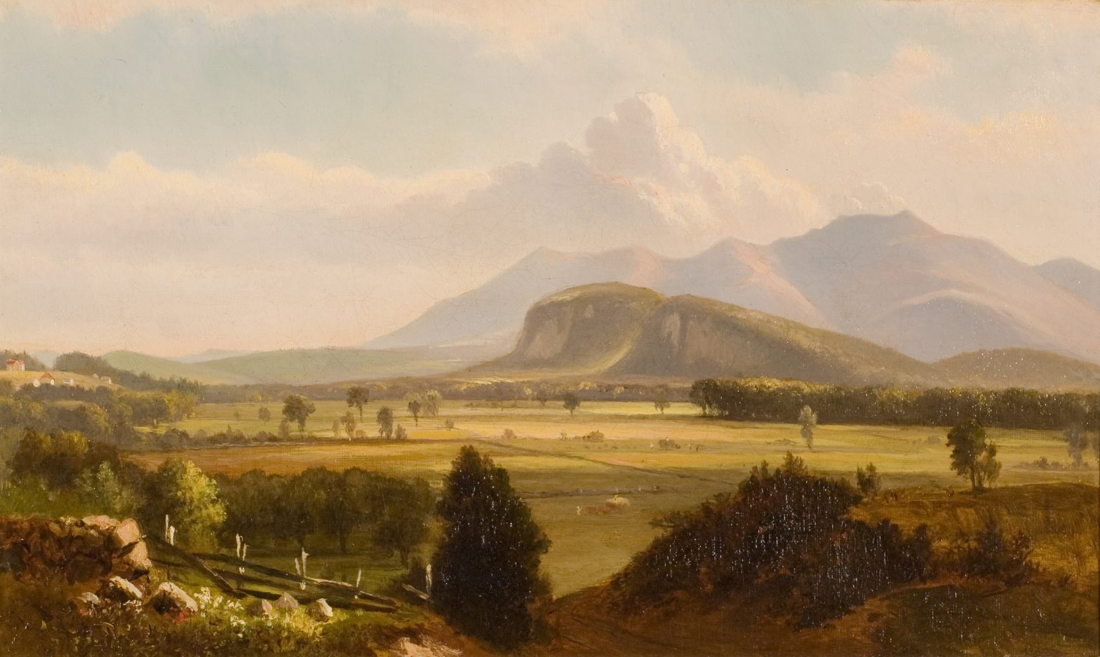
“N’Dakinna Landscapes Acknowledged” takes an innovative approach to presenting landscapes by members of the White Mountain School of painting, which flourished in New Hampshire during the 19th century. Similar to, though lesser known, than the Hudson River School, it shared some prominent Hudson River artists. Featured in this show are works by White Mountain painters Benjamin Champney, Samuel Lancaster Gerry, Samuel W. Griggs, and Sylvester Phelps Hodgdon.
As the robust American landscape painting tradition reveals, the land—its beauty and vastness—was a source of enormous inspiration and pride for newly arrived settlers. America’s great expanses represented a present-day Garden of Eden that was theirs to inhabit and tame into cultivation. This reverence was far-reaching, extending even to those who might never actually see these places in person. Champney’s paintings, for example, were often reproduced as chromolithographs that were widely distributed.
This perspective ignores the fact that the land had been inhabited for millennia by a whole host of Indigenous peoples who had very different ideas about the land and its stewardship. N’Dakinna (homeland) is the Abenaki’s (People of the Dawn Land) name for this area, which they have occupied for 13,000 years. The Fralin show asks us, when looking at these beautiful paintings, to consider the Abanaki and their relationship to the land.
As we navigate the choppy waters toward a more accurate understanding, the trick is to hold two different realities in one’s mind, acknowledging the experience of loss—of people, land, and culture, known as territory acknowledgment—and yet appreciate these paintings for what they are: beautiful landscapes that provide an incredibly valuable snapshot of what pre-industrial America looked liked.
Champney’s “Moat Mountains from Intervale” depicts a broad vista of cultivated valley before a backdrop of the dramatic geological formations known as the Ledges, with mountains beyond. The picture is surprisingly small given the grandiosity of the scene, but there’s an appealing intimacy to its size. The other works, oil on paper studies, provide charming pastoral vignettes, with Gerry’s view of a twisted tree against a blazing evening sky possessing a moodiness reminiscent of the almost contemporaneous German Romantic painters.
In addition to the paintings, two maps included in the exhibition speak to the Indigenous people’s relationship with the land. One, a topographical map Greci Green produced in collaboration with Chris Gist of UVA’s Scholars Lab, features the Abenaki and neighboring nations, the Haudenosaunee and Wabanaki, spelled out in a striking orange font across the map. The bold, flat writing effectively subverts the map’s imposed borders, proclaiming whose land it really was.
“My own work is very much focused on Indigenous Native sovereignty and treaties,” says Greci Green. “When I think about art and landscape, I see it through those lenses.”
The other map, made in 1852 by cartographer Franklin Leavitt, features superimposed reproductions of the paintings placed where they were made, as well as a vintage postcard and a stereographic photograph. These latter two, which feature Abanaki posing for the camera, are souvenirs of the tourist industry that emerged around them. “These pictures of Abenaki basket makers at tourist spots highlight how these artists remain there in this landscape and are engaged with the local touristic economy,’’ says Greci Green.
“Look Three Ways: Maya Painted Pottery” explores the rich tradition that flourished on the Yucatan Peninsula during the first millennium. Included in the show are works from The Fralin’s impressive collection of this art form, dating from 250–900 CE. Over the years, certain of these pieces have been displayed in the museum’s study center for the benefit of students, but the collection has never been displayed in this fashion before.
The vessels vary from everyday uses to ceremonial objects important to feasts that could be celebratory in nature, or important political events between different groups. They share a similar palette of red, black, soft terracotta, and cream, and the shapes of the vessels are simple: rounded bowls of different sizes, their fubsy form derived from gourds, some footed, and tall cylindrical drinking vessels.
The title of the show alludes to the three ways the works are analyzed by scholars: interpreting the Maya hieroglyphic writing that decorates the vessels, the style of the pot—it’s size and shape—and finally, instrumental neutron activation analysis which can identify the place where the pot was made.
There is a poignancy to what is on view at The Fralin, an unmistakable sense of loss and displacement, of precious relics of obliterated human experience. But there is also a vibrancy in the artistry, a chance to sense what was so widely destroyed, and appreciate those who came before.
“Symbiotic Tango” finds the common ground between two very different artistic visions. Image courtesy of the gallery.
Likening their artistic collaboration to dancing the tango—following, giving, and then stepping back, Michelle Gagliano and Beatrix Ost decided to call their venture “Symbiotic Tango.” Chroma Projects is currently showing a selection of Gagliano/Ost works that give us a taste of what the collaboration looks like. A more extensive “Symbiotic Tango” show will be presented by the William King Museum of Art in Abingdon in December.
At Chroma Projects, the work is hung inside its bank vault. This intimate shrine-like setting is the perfect backdrop for pieces limned, framed, and splashed with gold. This precious metal’s glint enlivens an artwork visually, but gold also connotes high value as it pertains to the object and its message. For Gagliano and Ost, this high esteem also extends to the collaboration itself, which has enriched them both in untold ways.
“Before this, I was never drawn to abstraction,” says Ost. “But, now I’m in it. I’m in Michelle’s abstract world.” For Gagliano, working with Ost’s narrative has been expansive. “I never studied surrealism,” she says. “But getting to know Beatrix’s life, and seeing how it extends on to the canvas has been an incredibly enriching experience.”
How did the Gagliano/Ost collaboration come about? Like just about everyone else during the early months of the COVID-19 pandemic, the two artists were struggling with isolation. So in November 2020, they hatched a plan to begin working collaboratively, transforming the ensuing months into a time of flourishing artistic output and creative growth.
One wouldn’t necessarily have thought to put the two artists together. Gagliano produces shimmering atmospheric, abstract compositions, while Ost’s ornate narratives boast a complex surrealist iconography that she uses to explore the human condition. But, this stylistic divergence works to their advantage as each brings her unique perspective to the project. “It’s like a collision of contemporary surrealism and abstracted nature,” says Gagliano.
The women do share many significant similarities. Both derive real sustenance from their practices, which have provided them not only a living, but an identity and psychic fulfillment. They are also each the mother of three sons. But, perhaps most important for their practice, Ost and Gagliano both grew up on large farms: Gagliano on a dairy farm in Upstate New York, and Ost on a farm in Bavaria that specialized in cabbages used in sauerkraut. This birthright has engendered in both artists a deep reverence for nature in its many forms—its bounty, its fury, and its fragility.
Gagliano and Ost work sequentially, completing paintings that they then exchange for the other to add to. To let go of something you’ve labored over to completion, giving it to someone else to work on as they wish, would give most of us pause, and in the beginning, it was challenging for the two. The artists were leery of stepping into the other’s painting for fear of mucking up the vision. It got easier as time passed and they became more in tune to each other and appreciative of the process.
The “Dissected Presence” series of paintings was begun by Ost. The works feature densely packed forms and images from her rich visual lexicon, creating a sumptuous allover effect. In two paintings from the series, an ancient-looking plaster idol reminiscent of the stylized Cycladic schematic figures is affixed to each panel. Their significance isn’t directly spelled out, but they seem to allude to a feminine goddess along the lines of Gaia. All of the works in this series are shot through with diagonal shafts of gold added by Gagliano. These metallic embellishments add a dynamic thrust of movement. They also disrupt the illusion of three-dimensional space, without obscuring the original composition.
Begun by Gagliano and finished by Ost, the series with the same name as the show, “Symbiotic Tango,” has nine paintings. Here, the focus shifts to the surfaces—Gagliano’s forte. She says she was inspired by the James River, with the churn and splash of paint intended to evoke water flowing over rocks. The explosions of paint resemble swirling clouds of vapor and the work can be taken to represent an emergence of some kind. The paintings boast hidden narrative tidbits—faces, birds, strange toothy creatures, a disembodied hand—that one must really look for in order to see. These partial glimpses of recognizable things amid the chaos of swirling medium suggest an excavated wall where only fragmentary sections remain, with the rest degraded or covered with dust or mud. Ost revels in these instances where the abstract meets the surreal. “That’s how the mind works,” she says. “It understands both the abstract and the surreal. It’s the eyes that want order.”
Working as an artist can be a very solitary pursuit. Many spend hours alone in the studio trying to figure things out. With another artist in the mix, it’s not only companionable, but there’s another person invested in the process to act as a sounding board. This is helpful in completing a piece by reinforcing the decisions and choices involved in its creation. It’s also easier to appreciate the artistic output and derive pleasure from its creation because you have someone else experiencing the same reaction and reinforcing one’s own. “I get so much from her and she gets so much from me,” says Ost. It’s a joint endeavor of listening, trust, and support.
Giselle Gautreau's “Virginia Nocturne with Fireflies.” Image courtesy of the gallery.
The moment you enter Second Street Gallery, you appreciate the variety of techniques featured in “Mirabilia naturae (Wonders of Nature)”—the precise, elegant line of Lara Call Gastinger’s works of paper; the poetic, emotive quality of Giselle Gautreau’s paintings; and the velvety tones and photographic verisimilitude of Elizabeth Perdue’s palladium prints. Each medium and style has its own formal and evocative allure, while also being ideally suited to capture and convey nature, a subject with which these artists are deeply engaged.
The differing approaches work very well in concert throughout the show, and specifically in the grid arrangement of 30 6″x 6″ squares that form a joint, site-specific piece. “We wanted a way to represent a cohesiveness in the show and came up with this idea of one gridded part of the wall that would embody all three of our styles together,” says Gastinger. “We love it. It shows everything from the detailed work of mine to the dreamy photographs of Elizabeth, and then the moody landscapes of Giselle.”
The individual works that make up Gastinger’s “Seeing Plants: A Year in Virginia (January-December),” feature florae as they appear during a given month. Her graphically symmetric arrangement of specimens is derived from the illustrated botanical plates of German scientist Ernst Haeckel. Gastinger uses the dry brush watercolor technique (a small amount of paint—without water—is used with a brush) to produce the extraordinary precision. Just look at her wispy paradise flower in “Seeing Plants,” or the thin hair-like filaments on the fiddlehead fern stems in “Emerging Ferns.” In this and the aforementioned series, Gastinger limits her palette to sepia, which produces varying tones of gray. In other works, she introduces color. Throughout, you marvel at Gastinger’s ability to artfully join scientific veracity with a finely tuned sensitivity to the myriad aesthetic qualities of her subjects.
Lara Call Gastinger’s “Big Leaf Magnolia.” Image courtesy of the gallery.
In her contemplative encaustic paintings, Gautreau uses tonal values to create mood. She downplays detail in these softly edged, atmospheric works, keeping her palette muted and focusing on dusk or twilight when shadows grow and light is diffused. The multiple layers of oil and encaustic that Gautreau employs expand the visual depth while augmenting qualities of luminosity.
In “Virginia Nocturne with Fireflies,” the insects of the title appear as pinpricks of brilliant bluish light against a backdrop of inky conifers. Hazy silvery light from the moon illuminates the sky and shines on a small glade in the foreground, creating the effect of a spotlit stage. Here, a patch of springy clumps of grass with worn areas of dirt is conjured out of lush brushstrokes in vivid green and yellow. A simple composition, the piece evokes childhood memories of the ineffable magic of lightening bugs and moonlight in a summer garden.
“With landscapes, there’s a point where the viewer might connect with them and feel some familiarity with something,” says Gautreau. “But if I get too specific, unless it’s something they have a personal connection to, they lose interest. So, I walk that line between making work that’s rooted in something specific, while also leaving it open to interpretation.”
Palladium printing is an old process, prized for its beautiful effects and archival resilience. Traditionally, large-format cameras are used because the technique requires the negative to be the same size as the image. Perdue uses a Calumet camera with either 8″ x 10″ or 4″ x 5″ negatives. When she’s ready to print, after first processing her film, Perdue paints an emulsion containing palladium salts and a light sensitizer onto watercolor paper. After it dries, she lays the negative on top to make a contact print. She then places this in a light box for exposure, with the addition of a developer. How long it stays in there depends on the desired effect, but it can range anywhere from a few minutes to an hour, or even more.
Elizabeth Perdue’s “Magnolia.” Image courtesy of the gallery.
“I love the tones, the gradations and the grays, and also the texture of the paper. None of it is digital,” says Perdue. “It’s all very tactile—very hands-on. It’s old school. I love that about it.” While palladium printing may be complicated, it’s also simple in the sense that the artist can be involved and in control of the entire process.
Perdue gathers her subject matter on walks, looking for things that “shine in their simplicity.” She selects just one stem or branch to photograph at a time, producing a form of portraiture. “I love celebrating the ephemeral quality of a single bloom, or shoot, and capturing it in a medium that is believed to last for up to a thousand years,” she says.
There’s an unmistakable elegiac quality to “Mirabilia naturae.” We see it in the desiccated magnolia leaf, the fragile fireflies facing collapse, and the somber grandeur of a lone magnolia bloom. It’s easy to revel in each approach, and also in the wonders they present, and it’s very hard to leave the gallery without being more mindful, observant, and appreciative of the ever-fascinating natural world.
Lara Call Gastinger, Giselle Gautreau, and Elizabeth Perdue are featured in “Mirabilia naturae (Wonders of Nature)” at Second Street Gallery through May 19.
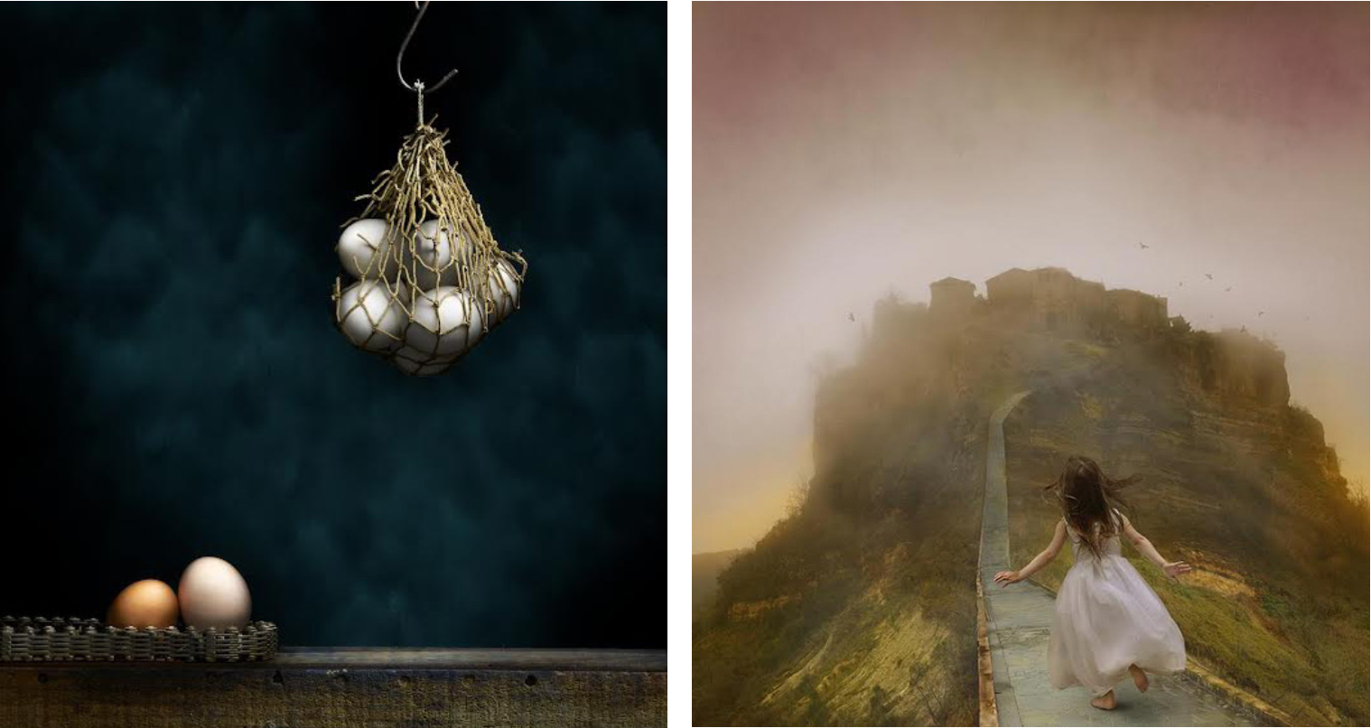
Tom Chambers’ (right) and Fax Ayres’ (left) photographs evoke magical otherworldliness at Chroma Projects through May 26.
Images courtesy of Chroma Projects.
“Tom Chambers and Fax Ayres: Everything is Extraordinary,” currently on view at Chroma Projects at Vault Virginia, features two artists using distinctive approaches to alter and enhance photographs in order to capture a mood, an evocation of a place, objects, or some mystical imaginary region.
Fax Ayres enjoys playing with perception. This is evident in his transformation of ordinary objects into something special, and the playful shifting back and forth between reality and fiction that’s a recurring theme throughout his work. Photographing each piece incrementally, Ayres works on small sections, taking as many as 200 photographs to end up with the 100 good ones that comprise a finished image.
“I like the fact that they can appear to be paintings or photographs,” says Ayres. “I have a definite affinity for some of the Dutch painters who did those hyper photorealistic paintings.”
To achieve the crystalline quality of his images, Ayres uses light painting. With the camera mounted on a tripod and tethered to a computer, Ayres holds a remote trigger in one hand and a small flashlight in the other. He opens the shutter and skims the light across the surface of the area he’s photographing, throwing the object into high relief. The shutter speed depends on a variety of factors, including the surface area size, how shiny or dull it is, and even how far away it is from the camera.
“I keep the shutter open with a manual count,” he says. “Then I close the shutter and look at the image to see if the highlights look right, if the texture of the surface is revealed in the way I want, etc.”
One can see the result of the process in the remarkable reflecting, haptic, and even emotional qualities Ayres is able to wrest from the ordinary, everyday objects he uses. To preserve the clarity of the work, Ayres has his images printed on smooth, matte aluminum.
At first, “The Usual Suspects” appears to be a sober and imposing work, but then we notice a plastic monkey and parakeet amidst the oil cans, padlocks, and weights. It’s a delightful touch that disrupts the unrelenting browns and grays of old metal by adding color, humor, and frivolity.
In “Portal,” Ayres takes this levity further, creating a faux landscape of fake trees and grass, a dog figurine, and a macabre novelty lamp, all set within a car gear part that’s resting on an old-school style level. These functional objects, made from steel and wood, shine under Ayres’ exacting eye—their humble ordinariness transformed into beauty by proximity to the garish artificial scene they’re paired with.
Ayres steps outside the studio with the striking “Birch Trees” and “Pool Gates.” In these works, intense lighting and hyperrealism work together to produce a curious artificiality that adds drama and suspense.
In his allegorical photomontages, Tom Chambers captures the innate beauty of young girls in a way that exalts them while preserving their innocence. In Chambers’ hands, this central theme yields powerful images.
According to Chambers, “the photographs present something that is possible but not probable,” a land where girls rule (or at least have agency) and feral beings are safe. He photographs his subjects in the studio, while placing them within landscapes that tend to be rugged, northern coastal settings—the perfect foil for the tender girlish pulchritude depicted.
In some images, the girls are either holding or interacting with natural beings—a wolf, birds, fireflies, which are in peril because of demonizing, loss of habitat, or pollution. In these mysterious tableaux, one has the sense that the girl is in control; a junior Mother Nature tending to and protecting her charges. “In each of my images, I’m going for my own expression of a feeling through telling a story,” he says. “I hope the viewer also connects in some way emotionally with his own personal interpretation.”
Chambers clothes his models in garments that sync perfectly with the timbre of the work. Their frocks, muted in color and style, have a timeless elegance about them that’s unusual and piques our interest. One girl, in a plain white shift, sports an arm in a matching sling. It’s unexpected and provocative, engaging the viewer’s curiosity and dispelling any whiffs of cloying sentimentality such enchanting subjects might arouse. Another girl wears a black and white checked dress that echoes the speckled hens at her feet. Still another wears pale pink, the same shade as the teapot she holds.
There’s an unmistakably elegiac quality to the work. The fragility depicted, whether of nature or young girls, is under constant threat. In these brave doe-like visages—serene, fearless, immutable—we see beauty certainly, but we also see strength. And yet, this strength is tempered by our understanding of the girl’s unequivocal vulnerability. It is this last quality together with the subjects’ patent goodness that makes them the ideal incarnation for humanity in these beguiling examples of memento naturae.