Categories
Arts Culture

Shutter to think

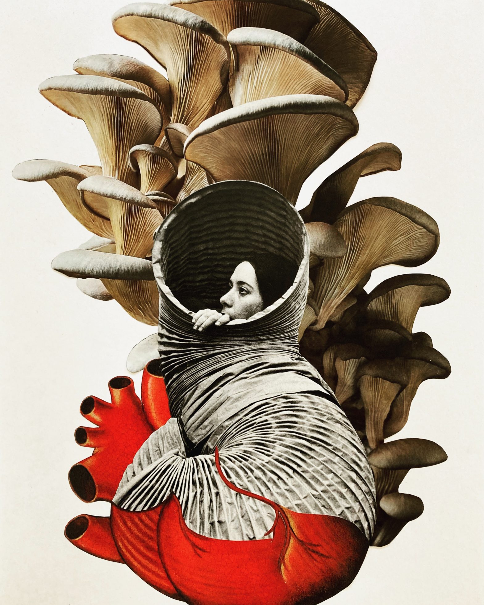
“Tom Chambers and Fax Ayres: Everything is Extraordinary,” currently on view at Chroma Projects at Vault Virginia, features two artists using distinctive approaches to alter and enhance photographs in order to capture a mood, an evocation of a place, objects, or some mystical imaginary region.

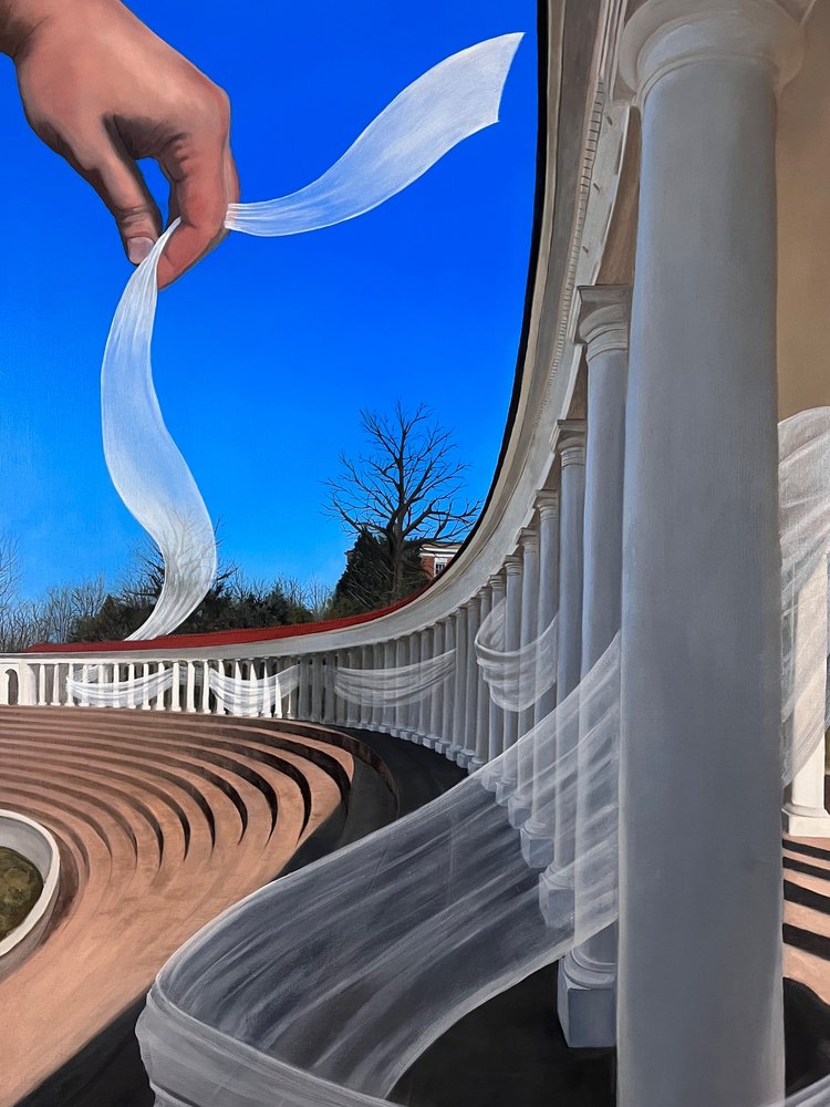
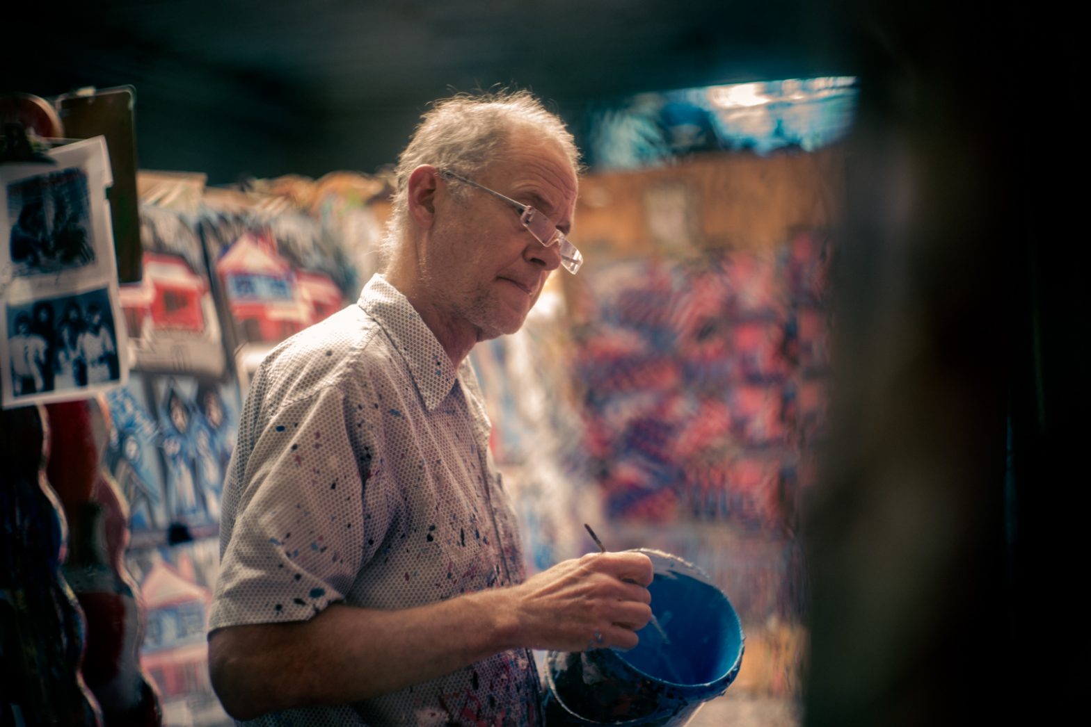
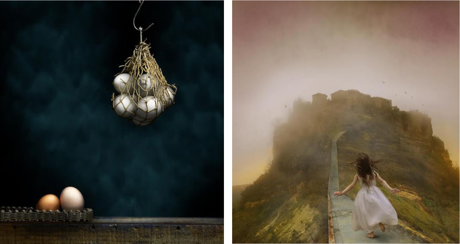
Fax Ayres enjoys playing with perception. This is evident in his transformation of ordinary objects into something special, and the playful shifting back and forth between reality and fiction that’s a recurring theme throughout his work. Photographing each piece incrementally, Ayres works on small sections, taking as many as 200 photographs to end up with the 100 good ones that comprise a finished image.

“I like the fact that they can appear to be paintings or photographs,” says Ayres. “I have a definite affinity for some of the Dutch painters who did those hyper photorealistic paintings.” 

To achieve the crystalline quality of his images, Ayres uses light painting. With the camera mounted on a tripod and tethered to a computer, Ayres holds a remote trigger in one hand and a small flashlight in the other. He opens the shutter and skims the light across the surface of the area he’s photographing, throwing the object into high relief. The shutter speed depends on a variety of factors, including the surface area size, how shiny or dull it is, and even how far away it is from the camera.

“I keep the shutter open with a manual count,” he says. “Then I close the shutter and look at the image to see if the highlights look right, if the texture of the surface is revealed in the way I want, etc.”

One can see the result of the process in the remarkable reflecting, haptic, and even emotional qualities Ayres is able to wrest from the ordinary, everyday objects he uses. To preserve the clarity of the work, Ayres has his images printed on smooth, matte aluminum.

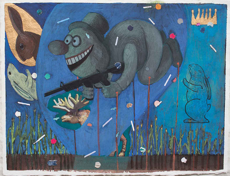
At first, “The Usual Suspects” appears to be a sober and imposing work, but then we notice a plastic monkey and parakeet amidst the oil cans, padlocks, and weights. It’s a delightful touch that disrupts the unrelenting browns and grays of old metal by adding color, humor, and frivolity.

In “Portal,” Ayres takes this levity further, creating a faux landscape of fake trees and grass, a dog figurine, and a macabre novelty lamp, all set within a car gear part that’s resting on an old-school style level. These functional objects, made from steel and wood, shine under Ayres’ exacting eye—their humble ordinariness transformed into beauty by proximity to the garish artificial scene they’re paired with.

Ayres steps outside the studio with the striking “Birch Trees” and “Pool Gates.” In these works, intense lighting and hyperrealism work together to produce a curious artificiality that adds drama and suspense.

In his allegorical photomontages, Tom Chambers captures the innate beauty of young girls in a way that exalts them while preserving their innocence. In Chambers’ hands, this central theme yields powerful images.

According to Chambers, “the photographs present something that is possible but not probable,” a land where girls rule (or at least have agency) and feral beings are safe. He photographs his subjects in the studio, while placing them within landscapes that tend to be rugged, northern coastal settings—the perfect foil for the tender girlish pulchritude depicted. 

In some images, the girls are either holding or interacting with natural beings—a wolf, birds, fireflies, which are in peril because of demonizing, loss of habitat, or pollution. In these mysterious tableaux, one has the sense that the girl is in control; a junior Mother Nature tending to and protecting her charges. “In each of my images, I’m going for my own expression of a feeling through telling a story,” he says. “I hope the viewer also connects in some way emotionally with his own personal interpretation.”

Chambers clothes his models in garments that sync perfectly with the timbre of the work. Their frocks, muted in color and style, have a timeless elegance about them that’s unusual and piques our interest. One girl, in a plain white shift, sports an arm in a matching sling. It’s unexpected and provocative, engaging the viewer’s curiosity and dispelling any whiffs of cloying sentimentality such enchanting subjects might arouse. Another girl wears a black and white checked dress that echoes the speckled hens at her feet. Still another wears pale pink, the same shade as the teapot she holds.

There’s an unmistakably elegiac quality to the work. The fragility depicted, whether of nature or young girls, is under constant threat. In these brave doe-like visages—serene, fearless, immutable—we see beauty certainly, but we also see strength. And yet, this strength is tempered by our understanding of the girl’s unequivocal vulnerability. It is this last quality together with the subjects’ patent goodness that makes them the ideal incarnation for humanity in these beguiling examples of memento naturae.

Categories
Arts Culture

Existential embrace

Though Sarah Lawson lives far from the coast in Nelson County, they have been keeping tabs on the climate crisis for some time now, following it internationally in the news, and even mapping the movement of a particular iceberg in Antarctica. At home, Lawson (a contributor to C-VILLE) has been monitoring the changes occurring in the creek that runs through their property. The land belonged to Lawson’s grandparents, so they’ve known this stream all their life and remember how it was and how it’s changed. 

Lawson’s show at New City Arts, “Salience, the sea,” addresses two different themes associated with the climate crisis. Mortality salience, meaning the knowledge that we’re all going to die, and also, the sea, or oceans and bodies of water generally—the flashpoints where the effects of the climate crisis are most apparent.

Lawson acknowledges the intrinsic sadness of the subject matter. “There’s a lot of unprocessed death and grieving I think we’re feeling as a society in response to COVID,” Lawson says. “I’m currently studying social work at VCU. A lot of studies about mortality salience talk about how, ‘Yes, it’s horrible, we’re all going to die. How could  there possibly be a silver lining?’ The silver lining, from a clinical standpoint, is that if you acknowledge this existential fact and embrace it, you can use that to really make the most of the time you have.” 

The larger works in the show are intended as a devotional on grieving, for what has been lost and what is to come. The smaller works started as part of a daily collage practice Lawson undertook when they turned 38 last February as a way of confronting their own mortality and staying in the moment. They titled this body of work using a numerical system: The first number is the chronological order in which the piece was done, followed by days in the year, followed by Lawson’s age. Lawson typically did these at the end of the day, while processing what news they’d read, the work they’d done and other quotidian occurrences. Gathering together the accordion files where they kept clippings, sorted by color, pattern, and texture, they went through them to see what jumped out. Beginning with “a very loose gaze,” Lawson would sort through, creating a smaller stack of things they wanted to incorporate. “I allow my subconscious to move things around in a certain way, trying to be as light-handed as possible in determining what’s going to come,” Lawson says.

Collage appeals to Lawson because it’s finding meaning in something discarded. It’s also open access—anyone can collage. “Something as simple as scissors and a glue stick can really affect someone’s day, or how they view the world. I just love that. It’s a really simple, easy to access form of self-expression.”

In some works, Lawson highlights the imagery represented in various scraps of paper, with others they subvert what’s being depicted, pairing it with pieces of colored paper to produce more abstract studies (“23/365/38,” “20/365/38,” “108/365/38” (a self-portrait), “70/365/38”). With both approaches, the inspired arrangements are striking. 

Lawson will often use the same picture twice to create a mirror image. Sometimes, this is exact, as in “6/365/38,” where the heads of two fantastical beasts form a portal from which a hand extends. In other works, like “29/365/38” and “54/365/38,” they alter them slightly, retaining the original shapes and outline. 

When they incorporate the human form, Lawson does so with a big helping of witty surrealism. In “22/365/38,” a colossal Audubon-like bird is picking up, or dropping, cartoon figures from or into an Italian town. In “123/365/38,” a woman’s head and hand emerge from a fat tubular offshoot of a heart, framed by a spray of mushrooms. “59/365/38” presents two fastidiously turned-out 18th-century soldiers sitting primly astride a large airborne fish. The two disembodied eyes in “31/365/38” grab the viewer’s attention, as they seem adrift on a sea of matter that could be cellular, geologic, or elemental.

It’s hard to pick a favorite from Lawson’s visual bounty, but there’s something so captivating about “89/365/38”—the modern building placed in the midst of a woodland setting. Lawson cut out a circle in the center, creating a void in the midst of the sleek corporate exterior. It also has the effect of a giant mirrored disc reflecting the surrounding landscape, and creates the impression of space vacillating from foreground to background.

Considering one’s own death and the collapse of the natural world is pretty bleak stuff. But the richness of Lawson’s work, which does just that, suggests it doesn’t have to be. If we can be clear-eyed about the realities of our future, we can thrive even if that future is grim. “The overall macro level problems that we’re facing from an ecosystem standpoint are horrific, but if we ignore them it just makes it worse,” says Lawson. “Unfortunately, there’s no shortage of darkness, but I try to practice being more comfortable within that and using it as an impetus to imagine alternatives.”

Categories
Arts Culture

Color forms

For artist Janet Bruce, the forced isolation of the COVID-19 pandemic was an opportunity to turn inward, to seek solace in nature and delve into a deep exploration of color. Directing her attention to the color theories of Goethe and Eugène Chevreul, as well as modern and contemporary colorists, Bruce produced over 360 color studies. This extensive foray is recorded in both a binder thick with diagrams, notes, and photographs, and the astonishing 13- by 8.5-foot installation “Color Study: On a Southern Horizon,” which features 247 of Bruce’s color analyses in a grid arrangement. These provocative artifacts are on view at Les Yeux du Monde in Bruce’s luminous show, “Locus Amoenus.” Latin for a place of safety and comfort, the title references not just a physical place—in this case, Bruce’s studio and the natural landscape she inhabits—but also a state of mind.

Hard work and introspection is evident in Bruce’s thrilling “Tree,” in which she pulls out all the stops. Bruce uses pigment and brushwork to describe the effects of light and shadow and delineate the features of the landscape, like the shape and texture of the vegetation or the crooked progress of a stream, but also to impart a sense of energy. Lavender and white zig-zagging lines buzz across the surface with fervid exuberance. 

Bruce’s color choices and pairings are beautiful in themselves, but they also have a distinct veracity. This is notable in her treatment of sun versus sunlight. Low on the horizon, the sun has a golden cast, but when it hits the forest floor, Bruce adds green to yellow to achieve the peculiar, almost day-glo, effect of sun raking across moss.

“Tree” alternates between representation and abstraction. We perceive a woodland scene with foreground, middle ground, and background, while admiring the dazzling stew of pigment and gesture that roils across the surface and elevates an ordinary scene into an extraordinary painting.

The perfectly calibrated composition “All Four Seasons in One Day” draws on all of Bruce’s talent. Though a more abstract work, it shares with “Tree” a similar organization with a kind of Y shape taking the place of the central tree. Bruce balances the work chromatically with lavender passages in the upper left and lower right, and gray in the opposite quadrants. At the center, cinnamon and rosy purple converge to form the Y. A calligraphic swish of black meanders in and around its periphery, concluding in a squiggly flourish at the bottom. 

To say Bruce uses pale yellow and white to compose her sun does a disservice to the complex passages she comes up with. The eye causes these mélanges of hues to coalesce into an impression of a particular color, but make no mistake, the artist’s colors are the sum of many parts. To suggest wind-tossed branches fleetingly obscuring the sun, she adds flicks of paint—cream, pale green, and brown. Her rosy aura of rays staining the sky perfectly captures how the heavens look at sunset when it clears after rain. The pigment’s application throughout the work conveys the effects of weather and atmosphere—sheets of rain, blustery wind, raw temperature. Gray and lilac suggest a front pushing across the sky or the unrelenting gloom of heavy cloud cover. 

“High Sun Day” may be a small work, but it grabs your attention. The bold, yet lyrical brushwork and nuanced palette of yellow and a tantalizing green strikes the perfect chromatic and gestural chord. Within the tangle of yellow strokes, you can see the speed of application and get a sense of brush moving paint along the surface. The areas where the pigment is more thickly applied act like highlights, with the thinner areas appearing to dissolve into the background.

Bruce’s inspiration for her series “Four Seasons” comes from Nicolas Poussin and Cy Twombly—she embraces both the pastoral landscape tradition of Poussin and Twombly’s formal approach to materials and technique. Bruce has synthesized and distilled her seasons so that what we really get is sense memory impressions. Whether it’s winter’s frosted suspended animation, summer sun on greenery, a tawny scrawl suggestive of fall foliage, or the shimmering luminism of “Spring,” each painting summons up a distinct time of year through abbreviated means.

A handful of the artist’s “Materiali/Immateriali” prints hang in the show, but there are others available for viewing in the gallery’s flat files. These are well worth your time. Produced using color viscosity and silk aquatint (printmaking techniques), you can see the ravishing effects in the ink’s movement across the plate—drizzly in some places, vaporous in others—as well as the riveting interplay between the different hues. 

Like so many of us, Bruce had very different plans for 2020. According to gallery director Hagan Tampellini, Bruce had been accepted into the Virginia Center for the Creative Arts residency program in Auvillar, France, but due to the pandemic, the program was canceled. Undeterred, she moved on to plan B: finding her locus amoenus in her own backyard.

Categories
Arts Culture

Shared experience

Untrained and subject to the dual, almost insurmountable, constraints of economics and Jim Crow, the artists on display in “Of Another Canon: African American Outsider Art” at the Jefferson School African American Heritage Center possessed a creative fire. Despite cruelly stacked odds, Mozell S. Benson, Rudolph Bostic, Bessie Harvey, Anderson Johnson, Mary Proctor, Bernice Sims, Jimmy Lee Sudduth, Annie Mural Tolliver, Mose Ernest Tolliver (aka Mose T), and Ruby Williams persevered in their art, creating work that brims with raw authenticity, joy, and passion.

With the show’s title, the curators place the work, from the collection of Richard and Ellie Wilson, in its own alternate, yet equally valid canon to that of Western art history. They also raise questions about the term “outsider art.”

While it’s a generally accepted way to refer to art made by self-taught artists who operate outside the traditional art world, in this case, the work speaks not just to the individual artist’s experience, but to similar experiences shared by a large group of people. It was a 1982 exhibition at the Corcoran Gallery, “Black Folk Art in America, 1930–1980,” that played a significant role in elevating the art of self-taught African American artists and creating a market for their work. Nearly all the artists represented in this show are now featured in major museum collections. Mose T is widely known, and Williams, who sold her paintings off the back of a truck along with her produce, was the subject of an extensive New York Times obituary in August of this year. With this recognition, I wonder if the artists benefited in any substantial way from their artwork. It’s likely they did not, but it gives me hope that other, similar artists coming up behind them will.

Entering the gallery space, the eye is immediately snagged by Williams’ electric “Piano Playing Cow I Give Better Buttermilk.” I’m betting Picasso, who reputedly once said, “It took me four years to paint like Raphael, but a lifetime to paint like a child,” would envy this odd-footed orange bovine sporting black and white keys running along its back and a toothy, mask-like face. Nearly as riveting, “Ms Bonnie Bon Bonnie with Purse” is a simple composition made exceptional by her weird and wonderful hands.

Mose T, Sudduth, and Johnson share a similar approach. For the most part, they rely on vibrant color and bold shapes to render figures against flat expanses of pigment or just plain plywood—as in the case of “Self-Portrait with Willie Mae.” T’s sophisticated sense of color and composition is laid bare in this painting and in his “Portrait of a Woman with Baby.”  A similar sensibility is echoed in the work of Sudduth, who used a combination of house paint and mud from his yard to create his jaunty self-portrait, and his likeness of a girl sporting a stylish hat and holding a violin. Annie Mural Tolliver (T’s daughter) and Sims take this approach and expand it into spiritual and narrative directions. Tolliver’s stylized “Garden of Eden” employs a dramatic palette and striking arrangement of forms, while Sims’ “Edmund Pettus Bridge,” painted from memory (as was all her work) with childlike simplicity, is made more powerful knowing the artist was an eyewitness to the seminal event.

Harvey’s “Garden of Eden,” the only sculpture in the show, is made from a tree root. The label describes how root sculpting plays an important role in African American vernacular art. Here, Harvey daubs paint across the surface, and uses the longest root for her serpent. It seems to veer like a malevolent tube man toward the viewer. Harvey takes advantage of a knob in the wood to form the nose, adding stuffed animal eyes surrounded by painted lashes, a row of pearls for teeth, and a jaunty orange earring. This almost human face is creepy, thanks largely to the teeth, with a totemic quality that suggests a spiritual purpose.

Bostic’s “Egyptian Scene” and “Garden of Eden” take us even further into visionary territory. The first, a tondo painted on the cover of a flour container (Bostic worked at a baking company), is studded with Egyptian iconography that identifies the reclining figure as a dying pharaoh. Bostic mixes his colors to add volume and highlights, and to produce a range of hues that tend toward the richer jewel tones. Indeed, the works, with figures outlined in a Sharpie, resemble stained glass. The second painting, on a rectangular piece of cardboard, features an ornate composition, chockablock with the wonderfully rendered animal and human cast of the Judeo-Christian origin story. Bostic tops it off effectively by creating a trompe-l’oeil gilded frame with yellow squiggles on a black border.

Other artists also used materials that were at hand and free—odd bits of plywood, leftover house paint, a tree root, or worn-out clothes. Though employed out of necessity, these humble materials have a grittiness that add both visual and emotional weight to the work. In addition to information about the works, the accompanying labels also provide brief accounts of the artists’ lives. They were universally challenging, rife with enormous obstacles. And yet, from these terrible circumstances art was produced—a vital outlet for the artists and a record of their existence. It’s an extraordinary testament to the creative drive and to the resiliency of the human spirit.

Categories
Arts Culture

Stretching the canvas

“One of the best things about collaborating with another artist is I learn a great deal about the other person’s sensibility to materials, aesthetics, and mark making,” says artist Diego Sanchez. His work is currently on view at the Quirk Gallery, together with fellow Richmonder Mary Scurlock.

In “Conversations,” each artist has eight paintings on display, which give the viewer enough information to understand and appreciate the artists’ individual approach and style, while providing a key, of sorts, to the intricate dance of give and take apparent in the 10 joint pieces. The artists worked in layers, on top of one another’s contribution, exchanging paintings back and forth three to four times, keeping a tally in pencil on the back of each work. 

Looking at the individual pieces, you might not put the two artists together. Sanchez favors bold color and geometric shapes, while Scurlock prefers a more streamlined palette and blurred edges. But spending time with their paintings, you begin to see that both artists employ a similarly diverse selection of media, and devote the same attention to developing their surfaces with layers of paint, wax, and paper.  

Sanchez’s paintings are hung in the front part of the gallery, where the Quirk’s soaring space can easily accommodate their exuberance. Scurlock’s are in the back, where the ceilings are lower in a quiet, more meditative area that suits these contemplative pieces.

One marvels at all that’s going on in terms of color, composition, and medium in a work like Sanchez’s “Composition #151.” The easy allure of turquoise and cobalt is tempered and elevated into something much more sophisticated by passages of dun and gray. The rectilinearity of the overlapping planes is subsumed in places by broad brushstrokes. Perfect orbs of blue dance across the surface, encountering more amorphous circular shapes. Partially obscured targets are “visual representations of ‘centering,’ of being mindful and present in our busy lives,” says Sanchez. They also summon Jasper Johns, an artist Sanchez admires, as does the mini crosshatch rectangle. Sanchez makes this his own by seasoning it with calligraphic scrawls of black and an odd tawny blob. Near the center, a lavender pastel rectangle dotted with burnt-orange dots more than holds its own against the more saturated passages.

“Composition #141” has a completely different effect. Here, it appears Sanchez has scraped off the background paint, leaving behind an expanse of fractured lines reminiscent of ceramic crazing. Whether it’s the light hue, or the network of lines that turn this flat expanse into a topographical map, the background appears quite distant with the strange shapes rendered in aqua, gold, and burnt sienna, floating above.

You might think it would be hard to compete with all the bright color and bold marks at the front of the room, but Scurlock’s paintings have a slow-burn heft and a presence that really gets under your skin. She relies heavily on the use of rubbings in her work. Instead of headstones, she goes after things like manhole covers, signs, and inscriptions, or even natural items. It all depends on her surroundings and what she wants to capture and convey about it, because, as she explains, “The intention of these paintings is to create a feeling—a space that mimics a place.” 

Back in the studio, she begins by adhering old paper—letters or clippings she’s saved—onto her panels. She then applies color, followed by the rubbings. These are done on delicate rice paper and are transparent, so when they are embedded in the surface they’re still legible. “The way I work, you put one thing down and something else changes, then you have to change that area so it works with the other area,” says Scurlock. “So, it’s hard to save things. But even though you can’t see them, they’re there. The idea is still there.” 

In “Ydra,” your eye is drawn to the graphically bold Greek lettering, especially the delta and zeta at center right that stand out against the vaporous clouds of pigment. There is the suggestion of houses on a hillside, evoking a Greek village. But it’s fragmentary, obscured here and there by blotches and daubs of shimmering paint. Similarly, incised lines and scratches form words or shapes, but they’re disjointed and incomplete. Just as memory does not present a perfect image, Scurlock intentionally renders this Saronic island in indistinct form.

With “Hatteras Village,” Scurlock introduces faded pink and dull green into the mix. Here, the composition is flatter, reflecting the topography of the subject. Again, we see bits and pieces, the eaves of a house possibly in the upper left, writing at the right center, and various circular shapes and squiggles scrawled across the surface.  

Within the collaborative pieces, you recognize the distinctive traits of each artist. There’s the color and geometric forms favored by Sanchez, but they’ve been softened, their tones and edges blurred by Scurlock’s hand. In doing so, she disturbs the integrity of those shapes and hues, shifting the timbre of the work to something more tenuous and uncertain.

Many artists would balk at the idea of letting go of a piece they’ve labored over and offering it unconditionally to another to augment as they wish. But the exercise can be remarkably rewarding, introducing new techniques and approaches, and producing exciting collaborative work.

Categories
Arts Culture

Conjuring the curriculum

With the series of paintings that make up Kristopher Castle’s engaging show “Curriculum Vitae” at Phaeton Gallery, the artist explores Thomas Jefferson’s Academical Village and his innovative ideas for education. As the title suggests, the exploration is not a discourse on the UVA founder’s achievements, but rather the artist’s deeply personal relationship to Jefferson’s ideals and his university.

Quorum Pars Fui (“Of which I was also a part”) pays homage to that. In the work, a disembodied hand, Castle’s own, holds the end of a diaphanous ribbon that weaves through the colonnade that runs along the top of UVA’s Lambeth Field. A metaphor for Castle’s life, the fabric references his close ties not only to Lambeth, where he spent the summer of 2001 working at UVA’s costume shop during the Heritage Repertory Theatre’s season, but also, the larger university and Jefferson himself. That summer was a seminal experience for Castle, introducing him to Jefferson and his university, and charting the course that would eventually lead Castle back to the area to live.

Initius (“Commencement”) revisits the fabric of life motif. Here, the fabric’s tail can be seen at the far end of the colonnade that runs along the side at the base of the Rotunda. It’s fluttering away from us, about to leave the Academical Village to commence its existence outside those hallowed walls.

Ab Eo Libertas A Quo Spiritus (“The spirit comes from him from whom liberty comes”) updates the seated statue of Jefferson from the west side of the South Lawn, so that he is shown having just broken a tiki torch across his knee. The allusion is to the assault on the university that occurred in 2017, when protesters wielded these hitherto benign objects in an action that recalled Nazi Germany’s torch-lit parades, albeit with a Walmart touch. Jefferson’s left foot rests on volumes of Locke, Rousseau, and Montesquieu, all major figures of the Enlightenment. This movement, so influential to Jefferson (and other founding thinkers like Thomas Paine, Benjamin Franklin, James Madison, and John Adams), featured rationality and knowledge as its basic tenets.

Castle performs a similar treatment on George Washington in his version of the statue that sits on the east side of the Lawn. Exitus Acto Probat (“The outcome is the test of the act”) depicts Washington covering the Washington Monument, a phallic symbol representing the American patriarchy, with his cape. Castle places tomes by Foucault, Derrida, and Marx—all of whom, according to Castle, would “celebrate [a] critical and punitive reevaluation of [Washington’s] efforts”—at the base of the statue. They are teetering precariously, held in place by Washington’s cane, suggesting he is tolerating them despite their criticism. With this iconography, Castle reminds us of Washington’s integrity. Committed to the freedoms laid out in the First Amendment (freedom of religion, freedom of speech, freedom of the press, and the right to protest peacefully and petition the government), Washington led selflessly—twice renouncing absolute power. These are important considerations in both assessing Washington’s record, as well as the current events surrounding the 2020 election and January 6.

Inexplicabilis Libertas (“Illimitable freedom of the human mind”) alludes specifically to Jefferson’s vision for his institution of higher learning. For Jefferson, the expansive vista of the Blue Ridge Mountains, once visible beyond the south end of the Lawn, was a tangible representation of the illimitable freedom of the human mind, which is why his original plan kept the area opposite the Rotunda open. It remained this way until Old Cabell Hall, designed by Stanford White in 1898, was erected. Castle paints the building as a transparent ghost of itself through which we can see the view Jefferson always wanted us to see. The nocturnal scene also includes Castle as a young man, exercising his own form of illimitable freedom in the form of streaking the Lawn, a time-honored tradition at UVA.

Omnium Curriculum Gatherum (“Gather all the history”) is arguably the apotheosis of the show. A quintych composed of five panels, the work gives Castle plenty of room to depict Jefferson’s vision for the Academical Village made manifest in both its educational and physical forms. In his rendering, Castle makes it clear that his vision is not sealed in amber, but is changing and flourishing—a fundamentally viable and timeless approach to education and society that has bent, adjusted, and endured. 

Castle has a great time conjuring Jefferson’s original course curriculum (anatomy and medicine, fine arts, ethics and grammar, modern languages, zoology and botany, ancient languages, physio-mathematics, history and government, pure mathematics, natural philosophy, and law) with a diverse cast of human counterparts dressed in modern clothes. Castle’s professional experience as a costume designer comes in handy here in his selection of clothing and accessories that identify the various disciplines represented. His admiration for Jefferson’s architecture is evident in his detailed rendering of the Rotunda and pavilions I-IV, which feature respectively the Doric, Ionic, Corinthian, and Doric (again) architectural orders used by Jefferson with the intention of educating and elevating the student body. In the painting, the pavilions appear left to right: III, I, II, IV.

Rounding out the show are Castle’s riffs on the secret society emblems seen on various surfaces around Grounds. These delightful trompe l’oeil works of writing on brick play with the original symbols turning the esoteric into the often amusing contemporary reference.

Categories
Arts Culture

Identity and magic

It feels like Carnival time at Second Street Gallery. Megan Marlatt’s vibrant paintings and eye-popping big head sculptures are on view and the space sings with boisterous energy. Festival themes loom large in her show entitled “Mummers,” and though Carnival doesn’t officially begin for a couple of months, its fall equivalent is happening right now. As we head into winter, we celebrate seasonal change with Halloween and Día de Muertos, which, like Carnival, feature magic and costumes.

For an artist like Marlatt, who has built her career as a painter, her big heads may seem like a departure, but from the moment she first saw a capgrosso (“big head” in Catalan), she was smitten. Her fascination prompted her to travel to Spain in 2010 to learn how to make capgrossos from renowned folk artists Ventura and Hosta. 

“Through the big heads, I became very interested in the rituals of European carnivals,” says Marlatt. In 2018, she returned to Europe, this time to Belgium, where she studied Carnival culture at the International Carnival and Mask Museum.

“In Binche, Carnival participants carry little brooms, which they use to sweep the ground,” says Marlatt. “They’re sweeping away the evils of winter to make way for spring. If they don’t do this, winter will never go away. In Bulgaria, they use sticks to beat the ground, waking spring up. 

“These are pagan rituals adopted by the church. So Lent … coincides with the time when food supplies would be running low. When Carnival occurs, it’s not yet spring, the vernal equinox hasn’t happened. It’s the in-between time when it’s not one thing or the other, and it’s during this liminal period that magic happens.” 

Transition is not just evident in the shifting in-between-time, but also in the act of donning a mask and changing one’s identity. For Marlatt, this is a powerful exercise in empathy. “What I love about masks (and big heads) is they‘re empathetic,” she says. “They erase age, species, race, gender. They allow you to play at being someone else, get inside their skin and empathize with their lot.” Marlatt explores these ideas further in her paintings of Wysteria Ivy, who, as a drag queen, both occupies a transitional space and assumes another identity.

On display are both animal and human heads—there’s a hare, a rooster, the Belgian painter James Ensor, sisters Salt and Pepper, and even a heavenly host of angels. Instantly appealing, the heads seem benign at first. But there’s something sinister and manic about them. Marlatt employs the masks in various ways: some are one-offs that she uses in her Big Head Brigade parades and performances, while others, she incorporates into her paintings, where they sometimes appear as masks worn by figures. Some have entirely morphed into otherworldly creatures.

With its vivid palette and striking imagery, “Wysteria Ivy and the Woodland Creatures” is a captivating and glorious work that presents its subject lounging odalisque-like on a picnic table within a covered shelter. Perched astride the roof, a grinning red bunny sports track shoes, while two mischievous mice tiptoe around the sides of the structure. Marlatt conveys the atmospheric elements in the painting with complete authenticity, which anchors the work in reality. 

We are coaxed by familiarity into accepting the fantastical elements as Marlatt creates a space of transition between reality and fantasy using ordinary references—the table and shelter and the familiar clothes her animals wear root the picture in the here and now. She performs a similar thing with her big heads, which each sport some real item—a crocheted hat (made by local artist Eli Frantzen), a scarf, or a bell—all of which enhance their immediacy.

“Near Gloaming” offers a crepuscular yin to the sunny yang of Wysteria Ivy back at the picnic grounds. The two paintings are the same size and each feature spindly trees that rise across the picture plane in dynamic vertical rhythm. Here, the fairy tale forest is alight with fireflies. Wysteria Ivy, holding a sunflower, crouches on the ground, gazing at the viewer warily. Disturbing the idyll, a figure wearing a hare mask stands to her right. Smudges of lemony paint between the trees suggests the sun’s last light, blurred by misty air.

In these two paintings, Wysteria Ivy is painted outdoors—an unusual place for her to be. According to Marlatt, Wysteria Ivy assumes her persona only in the safe space of her bedroom, interacting with the outside world exclusively online. In Marlatt’s version, she is able to step outside her protected realm and roam free.

While she acknowledges that her work possesses surreal elements, Marlatt resists being classified as a surrealist. Perhaps magical realism is a more accurate description of an artist who feels “the world is full of mythologies and miracles.”

“Those who would follow a hard stoic line of practicality and logic are just fooling themselves,” says Marlatt. “They think they’re above mystic thinking, but then often they acquire a drinking problem for all their logical realism. They believe they can get rid of mythology in their life, but all we really can do is replace one mythology with another.”

Categories
Arts Culture

An artist’s perspective

Lincoln Perry has been a prominent figure on the Charlottesville art scene since the mid-1980s. An acclaimed muralist with significant work in landscapes, figurative paintings, and sculpture, Perry’s murals grace walls around the country including the Met Life building in St. Louis and at the University of Virginia. “The Student’s Progress,” in UVA’s Old Cabell Hall, follows the journey of a fictional student named Shannon from her undergraduate days into her adulthood when she becomes a professor at the university. Consisting of 29 panels, the piece took 16 years to complete.

Perry first visited Charlottesville in 1970, and returned 15 years later to fill in for Philip Geiger, teaching drawing for a semester at UVA. It was during this time that he met his wife, author Ann Beattie, who was also teaching at UVA. After about a decade, the couple left Charlottesville, but returned in 2001. Both held teaching positions until 2012. They now divide time between Maine, Virginia, and Florida.

 C-VILLE caught up with Perry in Maine, where he was fresh off an interview with the local NPR affiliate, to talk about his new book, Seeing Like an Artist: What Artists Perceive in the Art of Others. He will discuss the book at New Dominion Bookshop on the Downtown Mall on Saturday, October 22.

C-VILLE Weekly: I think of you as a painter. Have you always written?

Lincoln Perry: No, in fact, I just came across a notebook I kept in 1981 that’s really badly written. So, somewhere along the line, I think maybe from living with Ann, I must have improved.

I was struck by the quality of your writing. There are numerous beautifully written paragraphs—I loved, in particular, your descriptions of the Bruegels. I also liked the way you integrated modern references and popular culture into your writing, it struck me as akin to what you did with paint in the Cabell Hall mural.

That’s actually interesting. I hadn’t even thought of that.

I would think your narrative talent would serve you well helping you
conceive of murals.

Yes. I wish I could do more of them. The hard part is getting the job. I was just a finalist for a courthouse in Alabama. It would have been fun. I enjoy the external collaboration of projects like that.

Are you continuing to write, and if so, how do you balance that with artmaking?

I can only paint for so long and I can only sculpt for so long, or draw for so long. Writing is a way to fill in the chinks between those other bricks.

I love the way the little sketches included in the book make us see the art through your eyes and pay attention to what you are looking at.

Some part of me thought I should make them more diagrammatic, but then I decided that doesn’t do justice to the things, so, I did my best to do copies.

What are you looking for when you look at art?

The book was originally going to be called Stealing from Museums, but the trouble was they thought it would be put in the crime section. But that’s really what it’s about—how painters and potentially non-painters learn to see in different ways. I think a lot of people are intimidated by visual art; they think there’s something they’re supposed to be getting. It’s a visual experience first. Let it wash over you and take pleasure in it. The idea is not to be intimidated or exhausted. It’s best to see some things well as opposed to trying to see everything. When I first went to Italy, I had one of the Blue Guides and I thought, because it was in the book, I had to go see it, and it became insane. Eventually, I realized that you can get more out of less.

I didn’t realize, until I read the book, that you sculpted. Is that something you’ve always done?

That started about 30 years ago. Difficulty interests me. Making a sculpture that’s legible and enticing from 360 degrees as opposed to, say, one view or two views is really difficult. About three years ago I started carving marble, which is ridiculously difficult. It’s almost too much: I feel like, c’mon, I’m too old for this. The stuff weighs a ton and is hard as a rock. But it does make me realize I spend at least as much time in museums looking at sculpture as I do paintings. They have to be seen in the round and, as I say in the book, you really have to be there in “the presence of” in order to read them properly. Which is also true of paintings, more than people know.

Describe a dream art-viewing trip.

A dream trip would be returning to the Villa Valmarana ai Nani in Vicenza, Italy, to see the Tiepolo frescoes. I also want to see Naples again because of the museums there.

As a successful creative person married to a successful creative person, how do you give equal opportunity to your respective practices?

Well, I read everything she writes, but not until she feels it’s done. It’s harder for me to lure her into the studio. She has a very good eye, but she’s really more interested in photography; she takes beautiful photographs—I think she should publish them. Painting’s a little mysterious to her and she wishes I wouldn’t carve marble because I’m getting old and I’ve got arthritis and she wonders what I’m doing this for. I totally respect what she does. I enjoy writing these essays but I cannot imagine writing fiction, and she can’t imagine painting. I suppose there are happy marriages among two painters or two writers, but in our case, it works well that we’re in different fields. 

Any upcoming exhibitions?

I’ll be in “Home and Away,” organized by Robert Stuart at the Beverley Street Studio School Gallery in Staunton, which runs from November 18 to January 2.

I hope the last line of the book sums it up. (“This isn’t the anxiety of influence; it’s the joy of influence.”) This is all supposed to be about the joy of influence. Rather than feeling oppressed or confused or intimidated by our tradition, we’re allowed to love it and enjoy it because it’s beautiful. It’s something we’ve done as humans that we can actually be proud of.

Categories
Arts Culture

Keen on Keene

If you lived in Charlottesville in the early ’90s, you’re probably familiar with Steve Keene’s art. Keene worked as a dishwasher at Monsoon Café, which opened on the Downtown Mall in 1992, and owner Lu-Mei Chang gave him free rein to paint the walls, tables, and chairs.

Chang’s early efforts to promote Keene are immortalized in an essay by her daughter, Elle, which appears alongside terrific pieces by Sam Brumbaugh, Shepard Fairey, and Ryan McGinness, among others, in The Steve Keene Art Book, produced by Daniel Efram.

Efram spent six years gathering material from art collectors, friends, and associates of Keene’s to create this comprehensive survey of his career. The book comprises 265 pages, over 200 of which are images of Keene’s work drawn from more than 600 submissions from around the world.

Spencer Lathrop of Spencer’s 206, a funky second-hand CD purveyor and coffee shop that was situated on the ground floor of what is now Common House, was an early Keene promoter. At Lathrop’s comfy, casual, and authentically hip establishment, you could browse the selection of used CDs, or get a coffee and sit in one of the mismatched chairs by the plant-filled window.

Along with the coffee and CDs, Lathrop had bins of Steve Keenes for sale. In nice weather, he’d move the bins outside with an honor system box where you’d slip in the money. The paintings, almost always on plywood panels, cost a dollar, sometimes two.

Daniel Efram spent six years gathering material from art collectors, friends, and associates of Keene’s to create The Steve Keene Art Book, a comprehensive survey of the artist’s career. Photo: Daniel Efram.

I was drawn to the unusual flickering quality of the paint and arresting subject matter paired with enigmatic titles. And the price was right. As I filled up my arms, shelling out the requisite bills, I didn’t think much about the work beyond its aesthetic appeal (which has held fast all these years). I was not alone. You began to see Steve Keene paintings popping up all over Charlottesville. To paraphrase Keene, it was bleeding into the landscape. “I was obsessed with leaving a mark, leaving a trace of me,” says the man whose goal was to be the Johnny Appleseed of art.

After his wife, Star, finished architecture school, the Keenes left town and the continuous supply of paintings dried up. The couple had been immersed in Charlottesville’s music scene and had UVA student friends who’d go on to form the bands Silver Jews and Pavement. In New York, they were swept up into the burgeoning indie music scene. “The music world was my world,” says Keene, 64. “That was our community, and so my art kind of mirrored that community.” The Steve Keene Art Book captures the era’s atmosphere with vivid descriptions of the Threadwaxing Space, an alternative art and live music venue in downtown Manhattan that “was regularly packed with Keene’s bright, inexpensive paintings, and everyone bought one—or five.”

While continuing to make his art, Keene worked with musicians on album covers and merch. He also continued painting portraits of album covers, an ongoing project commenced during his days as a DJ at WTJU. As the book points out, Keene has always painted pictures of pictures, or more precisely, pictures of the simulated world, selecting images that were designed to be seen. Knowing this, you can see the particular appeal of album covers.

It’s tempting to label Keene’s work as outsider art or visionary art on account of its DIY, raw, manic quality. But Keene holds an MFA from Yale (he went to VCU for his BA). Far from being a naïve artist, Keene incorporates conceptualism, installation, and performance art into his work. His low prices and enormous output is a revolutionary act, defying the established art world with its preciousness and “the ‘pickled’ coolness” of its denizens, ensuring that his art is accessible to nearly anyone. To date, Keene has produced over 300,000 paintings. But for the artist, it’s been one big painting. “The individual plywood panels are just puzzle pieces that together make up one great masterpiece,” he says.

Keene’s Brooklyn studio is a large cage of sorts, constructed of cyclone fencing that provides 80 linear feet in which to work. He paints assembly-line fashion on plywood boards hung in multiples on the fencing, producing the same image simultaneously. 

Photo: Daniel Efram.

He moves down the row adding the same dab of paint until he reaches the end. Going back to the beginning, he takes another color and repeats the cycle, over and over until the group is completed. Though the image is the same, the works aren’t identical; variations occur as he goes down the line. 

He paints eight hours a day, five to six days each week. It’s physically demanding and obsessive. On an average day, Keene runs through five gallons of latex and acrylic paint and produces about 50 works. “It’s like making a hundred pizzas or a hundred birthday cakes at the same time,” he says. And when he finishes painting, the job’s not done—Keene packs and ships about 18-20 orders each week.

Though he’s garnered plenty of attention, with museum exhibitions in Cologne, Germany, and Melbourne, Australia, as well as Los Angeles, Houston, and Santa Monica, along with appearances in Time magazine, The New York Times, The Wall Street Journal, and on NPR, Keene has never cashed in in the way art stars Damien Hirst and Jeff Koons did. His model of cheap multiples doesn’t support their kind of revenue. 

Keene is after something more enduring than money, and he may just achieve it. Certainly, The Steve Keene Art Book goes a long way toward elevating his profile and providing context for the prolific artist.

Keene considers the demand for his work an affirmation and enjoys hearing where his paintings end up, such as the late Dennis Hopper’s L.A. bathroom, and in the hands of influential New York Times art critic Roberta Smith. 

Original Steve Keenes can still be ordered from his website stevekeene.com. For $70, he’ll send you a random selection of six paintings, sometimes more. There’s a backlog of orders, but knowing Keene’s character and workmanlike approach, you’ll get them eventually.

Categories
Arts Culture

Joys and sorrows

Polly came into this world an artist,” says Carol Grant, speaking about her daughter Polly Breckenridge. “It was apparent from a very young age that she loved creating things out of whatever was available to her. That was her joy.” 

Breckenridge, who died unexpectedly on April 22, 2022, is the subject of a memorial show at the McGuffey Art Center.

Deborah McLeod, director of Chroma Projects Art Lab, says of Breckenridge, “Polly’s work came from an honest and personal place deep within her psyche. She was a bright and perceptive figurative artist who painted the truths of her own life; her struggle as a deeply sensitive young woman constantly coming to terms with what that meant. She depicted the release of joy as often as she painted the confinement of sorrow. She knew both and she gave them to us delicately and with beauty.”

Born on May 4, 1975, in Towson, Maryland, Breckenridge was a graduate of VCU’s art education program. She was a resident artist at McGuffey Art Center and exhibited her work frequently. In addition to her own art practice, Breckenridge was a beloved art teacher at Village School and Walton Middle School, where she taught for nine years.

She incorporated a wide variety of materials and techniques into her work—acrylics, watercolor, inks, and printmaking, or gold leaf, mirror, and glitter for added zing. “She reached for whatever she felt would do the job,” says Grant.

The McGuffey show consists of paintings, drawings, monotypes, artist’s books, and an assortment of journals, doodles, and notes positioned on a kind of altar. “Monotype Play” comprises a light box and cut-out images that Breckenridge used to create her monotypes. Visitors are invited to make their own arrangements. 

“The Collector”

Breckenridge was concerned with the human condition. Her many subjects seem to be grappling with an enigmatic situation or force beyond their control. There’s alienation, but also connection. Though obviously human, her curious, attenuated figures are featureless, without faces, gender, or even race. Breckenridge wanted to eliminate these distinguishing factors, so that anyone could identify with them. 

This inclusiveness and connectivity are underscored by the recurring mesh or bubble-like motif that skims across figures and surfaces in numerous works—most obvious in “Catch and Release” and “Stretch.”  Composed of many circles (individual circles also appear often in Breckenridge’s work), the mesh suggests energy, or aura, magnified by repletion. It emanates from and encompasses the figures like a net connecting all living things. 

Despite her figures’ stylized appearance, Breckenridge’s compositions reveal a deep understanding of how the human body works. This is apparent in “The Collector,” where the eye is drawn to the legs, knees, and wonderfully individualized feet rendered with ease. A striking painting, Breckenridge relaxes her perspective so the figure seems about to be dumped out from the splayed chair, and pairs a deep carmine background at the bottom with acid green and white stripes up top. These elements strike notes of discord that set the emotional tone of the piece. The subject, whose head is disproportionately small, is holding what appears to be a gold-filled purse in the right hand and a figurine in the left, perhaps weighing one against the other. 

Another figurine lies discarded on the floor, and three others—two standing and one about to fall—are positioned on a blue-draped table. It’s unclear whether these are objects, or meant to represent people, or, perhaps, souls.

At the bottom of the piece, Breckenridge’s distinctive mesh appears to emanate from the head of the figurine on the floor, traversing up the central figure and continuing to the upper edge of the painting. It’s as if this figurine’s gilded disc has burst, leaving behind a trail of golden effervescence.

Breckenridge wrote prolifically. Only a small number of the many journals and sketchbooks she produced are on view, but they provide a fascinating window into the creative process and Breckenridge’s outlook and state of mind. She wrote freely, not expecting others to read what she wrote. “It’s the way she processed, the way she thought,” says Grant. “In her sketchbooks, her writing overlaps her drawings; they move together.”

In one striking passage Breckenridge writes: “We are temporary vessels for the containment of pure energy and spirit. Things happen through us.” It provides insight into Breckenridge’s perspective, and is also an apt descriptor of her art, where her figures could be interpreted as vessels and the actual subject matter deals with intangible forces that exist beyond the physical. 

According to Grant, the printmaking process, which Breckenridge took up a few years ago, really resonated with her. “I think she was just at the start of something truly satisfying to her and her followers; a way of working that could bring together her love of the visual and her love of the written word.” 

A celebration of Breckenridge’s life will take place on Sunday, August 14, at noon at McGuffey Art Center. Cellist Catherine Monnes will perform, and the ceremony will conclude with Breckenridge’s signature gesture of giant bubbles—her own kind of effervescence—released to the sky from the front lawn of McGuffey.