Categories
Abode Magazines

Growing interest

Y

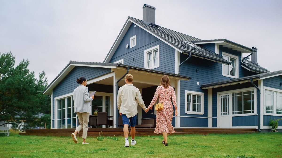
ou bought your house in 2021 with a 30-year fixed-rate mortgage at 2.5 percent interest. You sure were proud of yourself as you watched interest rates skyrocket over the past two years.

Now, you’d like to move. But with that honey of a mortgage, you start thinking. Maybe you want to rent out your existing home rather than sell it.

Buy-sell decisions are complicated and unique for every homeowner. But at least one local real estate expert says it’s pretty much a no-brainer, even in today’s economy.

“We almost always encourage folks to sell,” says Brentney Kozuch of Story House Realty. “Most people want to sell so they can tap into their equity.”

Still, Kozuch admits certain circumstances could make an owner consider becoming a landlord—at least in the short term. First, the real estate market has cooled since its red-hot streak a few years ago, due in part to the rapid interest rate hikes. Average 30-year fixed mortgage interest rates in Virginia were around 7.5 percent at the turn of the year, up about 300 percent from those historic lows around 2.5 percent. Those scary mortgages are keeping some prospective buyers on the sidelines. And with most industry analysts projecting that rates will soon begin to decline, some sellers are indeed electing to hold on to their properties.

Still, the macroeconomy offers no guarantees.

“From everything that we are seeing and hearing, interest rates will drop,” Kozuch says. “But that may not be in the spring. It might be something that doesn’t happen until the third quarter.”

Second, life circumstances can dictate outside-the-box real estate strategies. Folks planning a wedding, for example, might be looking to generate cash flow without tapping into their equity. Maybe the professional opportunity to be a landlord is just too interesting to pass up. Or perhaps the tax benefits of being a landlord suit your 2024 plans.

Third, seasonality drives many housing market considerations. “In winter, buyers have more purchasing power versus in the spring,” Kozuch says. “But, prices have not dropped in our area. Charlottesville is unique compared to the surrounding counties. Prices have stayed level and even peaked in some places.” 

For homeowners trying to decide whether to wait to sell, the strong market might be a reason to unload now. But even in a relatively hot market, historical trends show sellers will be able to get more out of buyers as the weather warms.

The reality, according to Kozuch, is that most homeowners aren’t in a situation where they can rent out an existing property and move into a new home to their liking. Most folks looking to move want an upgrade, and the equity in their home is simply a must-have as they go on the market as a buyer. 

Indeed, homeowners who bought in 2021 with a mortgage at 2.5 percent are likely to have some chunky equity. “At the end of the day, they want that equity, and in just two or three years, some people have doubled what they bought their house for,” Kozuch says.

Such an equity surplus can even help new buyers balance out the hit they’ll take on today’s elevated interest rates.

“Once interest rates have settled to 5s and 6s, it’s not going to be as daunting or scary,” Kozuch says. “But if you have that 2.5 and you have the ability to rent the home out, it can be a great investment. It’s hard for the seller to give that up. We are never going to see 2s or 3s again.”
Categories
Abode Magazines

In the mix

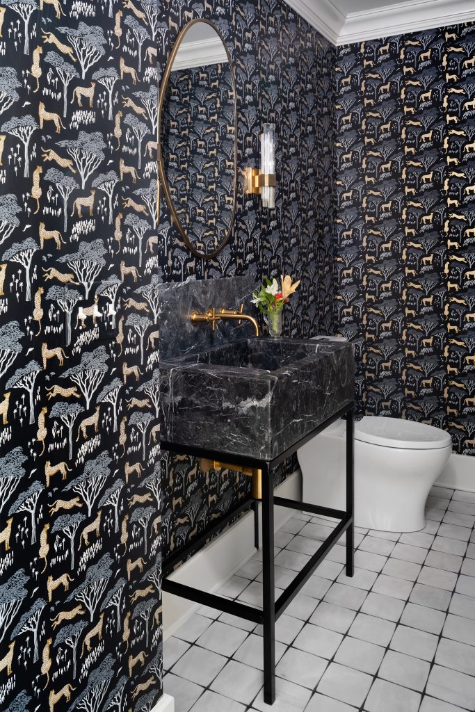
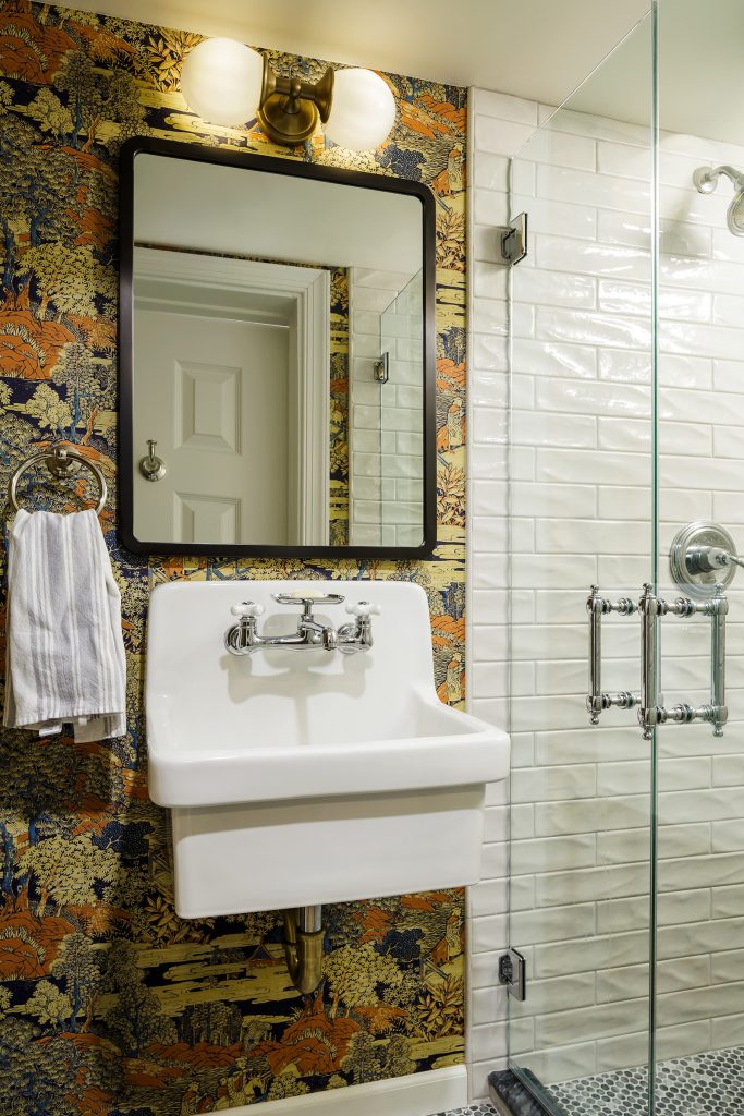
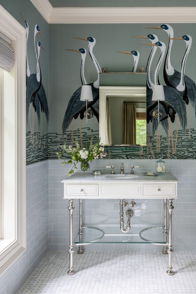
While a home’s public-facing (and public-gathering) rooms, like kitchens and dining areas, often call for more staid or timeless design, a powder bath—or even an ensuite—is the perfect opportunity to show a little personality. These three luxe loos (and their surprising wallpapers!) nailed the assignment.

Photo: Robert Radifera

Welcome to the jungle

This powder room off the home’s main entrance wasn’t part of the initial project, a whole house renovation in the Venable neighborhood, but Mandy Oliver, whose firm Oliver Falder oversaw the interior design, is so glad the homeowners changed their minds.

“We had great bones to work with,” says Oliver, who runs the business with her sister, Heidi Falder. “It was one of the most fun bathrooms we have done.”

And, to the designers’ delight, despite their initial hesitations the homeowners placed no restrictions or limitations on the design. They began by choosing the floor (sourced from Sarisand Tile).

“We were trying to find a wallpaper that held its own against it,” Oliver says. “When we suggested the one currently installed she immediately said ‘yes!’ It worked out beautifully.”

Photo: Lincoln Barber

For the trees

It’s not unusual for rooms to work double duty—guest rooms often are used as offices, dens take on a second life as playrooms—but this North Downtown basement bathroom had to take on three roles: bathroom to the guest bedroom and basement living area, as well as powder room fill in for the main level.

“Because of this,” says designer Betsy Kraft, “I wanted to ensure that it was punchy and bold but also highly functional.” The first step, given the poor shape the room was in, was ripping everything out and starting fresh. The minimal square footage proved to be a challenge, too (“originally the shower clearance was only about seven feet,” Kraft says), but Kraft worked with Peter Johnson Builders to finagle the shower casing and make the space a bit more roomy.

The showstopper, though, is the wallpaper. It was the colors that spoke to the homeowners, says Kraft. They loved that the orange and blue was a subtle nod to their alma mater, UVA. 

“They thought it was the perfect amount of whimsy surprise,” Kraft says.

Photo: Robert Radifera

Bathing birdies

Two decades ago, Dalgliesh Gilpin Paxton Architects designed a French-inspired home for a couple who’d lived in Paris. So when it came time for the current owners to renovate the space for their own needs­—to suit their active lifestyle, three teenagers, and two dogs—they turned to its original architects. 

The resulting addition comprises a primary bedroom suite, home office, guest bedroom, and adjoining guest bath. The guest bath, in particular, was one where designer Chloe Ball of Kenny Ball Designs, felt the family could do something a bit unexpected. 

“We wanted to create a fun vibe but still keep the space luxurious for guests to experience and enjoy while overnighting,” Ball says. “In Japanese culture, the crane symbolizes good fortune, longevity, and happiness. It’s considered a symbol of hope and healing as well. Perhaps this is the wish for all the guests who stay?”

Categories
Abode Magazines

The house so nice, they built it twice

Building and designing your dream home is usually a once-in-a-lifetime experience. Hours upon hours are spent researching and deciding on every detail, from where to store the KitchenAid to the right shade of white for inside the coat closet. If you’re lucky, you move in and everything is just as magical as you imagined. More likely, though, you’ll wish you’d done some things differently. After all, taste changes and hindsight is 20/20. 

So, what if you got to build your dream house twice? You could keep the things you liked, fix those pesky little problems, and drop any passé trends that old you loved.

Helen Kessler is so lucky. 

Kessler and her family moved from Norfolk to Charlottesville in 2016, when she built her first dream home, a modern barn-style dwelling. After living there for five years, the family decided to move. A piece of land popped up in Greenwood, they got an offer on their old home, and suddenly they had the challenge of building a new home from scratch in the midst of the pandemic with a tight deadline. 

Mitchell Shifflett of Evergreen Builders was brought on as project lead, and Kessler’s friend Kristin Cory as architect. The team got to work using photographs and drawings of the original home, and by summer 2022 the Kesslers had moved into their new one. 

Sitting neatly atop nearly 22 acres of the land, the dream house 2.0 is a sleek testament to the beauty of contrasting forms and materials. Dark, concrete composite boards in the shade Midnight Oil wrap the house, broken up by a wall of pale stone. The rich hues of the concrete seamlessly carry up to the gabled roof. 

“It’s a very sort of taut, minimalist feel to the outside,” says Cory. “There are minimal overhangs on the roof and minimal trim. Everything’s very clean.” 

More contrast can be found in the French gravel patio that leads from the driveway to the front door—a glass window that lets visitors see straight through the house and through the windows at the other end.

When the Kesslers built their first home, they decided to lean into the new-for-the-time modern farmhouse look. The home featured two stories, a flat roof section, an “H” shape, and a white exterior. Since then, the white farmhouse has certainly had a mainstream moment, so Helen looked to Europe for some fresh inspo. 

The new build—with its single story, “L” shape, and unique hues—is inspired by Suffolk barns found in the South of England and Scandinavian barn homes.

“It’s a Nordic kind of look and feel without it feeling too architectural or too cold,” Kessler says. “We did want it to feel like a warm and inviting, natural family home, not something that was really stylized and overly designed.”

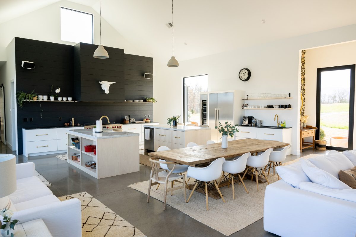
The doors open to an open-concept living, dining, and kitchen area, which at once feels minimal and clean, yet lived in and homey. Kessler achieved this by using a warm-toned white for the walls and a vaulted ceiling, clever lighting with dimmers (like the white resin antler chandelier by Kathy Kuo Home), and texture through rugs, overstuffed furniture, and pops of color. 

One way Kessler incorporated color and added depth into the space is through sparingly placed opulent wallpapers.

“I do love minimalism and that clean, Nordic aesthetic, but I also enjoy some of the richer, more dramatic English wallpapers that you get in some of the country homes,” she says. 

Though the front door opens right into the open living space, Kessler was able to create the feel of a separate foyer by papering a botanical wallpaper with flowers and bees on two walls facing each other right inside the door. The bathroom backsplashes also come alive with trippy wallpapers, like the kaleidoscopic pattern in the primary bedroom’s ensuite bathroom, and pink alligator print in the powder room.

In the kitchen, the cabinetry is kept entirely below waist-level, drawing the eye upwards to the dark soapstone countertops and a backsplash made from the same concrete boarding found outside. The center of the kitchen boasts two custom-built islands from local maker Mike Conway of Conway Custom Woodworks, topped with thick slabs of Carrara marble. 

Raw materials continue to make appearances in the restoration hardware table, and the radiant-heat concrete floors, which give an earthy feel to the space, and fun details, like a wood-burning stove from Malm, give the house a charming feel. 

“I think about, as an architect, what I would love to do differently with a project once it’s done,” says Cory. “That’s what Helen’s been able to do with this house. She lived in the old house, it was her dream house, and she had it exactly the way she wanted. Then she was able to do everything she wanted to do differently, and you can feel that.”

Categories
Abode Magazines

Organic luxury

The renovation of Keswick Hall gave new owners Molly and Robert Hardie a chance to rethink every aspect of the luxury hotel, including moving the resort’s spa from the members-only clubhouse to its own building. The result is a reimagined facility with more service rooms, a more private setting, easier access for hotel guests and the local community, and a whole new ethos.

The new Keswick Hall Spa takes full advantage of its setting on a side road away from the main hotel. While the building was designed by the same firm that did the resort’s renovation (Hart Howerton), its look and feel are completely geared to its “away from the world” identity, beginning with its exterior—warm fieldstone, dark seamed metal roof, and large windows, as distinct from the creamy stucco and terracotta tiles of the Italianate main complex.

Photo: James Baigrie Photography

“The materials inside and out were chosen to be reflective of the setting,” says spa director Molly Flora. The interior palette created by Howerton designer Philippe Gozlan echoes the greens, blues, and browns of the natural environment that’s visible through all the large windows. There’s even a meditation walk of tan gravel and slate borders set in the grounds nearby.

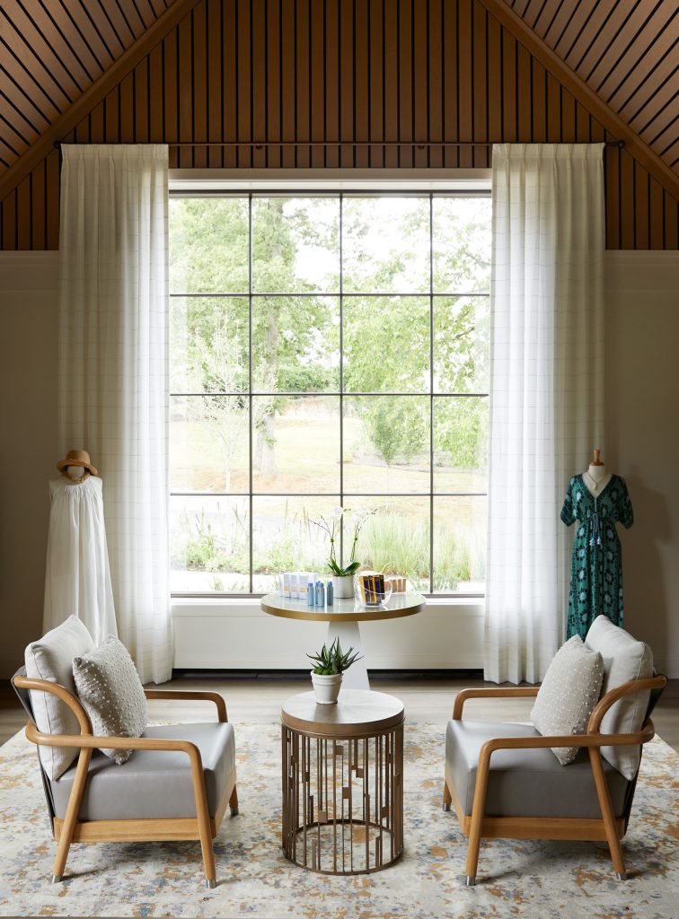
The entrance/reception area says “spa” right away—light filled, creamy neutrals and blond wood, soft chairs. For guests stopping by to shop, the boutique is just off the lobby. Big windows, a vaulted ceiling, and muted lights show off the skin and hair-care products—­“all organic and natural,” says Flora—plus sleep and lounge wear from local designer Gillian Valentine.

Across the lobby is a waiting area with manicure stands and private rooms for pedicures and hair treatments. Here too the setting is soft furnishings and carpets, toss pillows, calming blues and grays. The fabrics and art are natural themes, including several stunning depictions of flowers created by Richmond paper artist Daphne Lee. 

Patrons enter the service areas through the women’s and men’s locker rooms, where the hallways and bathrooms feature heated stone floors, smooth marble counters, muted lighting, and arrangements of fresh flowers. Both infrared saunas and steam rooms are available, as are individual dressing rooms for those who want privacy. Guests then emerge into an octagonal midnight-blue foyer with tiny lights like stars winking in the ceiling. Beyond, is The Overlook, where guests wait to be fetched for their individual services. 

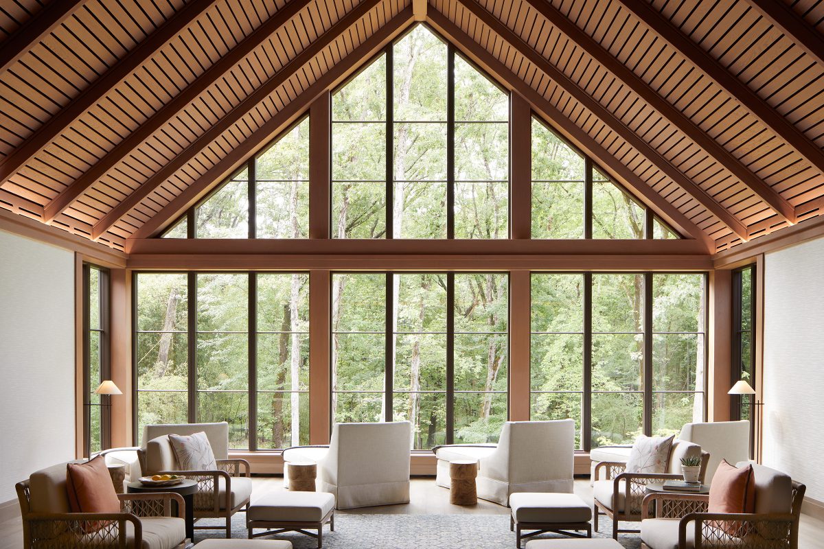
The Overlook is the heart of the spa. One end is a two-story window, as though guests are ensconced in the surrounding meadows and woods. Chairs with plump ecru and beige pillows and daybeds with lush blankets are positioned to take full advantage of the views. The walls are pale cream, with only a few nature-themed abstract art works; the vaulted ceiling is slatted wood paneling in a warm tan; the pendant lamps are golden teardrop-shaped glass. The abstract patterned area rug, manufactured in India, uses the same cream, blue, green, and gray shades as the ones in the foyer, waiting room, and boutique, “but each pattern is a little different,” Flora says. The hallways leading to the service rooms are screened by panels of leaded glass roundels. 

One of the benefits of creating a spa from the ground up is that the service rooms can be designed for the needs of both guests and service professionals. One room is specifically geared for couple’s services (with its own two-person shower), and another for ADA access. Every service room has those touches that make for a luxury experience—counters with plenty of drawers to keep products accessible but out of sight; wall panels that enable quick and soundless adjustments to lighting and music; a warming rack for the guest’s robe. The massage table’s face cradle is gel-filled “so you don’t get that pressure on your sinuses,” says Flora.

And, of course, there are fresh flowers here, too.

Categories
Abode Magazines

Good vibes

For a lot of us home-decor lovers, the bones of a house are sometimes the least exciting part. We give some thought to what windows will get the best light, and how we want the kitchen to flow, but it’s the finishing touches—patterns, colors, furniture—that make designing a house fun. 

Crozet couple Bob and Bev LoPinto have a different outlook. For them, good bones make a world of difference.

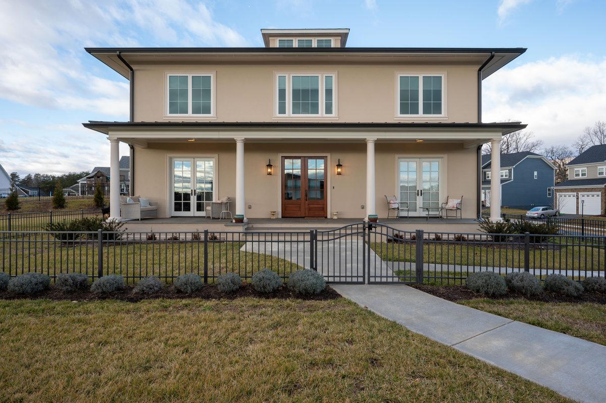
The couple started building their home in 2020. They chose Crozet to be close to family, and decided to do a custom build in a Stanley Martin community. Going custom was essential for the LoPintos, who wanted to build their house according to ancient Indian building principles that connect inner spirituality and social harmony with dwelling construction (think feng shui).

The principles go by various names, including vastu shastra (“structure science”) and sthapatya veda (“establishment knowledge”). It all roughly translates to the science of architecture, and it includes directives on orientation, placement, symmetry and proportion, and more. 

From the outside, you might not even be able to tell that the LoPinto home is steeped in such ancient traditions. According to Bob, that’s because surface-level design doesn’t really matter, it’s what’s beneath that counts. 

“I think there’s a lot of opportunity for personal preference,” says Bob. “We went with a Mediterranean, Italian-like stucco exterior for our house.”

It’s perhaps easiest to incorporate vastu into a new build where you have total control over all variables, but if you’re renting or buying, Bob says there’s one rule that’s most important to follow. 

“The most important principle of vastu and sthapatya veda is the orientation,” says Bob. “That it’s true east or true north, any other orientation is not ideal. The rest [of the principles] make it even better, but if one has a choice, look for true east and true north.”

The LoPintos chose to face their house east to take advantage of the nourishing influence of the rising sun. Connection to nature is another big part of vastu, and a lot of the rules are designed to help residents take advantage of the benefits of the natural world. 

Moving past the unassuming exterior, the house opens into a massive, two-story entryway atrium. While most atriums are grand, and meant to impress, the LoPinto atrium serves another, more intentional purpose. 

In the center of the atrium—in the very center of the house—sits a table with flowers, which marks the brahmasthan of the house. The brahmasthan refers to the “silent center,” which is where the intelligence of the house is believed to live. The space is meant to help distribute positive energy, and serves as another reflection of nature, mimicking the “silent” center found in the heart of a cell, a seed, or even a hurricane.

The rest of the house flows from the atrium, and features 10-foot ceilings, lots of symmetry, and plenty of natural light sources. All the dimensions are precisely calculated, and the LoPintos made an effort to be energy efficient and sustainable where they could by installing triple pane windows, a high-efficiency heat pump, all-natural wood flooring, and limestone details.

The kitchen can be found in the southeast corner of the house.

“As the sun goes through the sky, its highest point is in the southeast, and your largest meal of the day should be lunchtime,” says Bob. “So the orientation of the sun coincides with the peak of your digestion, it’s in synchrony with nature.”

If the LoPintos need to take a moment away from all the hustle and bustle, they head to the meditation room in the northeast corner, another area known for conducting good vibes. The 12×12-foot room features soft lighting, and has metal-clad wiring with a built-in power kill switch.

“The bedrooms and the meditation room are all built with power kill switches, so when you’re sleeping you can turn off all the outlets so there’s no electromagnetic influence,” Bob says.

The most notable part of the house is the lit cupola that sits atop the roof and glows different colored hues. A glowing cupola isn’t mandated by vastu—”that was for fun,” says Bob.

For the LoPintos, it’s a design they can feel. 

“You walk in and feel uplifted, not imposed upon,” says Bob. “I wouldn’t live in any other kind of house, and once you’re in it you won’t want to leave.”

Categories
Abode Magazines

Creating community

Dorothy Batten has traveled to some of the world’s most iconic places: the Galapagos Islands, Africa, New Zealand, and Indonesia. And everywhere she found that wildlife, ecosystems, and ways of life were endangered. But she’s taken to heart the dictum to start with your own backyard. Batten is turning Oakencroft Farm and Vineyard in Albemarle County into a showcase for sustainable agriculture, and hopes to foster both environmental education and action through her new venture, The Center at Oakencroft.

Photo: Virginia Hamrick

Batten has lived in the Charlottesville area for years, on farms and in town. With her sons graduated, she was looking to return to a more rural life when the Oakencroft property came on the market in 2018. Batten bought it—partly to protect it from development, she says, but also as a place to put into practice what she had been learning. The reinvigorated vineyard will be a showcase for sustainable wines, and the farm will be a model for regenerative agriculture practices. 

Her most ambitious undertaking is creating a place for community education and activation on a range of environmental issues. The Center will host knowledge-sharing discussions for local landowners and farm managers, meetings of conservation and climate action groups, and conferences on environmental challenges, from wildlife protection to habitat restoration and carbon sequestration. 

To redesign Oakencroft for its new mission, Batten called on H. Adams Sutphin of local firm Sutphin Architecture. She knew the work he had done for friends of hers, and she knew him personally because their sons played lacrosse together. “I wanted someone I knew would be a joy to work with,” Batten says. Sutphin, meanwhile, calls this project “the most collaborative” he’s worked on. (A Darden MBA, Batten also studied interior design at UCLA.)

Photo: Virginia Hamrick

Batten and Sutphin started with a reuse/recycle look at the existing buildings. The original Oakencroft Winery’s tasting room and winemaking space, created by connecting two cattle barns, was outdated—and far too large for the new, smaller winery operation—and it was sited right next to the farm’s pond, a perfect spot for the gathering space Batten envisioned. The plan: Renovate that building as The Center, and turn the existing hay barn into the winemaking/wine-tasting space. 

“I always see value in [using] existing construction,” Sutphin says, “but this was a real puzzle piece, getting the program into this structure.” The Center would need a reception area, a conference room, break-out rooms, and a catering kitchen, as well as some residential units for multi-day events. The design also needed to include handicapped access, state-of-the-art audiovisual technology, and sufficient parking—while using sustainable materials as much as possible.

Their first decision was to replace the gravel parking lot between the building and the pond with a garden area that features the natural surroundings and creates a contemplative ambience fitting for one of its purposes, as a place to host retreats. The existing open walkway along the length of the building was enclosed in glass walls, which connected all the spaces while allowing light and the outdoor setting to pervade the building. Placed along the glass walls are sliding wooden-slat screens that can be moved as the sun moves, cutting the glare, reducing the need for air conditioning, and adding a Japanese Zen touch that suits the building’s style and its setting. Landscape architecture firm Waterstreet Studio designed the garden (fed by recaptured rainwater) with walkways that invite strolling under the shade of decades-old willow oaks that used to be surrounded by gravel and parking stops.

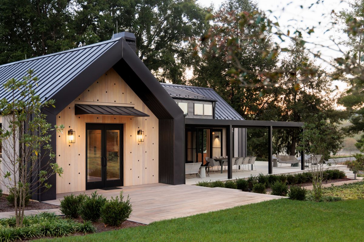
The cathedral-ceilinged central lobby/reception area sets the tone for The Center—airy, open, neutral natural colors and materials, decorated with large artworks from Batten’s travels to Africa and Asia. “We wanted to feature natural materials, a calm palette, and a clean and contemporary feel,” notes Sutphin—and, Batten adds, “we didn’t want it to feel like an office.”

The south hallway leads to the main conference room, two break-out rooms, and the facility’s kitchen. It ends in a large room that can be another meeting room, a dining room, or a social gathering space—with outdoor nooks for lunch, conversation, or quiet time overlooking the gardens. The north hallway holds the restrooms, bedrooms (one handicap-accessible), and a large suite at the end.

“Throughout the building, we wanted to use materials that are both natural and long-lived,” Sutphin says. Several rooms have vaulted ceilings of white pine; the exterior is clad in Accoya, a modified wood made in the Netherlands from fast-growing pine that has been “baked and pickled” (in Batten’s words) to be longer lasting and pest resistant. One interesting stylistic touch: the vertical wood panels at both front and rear entrances feature random holes, an element Batten took from Scandinavian design.

Scandinavia, Japan, the Netherlands, Africa, Asia, and Virginia—blended to make a place to consider and work for our planet. 

Categories
Abode Magazines

Blank slate

How do you create a new house? Do you restore, renovate, update (or demolish) an existing structure? Does the lot determine where the house has to go (as in, not in the stream bed or the septic field)? Is there a street, a sewer hookup, a close neighbor, or a cell tower you have to take into account?

Or, like David and Julie Calhoun and BRW Architects, are you faced with an open pasture that says, “Go ahead, pick your spot?”

When the Calhouns moved to Charlottesville in the summer of 2020 (David’s a UVA grad who grew up in the Richmond area), they knew they wanted to build their own home. They chose BRW Architects—Bruce Wardell, BRW principal, is their realtor’s uncle—and rented while scouting the area (“Scottsville, Free Union, all over,” recalls Julie). 

They chose a piece of farmland off Broad Axe Road in Ivy. There were existing wire fences along the treelines bordering the lot, a road running down its short end—and an open field with 360-degree views. David, who loves rural living (he takes care of the land, the garden, and the chickens), wanted “great views and easy access to the outdoors.” Julie, a painter, wanted a simple, contemporary, easy-to-maintain house. And they both love to cook and entertain.

“Their program fit in the context of the pasture,” says project architect Isaac Miller. “We decided to go with the elements of a farmhouse at its simplest, its basic forms.” Their program helped site the house. Placing it deep into the lot (away from any noise from the nearby road) meant designing a winding gravel driveway that works with the rural setting and gives visitors an approach across the open pasture that silhouettes the house. Unusually, that approach highlights the building’s gable end and brings visitors in to the back door—inside, the house is oriented toward the nearby woods, providing both privacy and the immersion in the natural setting the Calhouns were seeking.

Photo: Glenn Suttenfield

As the Calhouns envisioned, the house, built by Alloy Workshop, is not large—about 2,500 square feet—but feels spacious because of its two-story central great room. Wardell calls the layout “two bays” running along the long axis—the living spaces on the south side, and the smaller functional spaces (bathrooms, HVAC closet, storage) along the north side. The two-story window walls on both sides of the great room, with the freestanding brick fireplace, create a cross axis that keeps the house from feeling strung out. An extra bonus: placing the living spaces along the long southern exposure gives the place a passive solar assist in the colder seasons.

The farmhouse elements are there—the upright rectangular shape; the steep-pitched standing seam metal roof; white siding (HardiePanel with batten strip—“easy to maintain,” says Miller); tall narrow casement windows on the second story; and the outbuilding (in this case, a two-car garage). But so are the contemporary touches. The entry is set off by a triangular flat roof and stained Douglas fir horizontal paneling that contrasts with the vertical white siding. The one-story shed-like wings at each end (housing the master bedroom and the kitchen/mudroom) are clad in rawhide-textured matte brown corrugated metal siding. And the stainless-steel chimney pipe from the floating fireplace ties in with the stainless-steel gutters on the soaring windows.

Photo: Glenn Suttenfield

The home’s interior is flooded with light, mixing white walls with warm touches of wood, fabric, and brick. For a summer like this past one, the upper-story south windows are shaded with an overhang roof—“carefully calibrated,” says Wardell—to help reduce heat build up and glare. While the Calhouns wanted a kitchen that would be part of the living/dining area, it’s also its own cozy area with a dropped wood-paneled ceiling, open shelves full of vintage mixing bowls (David is a collector), and a spacious central marble-topped prep table. “That’s our baby—we hunted all over for that table,” says Julie.

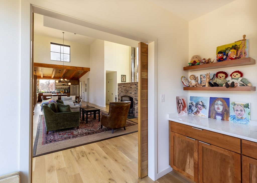
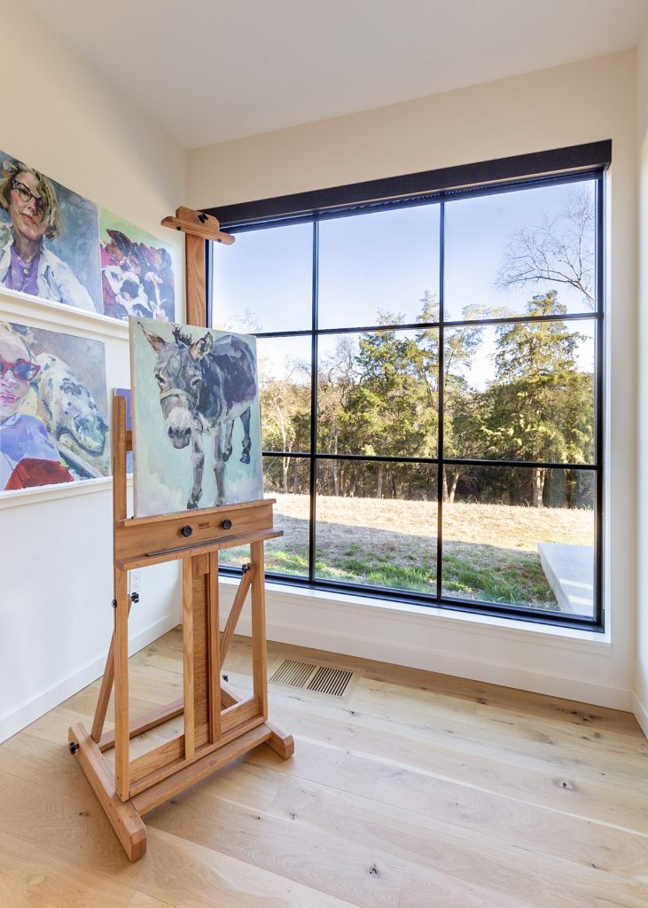
Facing the kitchen across the great room is Julie’s studio; its shelves of materials and paintings in all stages add a spot of color—or, if she needs privacy, there are sliding wooden barn doors to close off the space. Behind the studio is the owners’ bedroom suite, with its own patio overlooking the pasture and its still-surviving ash tree. (Miller points out that building this house didn’t require taking down a single tree.)

Photo: Glenn Suttenfield

There’s one touch that’s not contemporary or farmhouse, it’s just pure simplicity. When you live on the edge of the woods, a screened porch is a wonderful space for almost every season. The problem with a screened porch, as Wardell points out, is “any time you put a porch on a house, you block the connection to the outdoors—so we just slid the porch over.” Just outside the kitchen/mud room door is a free-standing room, fully screened on all four sides, taking in the garden and the woods. The room’s flat roof is angled up on the western side, to allow a fuller view into the trees and the sunset beyond. The Calhouns love their new home, and so do their visitors, says Julie—“this is the space they all wish they had.”  

Photo: Glenn Suttenfield

Interior design as treasure hunt

Eleanor Barton, a Richmond-based interior designer who has worked frequently with Wardell, turned out to be the perfect fit for the Calhouns. “Some people want to buy a [designer’s] style,” says Barton, “but I see my job as bringing out the client’s aesthetic”—and David and Julie had strong ideas about what they wanted in their home. 

When Barton first joined the team, she recalls, Julie was “frustrated—it was during COVID, and she was having trouble finding the things she wanted.” Barton found the right soapstone for the kitchen counters at Albemarle Stoneworks, and searched high and low for the studio’s sliding barn door. Julie scored an aqua-colored vintage sink that inspired the whimsical main floor powder room, with its antique mirror and pale green wallpaper patterned with golden palm leaves. “Julie can be very bold,” says Barton. “It’s fun to work with people with lots of different passions.”

Barton and Julie have become fast friends—and the search continues. “There’s still one wall where we want to find that perfect piece of art…”—CD

Categories
Abode Magazines

Raising the bars

Bar carts are fine for some, but if you’re a true home host, it’s worth considering finding a spot in your space for a proper wet bar. These three—carved out of a corner, tucked into a hallway—provide plenty of inspiration.

Photo: Supplied

Smooth transition

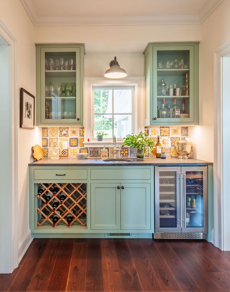
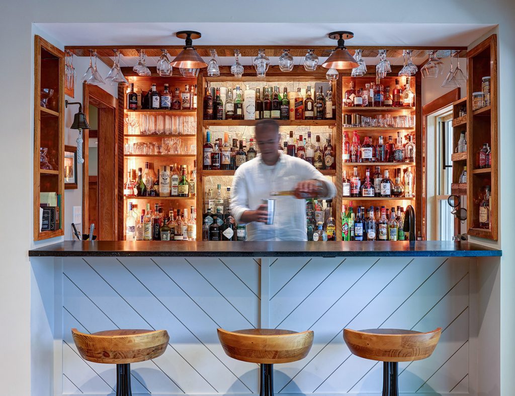
Located in what architect Peter LaBau calls the “knuckle” of a Madison County home, this home bar serves as a segue between the kitchen, laundry room, and homeowner’s study/office.

“It was intended as a kind of multipurpose space,” LaBau says. “It’s where they feed the dog and have cocktail hour.”

Green Mountain Construction handled the build, which included cabinets by Vaneri, a backsplash from Sarisand Tile, and a wine fridge from Kraft Appliance.

Photo: Supplied

Natural selections

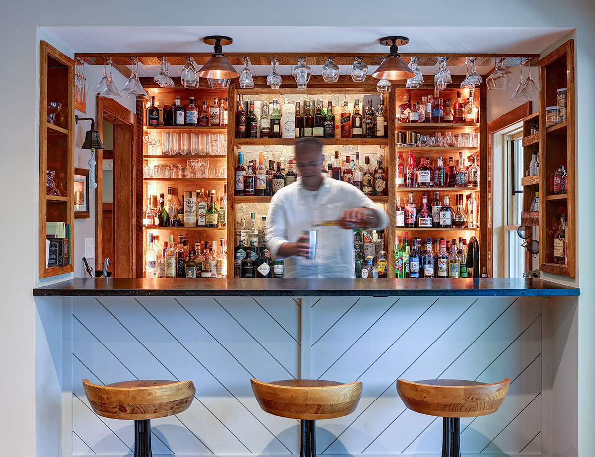
When the father of Crescent Simples’ co-founder set out to build a home bar, he found inspiration in an unlikely spot: the copper-lined boxes where he stored his firewood. Once you know that, the decisions he and Alloy Workshop made to help his dream come true make a lot more sense. 

The modern space is all about materials: natural stone and copper shelving, reclaimed oak floor boards from Appalachian Woods in Stuarts Draft, soapstone slabs from Alberene Soapstone Quarry. 

After that, it was all about proper stocking. The mixology hobbyist is a collector of spirits and a “master in the art of entertaining,” says Alloy’s Kristin Freese.

Photo: Gordon Beall

Better in blue

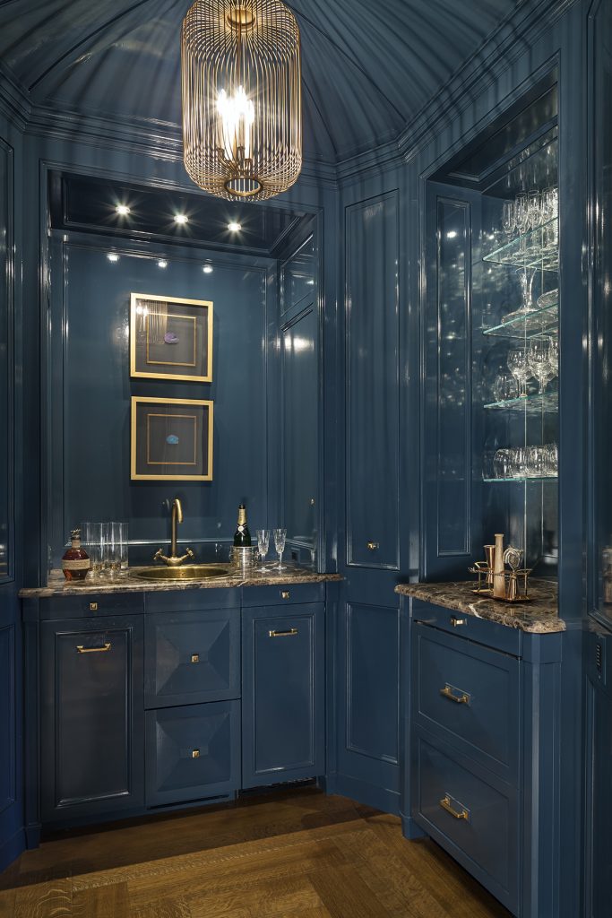
Given this high-gloss bar’s location at the intersection of the home’s formal living and dining rooms and its kitchen and family space, its complex geometry presented a bit of a challenge when it came to integrating the appliances and cabinetry. But a trip to Italy would hold the solution. 

While in Rome, DGP Architects’ Joe Chambers happened upon a small, paneled vestibule with a similar scale and geometry. “The resulting room elegantly resolves the functional requirements of the bar while resonating beautifully with the architectural rhythms of the overall house,” says DGP partner Roger Birle. 

Custom cabinetry from Gaston & Wyatt cleverly conceals a subzero wine fridge and ice maker, as well as lockable touch-latch panels with concealed bottle storage.

Categories
Abode Magazines

Hillside haven

The Treehouse at Williams Creek couldn’t be more aptly named.

As the driveway winds up the secluded 10-acre Afton property, it passes a creek before delivering you to the hideaway on the hill. What appears from the exterior as a modest dwelling expands into a luxurious 3,200-square-foot space the moment you walk through the front door. The entryway, which is actually located on the second floor of the home, provides an immediate “wow factor,” as you are greeted with a breathtaking view of nature, eye level with the trees surrounding the home. 

Like so many details of the house, the entryway was thoughtfully planned by the homeowners, local attorney Rachel Horvath and her husband Chris LeBlanc, owner of NOLA Build & Design in Charlottesville. Horvath handled the vision, while LeBlanc and his team designed and built the home. “I do a lot of this for a living, but Rachel was a huge inspiration for how to be in the space,” says LeBlanc. The second-story entrance, for example, was inspired by a design Horvath had seen in a Western desert abode. 

Horvath and LeBlanc make their home in Charlottesville, but built this retreat as a weekend getaway for their family. “Like most people these days, we lead very busy lives,” says Horvath. “We wanted a special place where we could relax, breathe, and take time to appreciate the stunning nature that this area has to offer. For our family and our guests, the Treehouse provides a welcome retreat from the chaos.” 

They chose this location in Nelson County for the privacy and outdoor space it affords, but also for its close proximity to the popular 151 brew trail and other nearby attractions. “We love the convenience of living in Charlottesville, but it’s nice to be able to be in the country,” says LeBlanc. “It’s peaceful. It’s close to everything. It’s a great space for the kids to be able to run free.” 

Photo: Supplied

Self-described entertainers, Horvath and LeBlanc wanted to ensure the layout would balance private spaces with gathering places. The entry level consists of three of the four bedrooms and three full bathrooms, so guests don’t have to bring luggage up and down stairs. The open-floor-plan ground level is where everyone gathers, with its two-story living room, a party-prep-ready kitchen, and a dining area featuring a custom-built table that comfortably seats 12. One bedroom and a full bathroom are located on the ground level adjacent to the kitchen to accommodate single-story living. 

With four sliding glass doors on the ground level, the flow between interior and exterior is seamless. There’s ample entertainment space on the patio, including a 10-seat dining area and a spacious seating area. There’s also a fire pit for cooler-weather outdoor celebrations, and an in-ground hot tub with an outdoor shower. 

With two growing children and now-realized plans to list the home as a short-term rental property, the homeowners carefully chose materials that would be low maintenance and “that could take the wear and tear,” says LeBlanc. They selected radiant-heated concrete for the flooring and soapstone countertops from Alberene in Schuyler. In the living room, the fireplace is poured concrete with casework, and the mantel is constructed from wood felled on the property. Benches inside and outside the home were made from ash trees salvaged from the land clearing as well. When it came time to furnish the space, Horvath opted for simple, modern décor that would keep nature as the focal point. Calming views of the landscape are available at every vantage point in the home, making it a true rural retreat.

Categories
Abode Magazines

New home base

Jeanne Ward has traveled the world. As a child, she grew up “all over the United States,” and as an international consultant, she lived for 15 years in Kenya and went wherever the job took her: East Africa, the Middle East, Southeast Asia. But a friend’s suggestion, serendipity, and the pandemic brought her to a quiet hillside outside Batesville—and a new home.

Ward had dreamed for years of building her own home, and had started looking at pieces of land in Kenya. In the meantime, one of her best friends from her college years, who had settled in the Batesville area, told Ward about a 10-acre lot for sale just down the hill. Ward thought Albemarle County land might make a good investment, and in summer 2015 bought the lot sight unseen. “At first, I wasn’t going to build there,” she recalls. “But when I came [to sign the sale documents], I thought, ‘Wow, this is pretty’—and after living in Kenya, my standards are pretty high.”

Photo: Virginia Hamrick

In the meantime, Ward had been talking about her design ideas to an architect acquaintance who said, “I have the perfect person for you”—a Chicago-based architect named Trish VanderBeke. Ward and VanderBeke talked on Zoom and connected; VanderBeke (whose bucket list had always included Kenya) came to Africa and spent a week looking around with Ward and learning about her tastes. 

When Ward decided to go ahead and build in Batesville, VanderBeke developed a design and put it out to bid—and her new client faced the reality of U.S. construction costs. Ward reluctantly gave up the full basement with guest suite; VanderBeke made the house more compact (a little more than 2,000 square feet) and designed for natural climate control when Tesla solar roof tiles were still too pricey. Charlottesville contractor Sun Structures became a real partner in creating the house, says Ward—who throughout the construction process was still in Kenya. She saw her new home for the first time in 2019, when she arrived from Africa to move in.

Photo: Virginia Hamrick

Great timing—because once the pandemic hit in March 2020, there was no more traveling to work sites internationally. “I was so lucky—this house became my bolt-hole,” says Ward. 

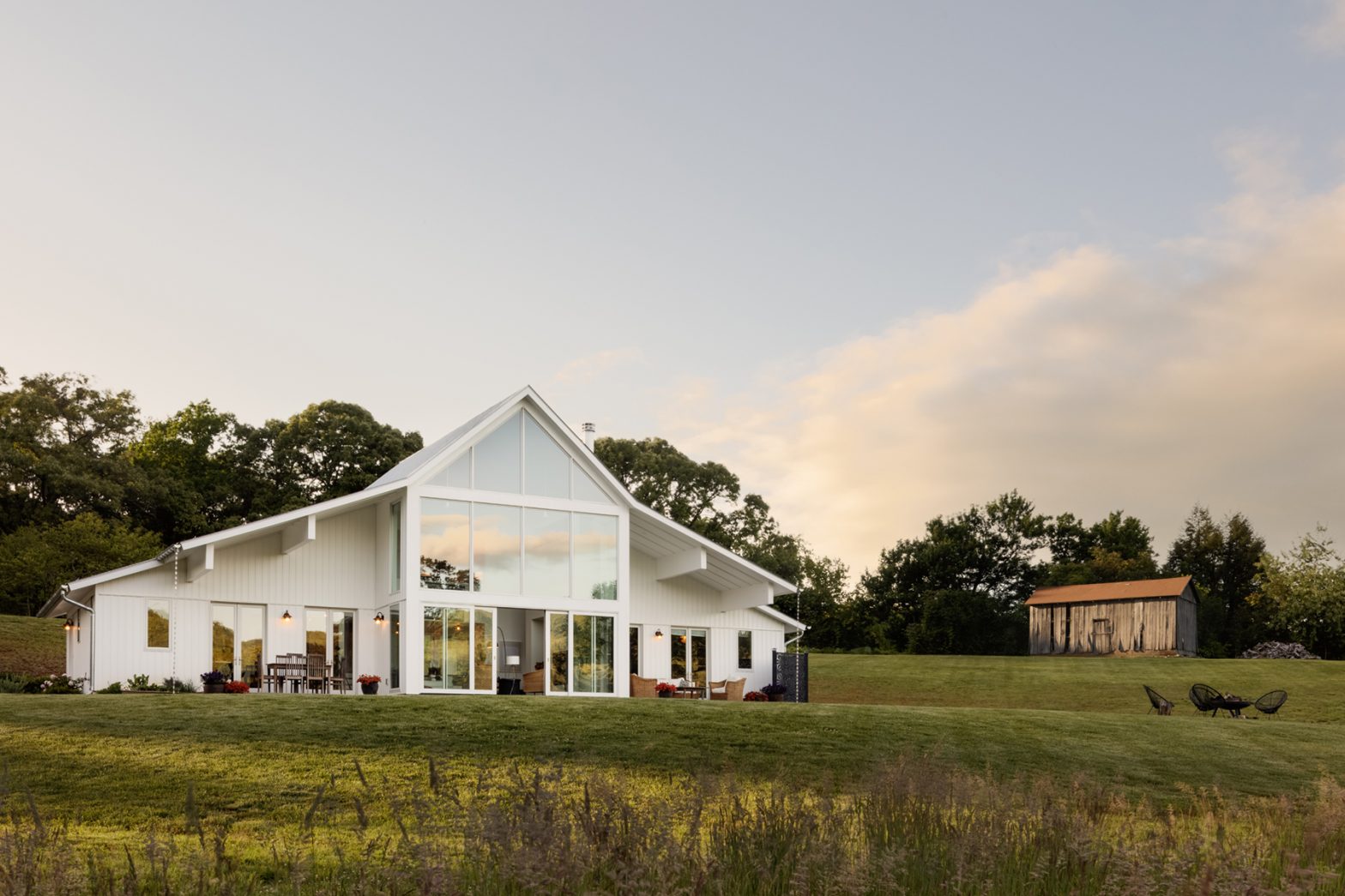
VanderBeke had homed in on two qualities important to Ward: a connection to the land, and a sense of both openness and privacy. (“We used the rural prototypes,” the architect says. “We didn’t want the house to stand out as an oddity.”) Its massing, the monitor roofline, the hayloft window, and the white vertical siding all fit right into the Virginia farm vernacular. Because soil conditions meant the house would be sited close to the road, VanderBeke minimized openings on that side and faced the living spaces out toward the meadows and hillsides. A felicitous result: The house is more closed to the north and west, keeping out winter winds and minimizing late-afternoon summer sun; Ward says the house barely needs to be heated—although the radiant flooring helps there—and requires minimal air conditioning.

Photo: Virginia Hamrick

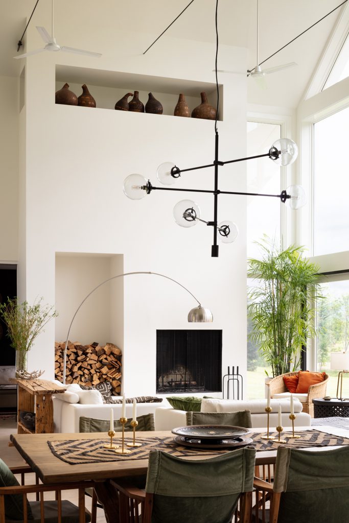
The home’s airy white-walled interior harkens back to Ward’s lifestyle in the mild Kenyan climate; the kitchen, dining, and living areas flow together, and each space has its own access to outdoor seating and the meadow beyond. The living area’s two-and-a half-story window wall takes full advantage of the Blue Ridge landscape. As a result, the house feels more spacious than its square footage, and serenely private—the only intrusion on the view are the birds and an occasional contrail in the distance. 

Past the main living space is a small den/guest room and the master suite, set off by a pocket door. The master bedroom has its own patio, and even an outdoor shower (“not hooked up yet, that’s on my list,” says Ward). On each corner of the deep-overhang roof are silver rain chains—a charming and visually attractive way to channel water off the steep roof (VanderBeke says, “I searched all over for that particular design.”). A second-story space overlooking the living area functions for now as Ward’s office, but may become a small guest suite.

Photo: Virginia Hamrick

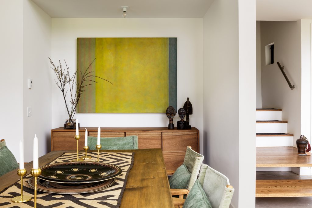
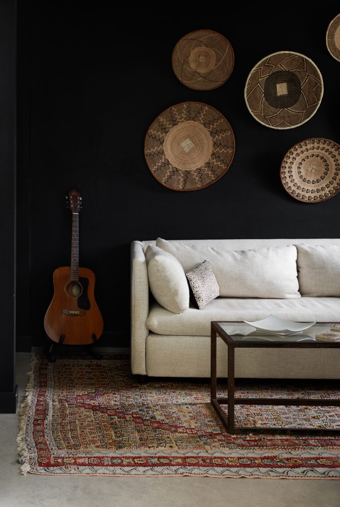
Throughout the home are furniture and furnishings from Ward’s years in Kenya and her travels. Woods and fabrics dominate, along with fresh flowers. There are a few decorator touches: The main wall in the master bedroom is papered in an almost-lilac neutral Philip Jeffries pattern called Dandelion Seeds, and two powder room walls are Kelly Wearstler’s black-and-gold Graffito. Ward likes the idea of dark walls in small spaces “to make them appear larger.” In the den, for example, painting the walls a soft black makes the space feel like a little hideaway after the wide-open white living space.

Now that she’s in her dream home, Ward has found—as most homeowners do—that the work is never done. Her first-year project was opening her meadow view and revealing the orchard beyond by clearing out an acre of scrub trees and undergrowth (including the remains of a former Christmas tree farm—her new neighbors appreciated the free Christmas trees). Last year’s project was renovating the property’s original farmhouse to serve as an Airbnb; Ward filled it with some of her own furniture, supplemented by Charlottesville’s Habitat for Humanity ReStore, and she’s already hosting. 

Photo: Virginia Hamrick

Still to come is finishing the landscaping around the new house, including a possible retaining wall and larger gravel drive/parking area. And then perhaps the guest quarters Ward had to give up in the original design will be reincarnated in a silo-type structure at the top of the driveway. One of Ward’s Kenyan rentals was a small one-bedroom place with two little guest houses; she liked that approach—“I got to have my guests and my own private space,” she says with a smile.

In the meantime, Ward is living in a space she had always dreamed of. “I adore this house,” she says, and from the look on her face it’s clear she has come home.