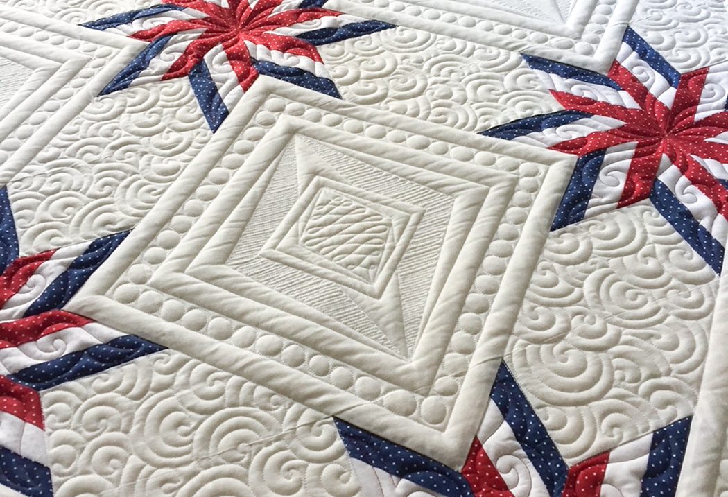
The Charlottesville Area Quilters Guild Biennial Quilt Show features 180 quilts at Tandem Friends School on April 9 and 10.
Supplied photo.
It goes without saying that a quilting judge must have a sharp eye for details, but there’s more to it than that. Sure, “things like originality, consistency in the length of quilting stitches, square corners, levelness in hanging, and matching points (joints of fabric) play into awards,” says Linda Boone, chair of the Charlottesville Area Quilters Guild Biennial Quilt Show. But it’s the ability to find the “final spark,” an understanding of the quilters’ approach and how they take on a challenge, that shows a mastery of the craft.
The CAQG biennial marks 50 years for the organization, and though it is not judged professionally, it is an opportunity for locals to view and vote on the work from four area chapters: Crozet Quilters, Moonlighters, Tuesday Morning Quilts, and Nelson Quilters.
Whether piecing a nap or throw quilt, creating a modern pattern, or designing an art quilt to hang on the wall, quilters face crucial decisions at every stage in sewing, beginning with the selection of a style, which may include appliqué, art/innovative, pieced (small), pieced (medium), pieced (large), or challenge.
“Some quilters find choosing fabrics harder than the piecing,” says Boone. “Some find quilting the layers…curves…small pieces challenging. Some find it most challenging to make a quilt a certain size and color (boundaries can be challenging!).”
Then begins a journey of dedication, precision, and incredible patience. The 2019 Best of Show winner Julie Davis’ current entry is a work of stars, dedicated to pandemic frontline workers, that includes 620,680 stitches.
Beyond their utility and beauty, quilts can also tell stories, and in some cases pass down history—a tangible artifact that holds a social and economic origin story through its fiber and composition.
Antique, new, decorative, or traditional, “each quilt made is a learning experience…quilters never stop learning,” says Boone. The mostly female group (at press time, the CAQG counted one man among the four chapters) supports each other by sharing tips, patterns, and lighthearted banter to keep everyone stitching in stitches. “Finished is better than perfect!” says Boone. “There is no such thing as the quilt police.”
Decoding quilters
Sewing circles are no joke, but their members do have a sense of humor when communicating about the status of their work. Here’s a glossary:
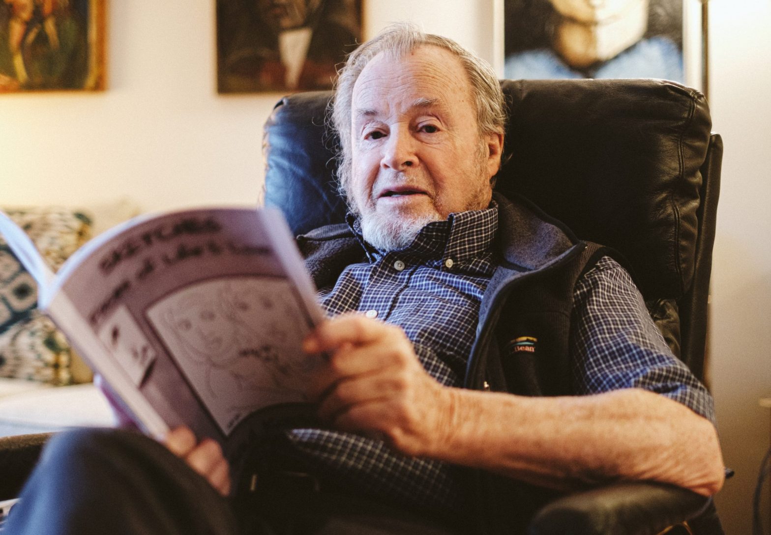
Saul Kaplan began his professional artmaking in 1948 at the prestigious Hans Hofmann School of Fine Arts, where he studied drawing under Hofmann, who was a contemporary of Henri Matisse. Photo: Eze Amos
By Matt Dhillon
In February, Saul Kaplan marked both his 93rd birthday and the release of a new book of artwork. The self-published Sketches: Faces of Life & Love highlights what is perhaps the artist’s most discreet and most intimate medium, his drawings.
Having retired to an apartment in Martha Jefferson House, the ceramics and painting that were the priority of Kaplan’s artistic career became more difficult. But Kaplan cannot sit down with a pen without coming away with a drawing. It’s a habit he’s developed from over 60 years of practicing.
“Drawing is a muscle memory, eye muscle coordination,” Kaplan says. The memory that keeps returning to the muscles of his fingers, wrist, and arm is the memory of human faces.
Over the years, Kaplan has drawn thousands of human faces, and on every page his book is populated with that most familiar of images.
“The human face expresses everything,” he says.
Kaplan’s simple lines craft expressions on the shifting array of faces, digging for the bare-bones of emotion buried there. We see eyes meet, or downcast, or slitted, eyes tired, or gentle, or cunning. Lips are curled, puckered, pouting, or tense. Noses sharp and soft, cheeks broad and narrow.
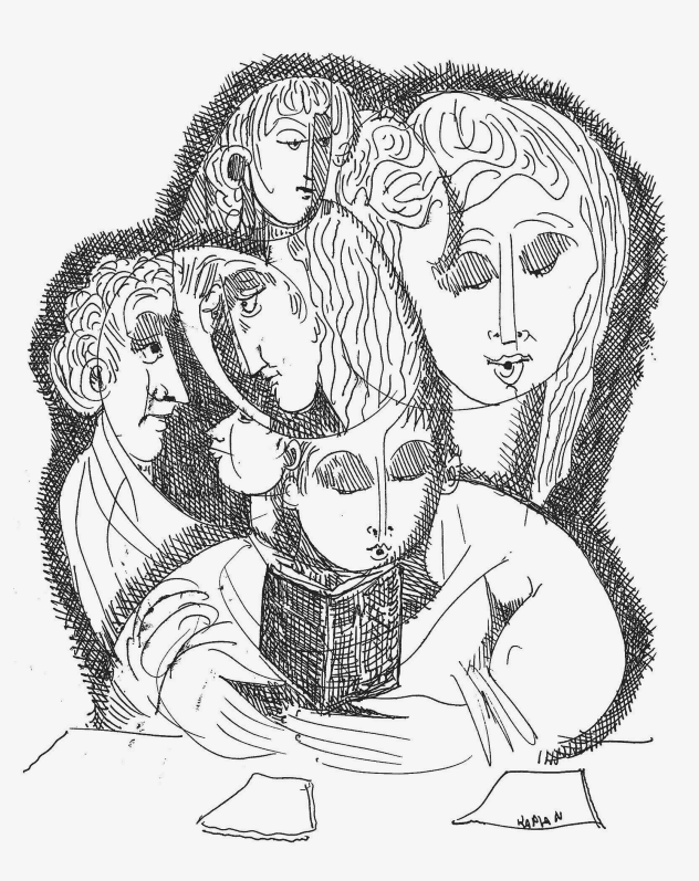
Kaplan released his third book, Sketches: Faces of Life & Love, just before his 93rd birthday. Image courtesy of the artist.
Perhaps it is this simplicity of bare lines that makes drawing, as Kaplan says in the book’s prologue, “the most intimate and direct form of visual communication.” While intricacy serves to expand and amplify, the simplicity of the line drawings in Faces of Life & Love go in the opposite direction, seeking to distill the essence of an eyebrow, or a lip, and identify the essential lines that carry emotion. In the most minimalist renderings, Kaplan refines a somber face into just a handful of lines.
Kaplan also alludes to ancient Egyptian drawings. “The style of the Egyptian eye has been repeated over history,” he writes. “The eye I draw, like Picasso did, had its beginning in Egypt.”
That eye—drawn over and over for centuries—mirrors Kaplan’s endless creation of faces throughout the years. In this obsessive repetition and focus on the geometry of shape, Kaplan’s drawings search for something basic about the human face, its composition, and its familiarity. As the Egyptians did, Kaplan attempts to use the very specific and precise lines of a face to strike a resounding chord.
In this collection, we see the warm human population that Kaplan has created as a result of that repetition. Most of them are not alone, drawings occupied by two or more figures in some form of relationship to each other. Often, their bodies overlap or blend so that we see two faces that share one eye, or three heads that share one torso. In these fusions there is a sense of togetherness, of something shared that merges the characters in a visceral way.
Each drawing, he says, is a kind of personal signature. “[As artists] we are making our mark some way or another. It’s a kind of waving and saying, ‘I’m here.’”
Kaplan, like his characters, tries to merge with something bigger than himself, participating in the collective story. “That’s what an artist really does,” Kaplan says. “He tries to use the medium he’s in to express something—it could be anything—but it is now part of history, a part of mankind.”
In the same way that the thousands of Egyptian eyes are actually one eye, iterations of the same form, Kaplan’s endless faces resolve into one face, waving at the world.
Charlottesville’s Priscilla Whitlock and Richmond-based artist Mary Holland complement each other’s work in a dual exhibition at Quirk Gallery. Photo courtesy of the artists
As daily temps start to climb, and we await the vibrant colors of spring, Quirk Gallery offers a visually stunning show celebrating the work of two artists, Priscilla Whitlock and Mary Holland, whose work is guaranteed to lift winter’s gray grip.
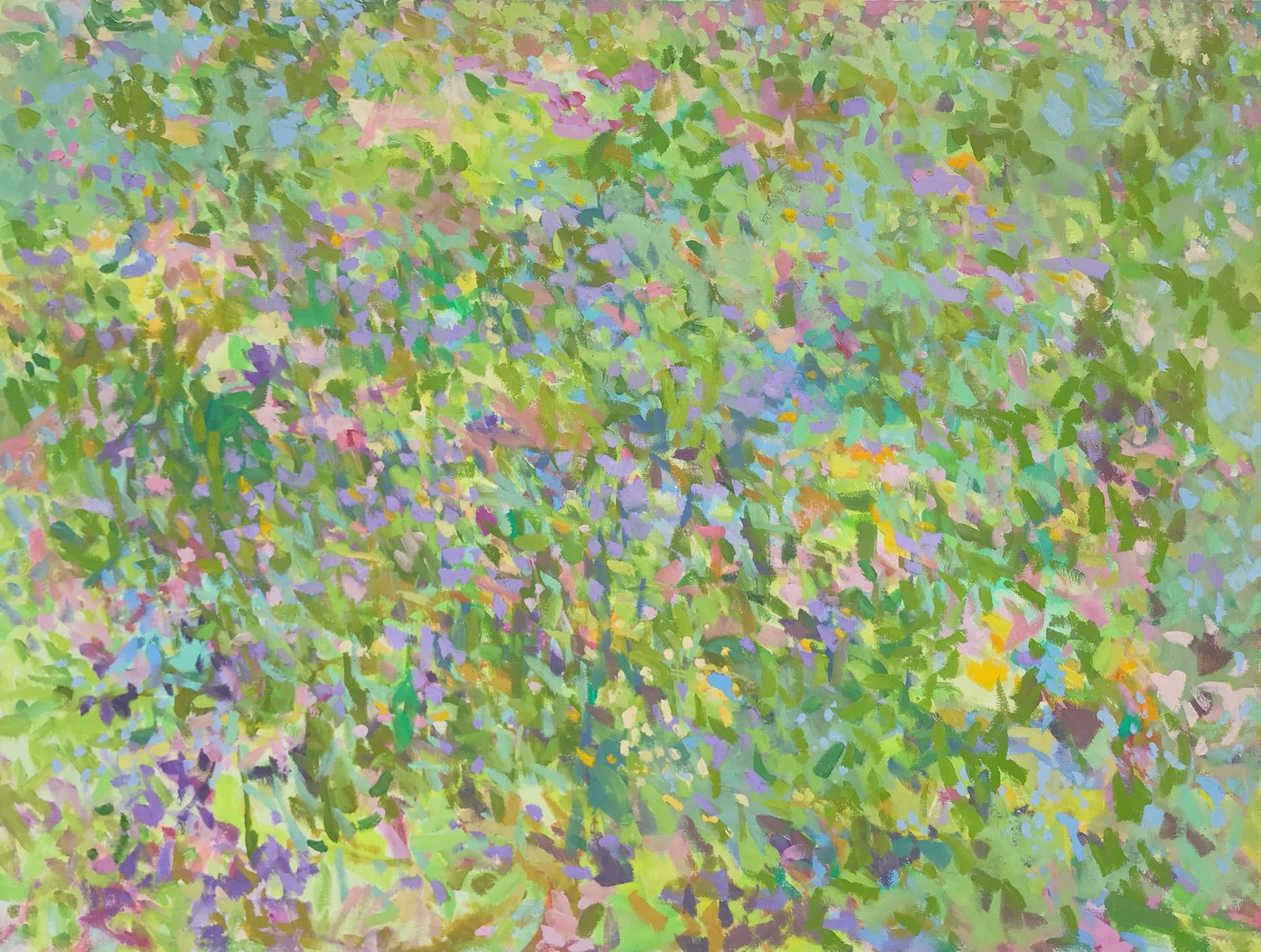
Whether producing vignettes of her garden, open meadows, or mountain vistas, Whitlock’s “Eden” conveys with paint the essence of a place—not just its physical manifestation, but also the experience of being there. She clearly revels in depicting nature, and her manipulation of paint and her lively gestural style expose a deep appreciation for the purely visual aspects of painting, too.
The trio “Spring, Greens,” “Goldenrod Thistles” and “Wild Field, Mustard” are heady depictions of a world in full bloom. The paintings buzz with life. Whitlock captures the effects of nature—wind, shifting light and shadow, and the sense of ever-present insects—to reflect this bombinating sensation, but her painterly approach infuses the works with vitality. With “Spring, Greens,” Whitlock zooms in beyond the vegetation depicted in the other two works and emphasizes the riotous sensual quality of the place as a whole.
“Dogwoods, Spring Mountain” has an entirely different mood. Its muted colors suggest dawn or dusk, a quieter, more somber time. In the work, a vista of mountains rises above a grove of dogwood trees. The mountains are rendered in broad mauve and blue brushstrokes. Whitlock uses jagged lines to describe variations in the terrain, but for the most part this area has a distinct serenity as compared to the foreground. Visually, this situates the mountains in the distance, but it also fittingly depicts their grandeur and permanence. In front, the trees of the title are animated with wind and light. They seem to bend and twist before our eyes, brought to life by Whitlock’s adept handling of the paint.
Photo courtesy of the artists
With the showy “Bee Balm, My Garden” and “Blues, Pinks, Whites, My Garden,” Whitlock ventures closer to the world of abstract painting. Yes, these works are representations of plants in the patch of earth by her studio, but how she arranges her composition and the way she applies paint demonstrate an emphasis on the formal aspects of painting. Just look at the riotous blobs of pigment in “Blues, Pinks, Whites,” and the daubs of scarlet, green, and blue overlaid with the scrawl of oil stick in “Bee Balm.”
Like her paintings, Whitlock’s monotypes (unique images printed from a plate that has been painted by the artist) are about putting pigment down on a flat surface. These delightful, small-scale works possess a thrilling freshness and dynamism that holds its own against the larger works. “Flow,” “Spring, Peaches” and “Orchard, Spring” are visually striking examples, but I was particularly taken with the perfectly balanced “Water, Blues” and “My Garden.”
Whitlock has been producing monotypes for years. “I’ve stayed with it so long because it’s like playing another instrument,” she says. “You see something new that you wouldn’t have if you just stuck to your primary medium.”
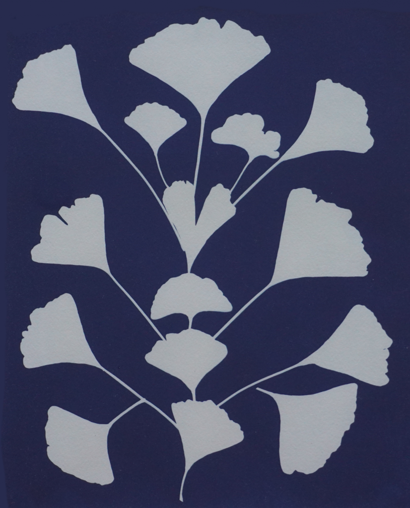
At the other end of the gallery hangs Holland’s “Compositions in Blue: Cyanotype.” Cyanotype is a photographic printing process discovered in the mid-19th century that uses paper coated with a photo-sensitive solution and sunlight to produce an image of a stencil or object. The indigo hue produced by the cyanotype process has profound emotional resonance. Whether it strikes primordial chords within our subconscious, referencing natural phenomena like the night sky or deep water, this bold yet quiet color has an undeniably mysterious and romantic quality.
In 14 works, Holland takes full advantage of this. The reduced palette of blue and white sets off her striking arrangements of both natural and manufactured objects. Some of these she leaves as is. With others, she introduces collage and watercolor, occasionally adding the bling of silver foil to augment the white.
Holland’s assortments of leaves lend themselves well to the cyanotype technique. The veiny beech frond skeletons of “Forest Bathing,” the silvery disks of “Money Plant,” and the graphic power of the fan-shaped leaf blades in “Gingko Pattern,” all present a different kind of foliage. Holland’s approach reveals an affinity for the individual qualities of each specimen. With the first two, she employs collage to enhance the basic thrust of the work, adding silver to underscore the mica-like money plant pods and inserting silver hands in the allegorical “Forest Bathing.” When it comes to the distinctive gingko leaves, she adds nothing, deeming the rhythm of their silhouette powerful enough.
In other pieces, Holland turns to the world of handicrafts, using antique lace doilies, placemats, and embroidered handkerchiefs as her subjects. These are poetic works that highlight the intricacy of needlework and the filmy quality of fabric. Against the blue field, these stark white pieces are transformed to reveal works of intricate design and superb workmanship. One can’t help thinking about the anonymous creators of these bits of needlework.
“I think women’s work is undervalued,” says Holland. “Especially old crochet, and lace, and all these things women did. You can pick them up at junk shops and vintage places for very little, which is amazing when you think how beautiful they are and the amount of time that was put into them.” Holland gives these pieces a second chance and shines new light into their origins.